Microsoft has announced a new tablet-optimized taskbar
2 min. read
Published on
Read our disclosure page to find out how can you help MSPoweruser sustain the editorial team Read more
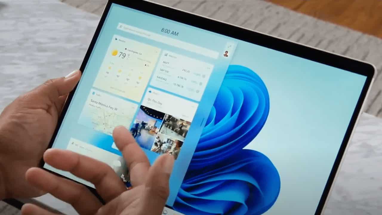
As part of their continued efforts to make Windows more tablet-friendly, Microsoft has announced a new tablet-optimized taskbar and some changes to widgets.
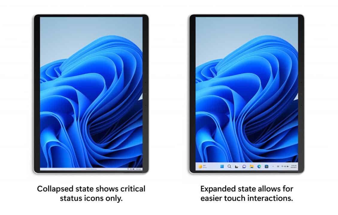
The new taskbar, which is available in build 22563, comes in two states, collapsed and expanded. As the names suggest, the collapsed state gives you more screen space while also preventing you from accidentally tapping on things so easily, while the expanded state makes the taskbar easier to use with touch controls thanks to bigger icons.
According to Microsoft, the new taskbar state is “specifically designed to make you feel more confident and comfortable using your device as a tablet,” which should be a welcome improvement to 2-in-1 device users.
These two taskbar states can be easily switched between by just swiping up and down on the bottom of your device, so long as you have the feature enabled. This feature should be enabled on your device by default, but if you want to check it out for yourself, you’ll need to navigate to Settings > Personalization > Taskbar > Taskbar behaviours.
In Taskbar behaviours, you should be able to see the new setting for “automatically hide the taskbar when using your device as tablet,” so long as your device is supported.
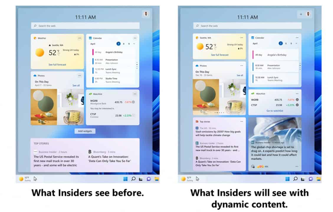
Alongside the improvements to the tablet taskbar, Microsoft is also implementing some changes to make Widgets more dynamic. Bringing you a “dynamic blended feed containing both widgets and news content,” Microsoft is hoping to make it easier for you to engage with both widgets and news without the burden of curating your perfect widget canvas.



User forum
0 messages