Google Gives Gemini on iOS a Smarter, Cleaner Prompt Bar
![]() 2 min. read
2 min. read
![]() Published on
Published on
Share this article
Improve this guide
Read our disclosure page to find out how can you help MSPoweruser sustain the editorial team Read more

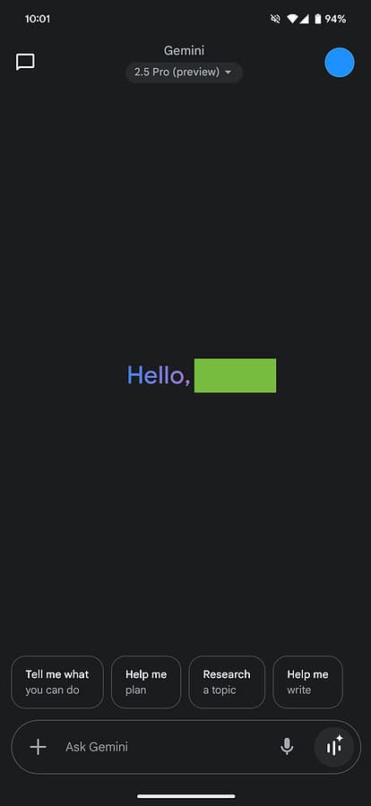
On May 15, Google pushed a redesign to Gemini’s prompt bar on iOS. The update brings a more focused interface with tighter integration of recent user activity.
The new layout moves suggested prompts into a collapsible carousel, giving users more space to type. Google also added a quick-access bar showing recent conversations, making it easier to revisit or pick up older threads without digging through menus.
Also read : Google Says RCS Messaging Hits 1 Billion Daily Messages in the U.S., Right After Apple’s Adoption
Now, when users open Gemini, they see a cleaner screen with minimal distractions. Instead of cluttering the input field, suggestions appear in a scrollable card format. This layout mirrors design choices Google already uses on Android and the web version of Gemini.
Google continues to position Gemini as a core feature across different OS platforms, slowly phasing out Assistant on some devices. While the iOS app changes are visual on the surface, they reflect Google’s push to streamline Gemini into a more consistent tool across its ecosystem.
You may also be interested to read –
- Google Workspace Gets New AI Tools for Gmail, Gemini, Google Slides and more
- Google’s Gemini Replaces Assistant in Android Auto, and This Is What’s New
- Google Workspace Gets Gemini Live for Real-Time Voice Interactions
The update follows recent moves by Google to integrate Gemini deeper into Android, Gmail, and Docs. It also signals that Google wants users to rely more on Gemini as the central point of interaction across its apps and devices.


User forum
0 messages