Xbox Home UI gets better background view but still lacks full customization options
3 min. read
Published on
Read our disclosure page to find out how can you help MSPoweruser sustain the editorial team Read more

It seems Xbox has partially listened to the repeated requests of Xbox players to have an Xbox Home UI that gives more space for their background design. In the new Xbox Home experience being tested with Alpha Skip-Ahead and Alpha Xbox Insider testing rings this week, testers will see smaller tile sizes and a spacious place for their selected backgrounds. However, just like in the past, fans are still asking for full customization options.
In April, Xbox announced that it was halting the test for the Xbox Home after hearing complaints from testers and gamers in the Xbox community. Fans stressed at that time the crowded-looking UI filled with tiles. Now, Xbox addresses these points in the new test with Insiders.
“As we mentioned when we paused our experiments last month, we heard you tell us that the changes to the top of Home felt crowded and didn’t leave enough space for you to enjoy your background,” wrote Ivy Krislov, Senior Product Manager Lead, Xbox Experiences, in a blog post. “So, we designed hundreds of options, then refined with prototypes and finally user-tested in our Research labs until we found one we hope you’ll love. It balances the experience, accessibility, function, and the needs of our community.”
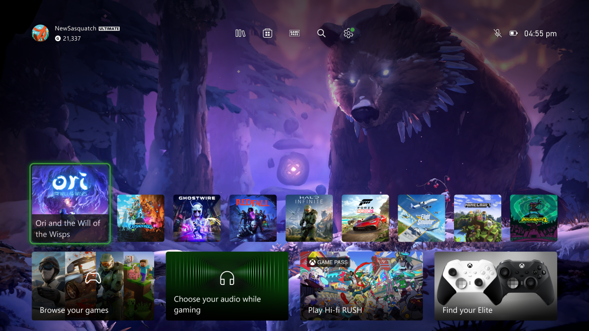
In this test, the new Home experience will boast a wider space for users to view their background. That’s all possible through the adjustments made with the tiles, which are moved to a lower position and reduced in size. Xbox also included a new floating UI for a quick access menu for the library, the Microsoft Store, Xbox Game Pass, search, and settings. Another addition to the new UI experience is a responsive game art feature, which will work when users hover the tiles. This will temporarily change the background to show the art related to the tile of a game.
While these changes undeniably answered some of the requests of Xbox fans, some still expressed their disappointment over the ads and the absence of complete customization options in the UI.
“On the new home released today, ad rows are still taking priority over my pins,” said one user on Reddit. “The first option when I scroll should be my pins and not an ad for Game Pass or anything else. We are still unable to rearrange the order of the rows and pins on the home page.”
“My biggest complaint are the pins,” another user echoed the complaint. “If you want to get rid of them, just say so. The whole point behind pins was to be able to customize your dashboard and quickly get to the things that matter the most to you. Now I have to scroll past advertisements and a bunch of stuff that I don’t care about just to see them. It completely defeats the purpose.”


User forum
0 messages