Vivaldi vs Opera – Which Chromium Browser is Best in 2025?
9 min. read
Updated on
Read our disclosure page to find out how can you help MSPoweruser sustain the editorial team Read more
I decided to put Vivaldi vs Opera head-to-head, to see which of the two is the best today. According to the browser usage statistics, both options are gaining popularity, and for good reason.
Read on as I’ll test their top features, compare performance, ease of use, and more.
Vivaldi vs Opera – Features
As Chromium browsers, Vivaldi and Opera have many similarities. However, there are also excellent features unique to each of them. Here’s what stands out the most:
Cross-device Syncing
We all want a seamless experience across our devices, and Vivaldi and Opera both support cross-device and cross-platform syncing.
This allows your browsing data and settings to remain consistent when switching between desktop, mobile, and tablet.
Both sync bookmarks, history, passwords, and open tabs, and all you have to do is sign into your account on any device and enable syncing.
Winner: Draw
Privacy and Security
Vivaldi takes privacy and security seriously and comes with a built-in ad blocker. This stops most types of display ads, including banners, pop-ups, and video ads. The browser also blocks malicious sites, tracking URLs, tracking cookies, and prevents targeted advertising.
Furthermore, private browsing mode ensures browsing history and cookies aren’t saved, and you can manage cookies and other privacy settings on a per-site basis.
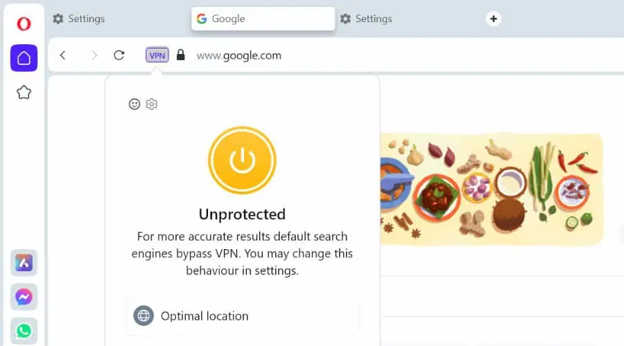
Opera offers all of the above, with the added benefit of a free VPN. This encrypts your internet connection, so hackers, snoopers, ISPs, and restrictive governments cannot effectively monitor your activity.
Winner: Opera
Tab Management
If you use a lot of tabs, it’s important to be able to organize them efficiently, instead of in one long confusing list.
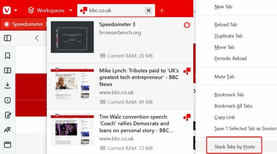
Vivaldi provides multiple tab formats, as well as horizontal or vertical tabs. These include stacks to group similar tabs together, tiles you can view in one window in different layouts, and a folder tree structure. You can also give tab groups names, to locate them more easily.
Opera uses a more traditional tab system – horizontal by default, but vertical is also an option.
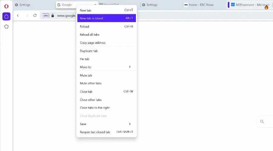
I like that you can get a thumbnail preview of a tab by hovering over it and it automatically groups tabs with the same domain in tab Islands. Moreover, you can pin important tabs to the left side of the tab bar, making them smaller and harder to close accidentally.
Both allow you to view two tabs in a split screen when you need to work with two sets of pages but don’t have two monitors.
Focusing on tabs alone, Vivaldi provides a more comprehensive solution.
Winner: Vivaldi
Opera Workspaces
A feature unique to Opera is Workspaces, which goes beyond tab management. This lets you create different workspaces for different projects, such as one for work or school and another for personal browsing.
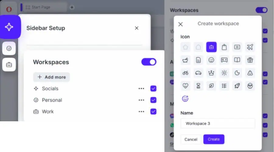
Workspaces are like tab groups in Vivaldi, but Opera offers some additional features, such as the ability to pin tabs to specific workspaces and customize the icons and colors of each workspace.
Extensions
Both Vivaldi and Opera offer essentially all the same browser extensions as Chrome, allowing for lots of new functions beyond their native features.
They also have their own unique add-ons for an even larger library of features.
With so much to offer, it’s difficult to say which is better, unless there’s a specific extension or add-on you prefer.
Winner: Draw
Customizations
Customization is where Vivaldi really shines. No other browser gives you this much freedom to tweak the interface and browser behavior.
Its toolbars can be moved to different positions and modified further in the Toolbar Editor. It lets you add and remove buttons, widgets, statuses, and notification icons at will.
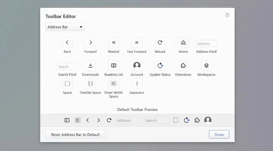
You can also choose from a variety of pre-installed themes or create your own custom theme, which is shareable with others.
You can customize Vivaldi’s start page with different background images, speed dials, news feeds, and bookmarks. Moreover, bookmarks themselves can be organized with tags and folders, and labeled with icons.
It also supports custom keyboard shortcuts and mouse gestures.
Those with a bit of skill can even apply their own custom CSS styling, transforming the interface and how web pages look.
Nonetheless, Opera is no slouch and offers a good range of customizations to get it looking and working the way you prefer.
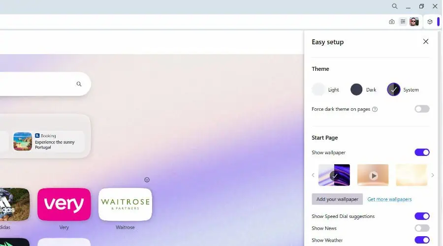
Beyond the app sidebar and Workspaces, you can change the theme, wallpaper, and color scheme of the browser, as well as adjust the size of interface elements. Like Vivaldi, it also supports keyboard shortcuts and mouse gestures.
Winner: Vivaldi
Opera AI Assistant
Another unique feature of Opera is its Aria AI assistant. While Vivaldi can offer some AI features via extensions, Aria AI is built into Opera and helps alongside every browsing session.
It summarizes pages to be more digestible and you can highlight text to further explore the information.
It’s also an AI chatbot that answers questions rather than using a search engine and composes content from prompts, such as emails, blog posts, and coding.
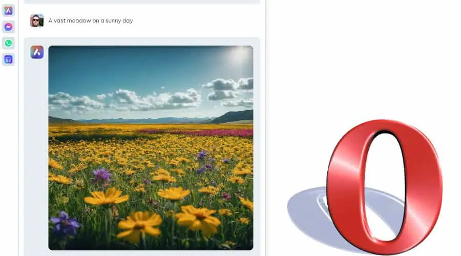
Furthermore, you get 30 free AI image generations a day using the stunning Google Imagen2 model.
Vivaldi Web Panels vs Opera App Sidebar
If you’re using mobile social media and messaging apps, their desktop sites can be a little clunky. Opera solves this by offering an app sidebar that includes Facebook Messenger and WhatsApp, and you can add others with a few clicks.
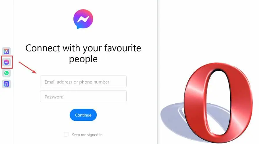
These function in the sidebar itself, so you can stop to reply to messages wherever you’re on the web.
The closest equivalent from Vivaldi is its Web Panels feature. Here you can display websites within a side panel of the browser while still engaging with the main page.
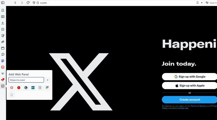
Although you can leave Facebook or X open, these are still the website versions and you don’t get the same level of integration as Opera’s app sidebar.
Winner: Opera
Vivaldi Notes vs Opera Flow
If you want to make notes and save content, Vivaldi boasts a Notes feature within its sidebar. These can be sorted into folders and tagged for easy organization. Moreover, you can attach files, add screenshots, and link notes to specific web pages.
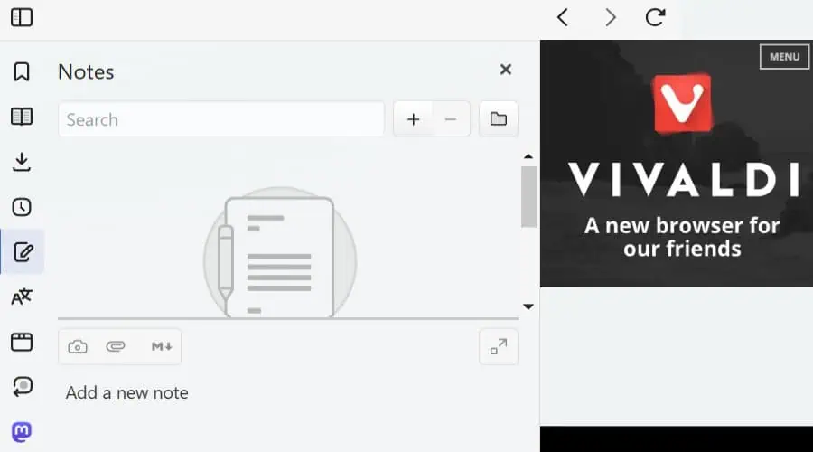
Notes are available across devices via the syncing feature and are viewable offline. I use this to organize research and keep track of ideas even when there’s no Wi-Fi around.
Similarly, Opera’s My Flow lets you transfer files, links, images, videos, and messages between your desktop and mobile devices.
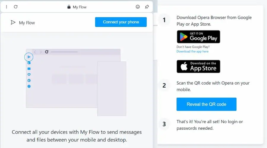
It functions more as a quick file-sharing feature and lacks typed note-taking and the organizational aspect of Vivaldi Notes.
It’s not difficult to share files, so in this case, I find Vivaldi Notes to be the more useful feature, especially with offline access.
Winner: Vivaldi
Opera Wallet, Crypto, and Rewards
Opera provides a rewards program where you earn points for shopping in the browser on 1,000+ partnered stores.
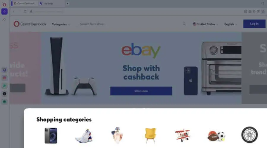
Points are stored in the built-in Opera Wallet and can be redeemed for cash and discounts on future purchases.
Opera Wallet also supports cryptocurrencies and your own private keys, so you have full control over your assets and can make transfers and purchases in crypto without using a separate service.
Vivaldi Reading List
A unique feature for Vivaldi is Reading Lists, which you’ll find in the sidebar. I find this especially useful when I come across interesting articles or web pages that I don’t have time to read right away.
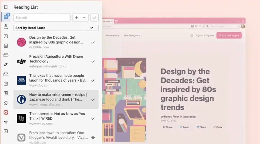
I can add them to the list without cluttering the tab bar or making a permanent bookmark.
Ease of use and User Interface
Before any customizations, Vivaldi and Opera share a similar and familiar user interface, with the address bar and tabs at the top and a retracted sidebar on the left.
They are both intuitive and easy to use. Their logos are at the top to access the main settings and other icons are clearly labeled or provide a hover explanation.
Once in the main settings pages, you’ll find categories on the left like Privacy & Security and other features, with the configurable options then shown in the main window.
Getting started couldn’t be easier. Both give the option to set the browser as default, import bookmarks and other data, and sync with your other devices.
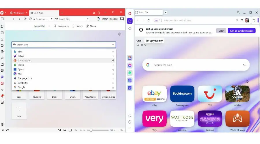
Even the start pages have a similar layout, with speed dial shortcuts below a search bar. The only real difference is Vivaldi defaults to Bing and lets you use a dropdown arrow to select a different search engine, while Opera is set to Google on the start page, and you must change this within its settings.
Vivaldi only becomes a little more difficult if you decide to dive deep into its customization options.
Ultimately, whether you’re switching from Chrome, Edge, or any other browser, you’ll be able to navigate Vivaldi and Opera without any trouble.
Winner: Draw
Resource Usage and Page Load Speed
Due to its extensive features, Opera tends to consume more memory than Vivaldi.
To test this, I opened the same 5 tabs of content on each browser and measured a consistent range of RAM usage using Windows Task Manager.
Opera used between 1,300-1,320 MB of memory, while Vivaldi only showed 595-615 MB.
Of course, resource usage is important for low-spec computers, but what about performance on the page? To benchmark browsing speed, I used Speedometer 3.0 – the higher the number the faster the browser.
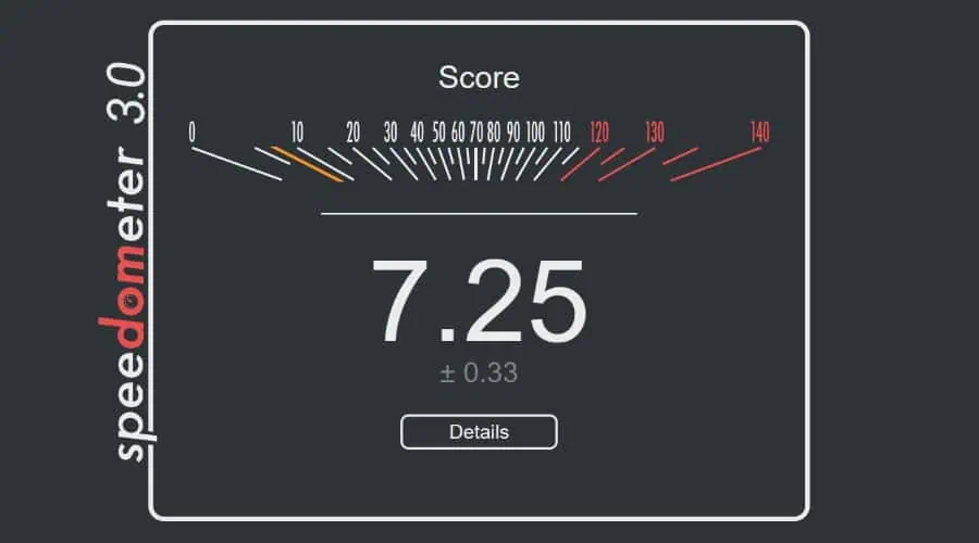
Opera scored 7.25, while Vivaldi scored slightly higher at 9.19.
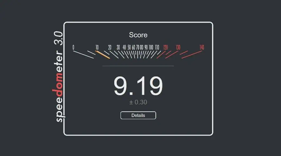
This minor difference has little impact on day-to-day use, and I found both browsers to be fast and efficient across all types of web pages and multimedia on a mid-range PC.
Vivaldi vs Opera – Head-to-Head Comparison
Now you know all the features in detail and how they compare, let’s recap Vivaldi vs Opera’s key areas:
| Vivaldi | Opera | |
| Ease of Use | 4/5 | 4/5 |
| RAM | 595-615 MB | 1,300-1,320 MB |
| Page Speed | 4/5 | 3.5/5 |
| Privacy and Security | 4/5 | 5/5 |
| Extensions | Chromium | Chromium |
| AI Assistant | No | Full AI Assistant |
| Customization | 5/5 | 3/5 |
| Overall Features | Better tab management + Notes and Reading Lists | VPN, better in-browser apps, Rewards and Wallet |
Vivaldi vs Opera – Verdict
Overall, when looking at Vivaldi vs Opera, I sway towards Opera. It has a VPN, one of the best in-browser AI assistants, and the ability to use messaging and social media apps within its sidebar.
That being said, Vivaldi’s Notes and Reading List features are useful, and if you want a highly customizable browser that has less impact on system performance, it’s certainly the better choice.

User forum
0 messages