Microsoft talks about the refreshed Office UX based on Fluent Design System
![]() 1 min. read
1 min. read
![]() Published on
Published on
Share this article
Improve this guide
Read our disclosure page to find out how can you help MSPoweruser sustain the editorial team Read more
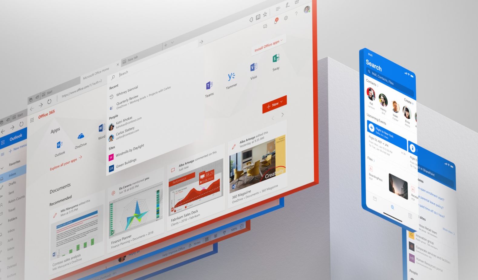
Microsoft started adding Fluent Design elements to Office apps last year. At first, Microsoft added Fluent Design’s Acrylic material to the sidebar of the Office apps. Back in June this year, Microsoft revealed that they are working on refreshed UX based on Fluent Design.
As part of this refresh, Microsoft has aligned the entire Office 365 suite on typography and iconography. Users can experience shared header and same grid across products, and depth element is added to the design to focus on what matters. Microsoft has also improved the color palette, the hues are lighter and more vibrant.
Microsoft Design team today published a blog post about how they designed this new refreshed UX for Office apps. Check the video below.
One billion people can’t and shouldn’t have a one-size-fits-all design solution, and we’re evolving Office 365 into a suite of connected services with experiences that adapt to the needs of whoever is using it. We’ve put a lot of heart (and some serious midnight oil!) into these changes, and we’re excited to share them with you today.
Read the full blog post of Microsoft Design team here.


User forum
0 messages