Microsoft has debuted new colourful icons for Office (video)
2 min. read
Published on
Read our disclosure page to find out how can you help MSPoweruser sustain the editorial team Read more
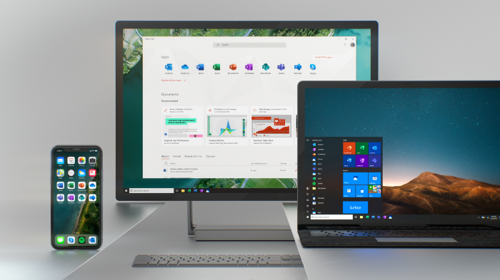
Microsoft has debuted a new set of Office icons to represent a new era of Office, The firm had kept the same flat design for the app’s iconography between Office 2013 and 2016, but with 2018 will be moving on to a new rethought design.
“We wanted a visual language that emotionally resonates across generations, works across platforms and devices, and echoes the kinetic nature of productivity today,” Microsoft’s Jon Friedman – Head of Microsoft Office design — said in a Medium post today.
These new Office icons would look different to older office icons which all shared a common theme. The Word icon typically was a large W superimposed over an image of a document; excel would be an X over a spreadsheet, and so on. Microsoft had used these guidelines for over ten years, but no longer.
“Whereas prior Office icons had a document outline for Microsoft Word and a spreadsheet outline for Excel, we now show lines of text for Word and individual cells for Excel. ” Friedman said, “By focusing on the content rather than any specific format, these icons embody the collaborative nature of the apps they represent.”
Microsoft says the new icons will begin rolling out to Office platforms over the coming months. As expected, mobile and web will be the first ports of call.
See their introduction to the new look below:
Thanks for the tip, Satyan.








User forum
0 messages