Windows 10 Mobile on a Lumia 1520
7 min. read
Published on
Read our disclosure page to find out how can you help MSPoweruser sustain the editorial team Read more
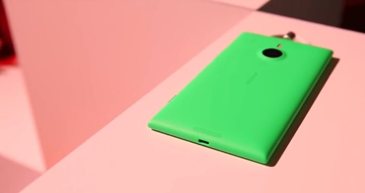
Call me insane, but I’ve installed the Windows 10 mobile preview for insiders on my main device – a Lumia 1520. I was just really curious about how the OS would work on a phablet because they always had a little bit of extra treatment.
Most of the things are exactly as you’ve seen them already: Hamburgers, bugs, hamburgers. But there are a few things which are different. I will not cover everything again, you have seen enough posts, but I will cover the things which are relevant (and/or unique) for the Lumia 1520.
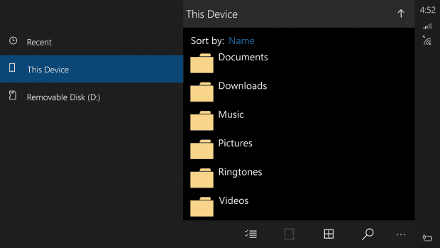
Let’s start with the biggest difference. Either this is just a bug or it is a feature. I really hope it is a feature as it would be very great to have it on such a big screen. The Lumia 1520 is a mix of smartphone and tablet. In portrait mode the phone works just as every other Windows Phone. However, now more of the OS can be used in landscape mode, which is a difference to Windows Phone 8.1. Anyway, that’s not everything as one app scales like on tablets when used in landscape. This app is the new file explorer and it looks like this:
Obviously this looks a little buggy. The left element (in fact it’s the hamburger menu just without a button – it’s always displayed because of the size of the screen) is way too big, but I would really love to see this come to more apps in an improved form.
I am absolutely against the hamburger menu. Instead of hiding the lists in a ugly button, Microsoft should make the pages swipeable like they always have been. In fact they even promised it already, it’s just not finished yet. In landscape, however, I am not sure if swipe-able pivots would not waste too much space. Therefore I think a tablet like UI with a split screen like in the screenshot above would rock – only a little more improved. I mean hey, on a 6” 1080p device this makes sense, doesn’t it?
The landscape mode is not that good in every app, though. The maps app for example looks very crappy in landscape as the elements are really badly placed. However, it’s a preview and everything might change. So far it is a huge step forward compared to Windows Phone since at least there now is landscape functionality and I really hope the 1520 will benefit from it eventually.
I’ve already mentioned the hamburgers above. While an always displayed menu makes sense in landscape, here universal apps could really shine if properly coded. In portrait mode the hamburger menu is simply crap (sorry for the word but it’s the only one that fits). The best example in the new music preview app. It’s gorgeous but the button on the top left corner is only disturbing. Pivots would do much better (basically like everywhere). The same for the new mail app. It’s gorgeous as well and very functional, but having the elements up top makes it almost unusable on the 1520.
Another thing I noticed is that the option menu on the bottom of the screen can no longer be opened by swipes over the edge of the screen. Especially in the new office apps this would make sense since it speeds the workflow: Instead of having to tap the three buttons one could simply swipe over the edge just as it works in Windows Phone currently. I hope that this is simply not coded yet but planned.
Of course one can connect a keyboard or a mouse via Bluetooth to the phone. It works quickly and is easy to use, and in my case the OS even supported the dedicated Windows button on my mouse. Scrolling didn’t work yet and I also couldn’t access the action center with it, but I am sure this will all be finished eventually.
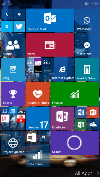
Two more changes that the latest technical preview added are a new start screen and a new keyboard. Okay, they’ve been there since the first technical preview that was available for the 1520 I think, but they are worth to be mentioned again. The start screen now has four columns and it’s just great. I only hope for a landscape startscreen 😛
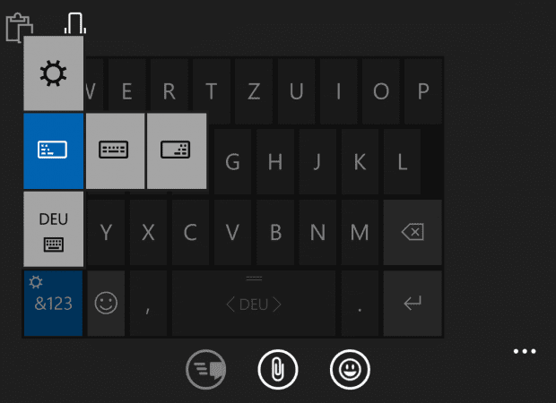
The keyboard is so much more precise compared to Windows Phone. Windows Phone always had a great keyboard experience, but Windows 10 mobile has improved it even further. With two hands in landscape and portrait mode I can type even faster and with less errors than before. With one hand, which is finally possible thanks to the split screen keyboard, I can swipe over the letters and it gets me right 99% of the time. Yeah, okay, I made that number up, but is really fast and precise. Additionally, the new cursor button really lets you get stuff done. I always found the Windows Phone way of moving the cursor more complicated than useful and I always ended up selecting stuff I didn’t want to select, but now I can freely move the cursor without problems most of the times. Somehow it is even possible to mark words with that cursor button – I just haven’t found out how yet.
In fact the new keyboard is one of the main reasons why I’ll keep the insider preview installed even though there are still a lot of bugs, but more on this later. First I want to say something about the office preview. This article, even with all its pictures, was written on my phone only. Word works great and with only a very small amount of bugs, and all the features were really needed. I haven’t really tried out PowerPoint, Excel and OneNote as I am not using them very often, but I have taken a look at them and in my honest opinion they are fantastic on a 6” screen. One can see a lot of stuff without needing to scroll and do a lot of editing. I really don’t know why Microsoft didn’t give it to us much earlier, but better late than never.
Even the UI is great. Behind the hamburger menu options like print, save or share hide. In this case it is only options which are not used that often, so it is more like an option menu instead of a menu the user would need to open to do basic stuff. I’m totally alright with that because the actual UI is on the bottom of the screen.
Now the bugs: The icons are really low res, Cortana doesn’t work for me and the battery drains really quickly. Of course, there’s more, mostly optical, which just hasn’t been properly coded yet. It’s still an early preview and everyone who is willing to try it out should keep that in mind. It works fast and mostly smooth, but it is not always stable, looks unfinished in some corners and features might change with coming updates.
Also, I was very happy to see the back button behavior being consistent again in the first preview of Windows 10 mobile. Every app behaved the same way (I think none app really closed and just got thrown into the task manager), but now, unfortunately, we are at the state of 8.1 again: Some apps close, some minimize.
I really like where Windows 10 mobile is heading! Microsoft still needs to fix that UI that’s often criticized, but they said they are working on it. Besides this the system needs a lot of bug fixing (obviously), but feature wise and in terms of design language Windows 10 already rocks!
You can find some more screenshots of Windows 10 on the Lumia 1520 in my OneDrive here.



User forum
0 messages