Windows 10 Mobile review: Better than 8, less than a perfect 10
19 min. read
Updated on
Read our disclosure page to find out how can you help MSPoweruser sustain the editorial team Read more
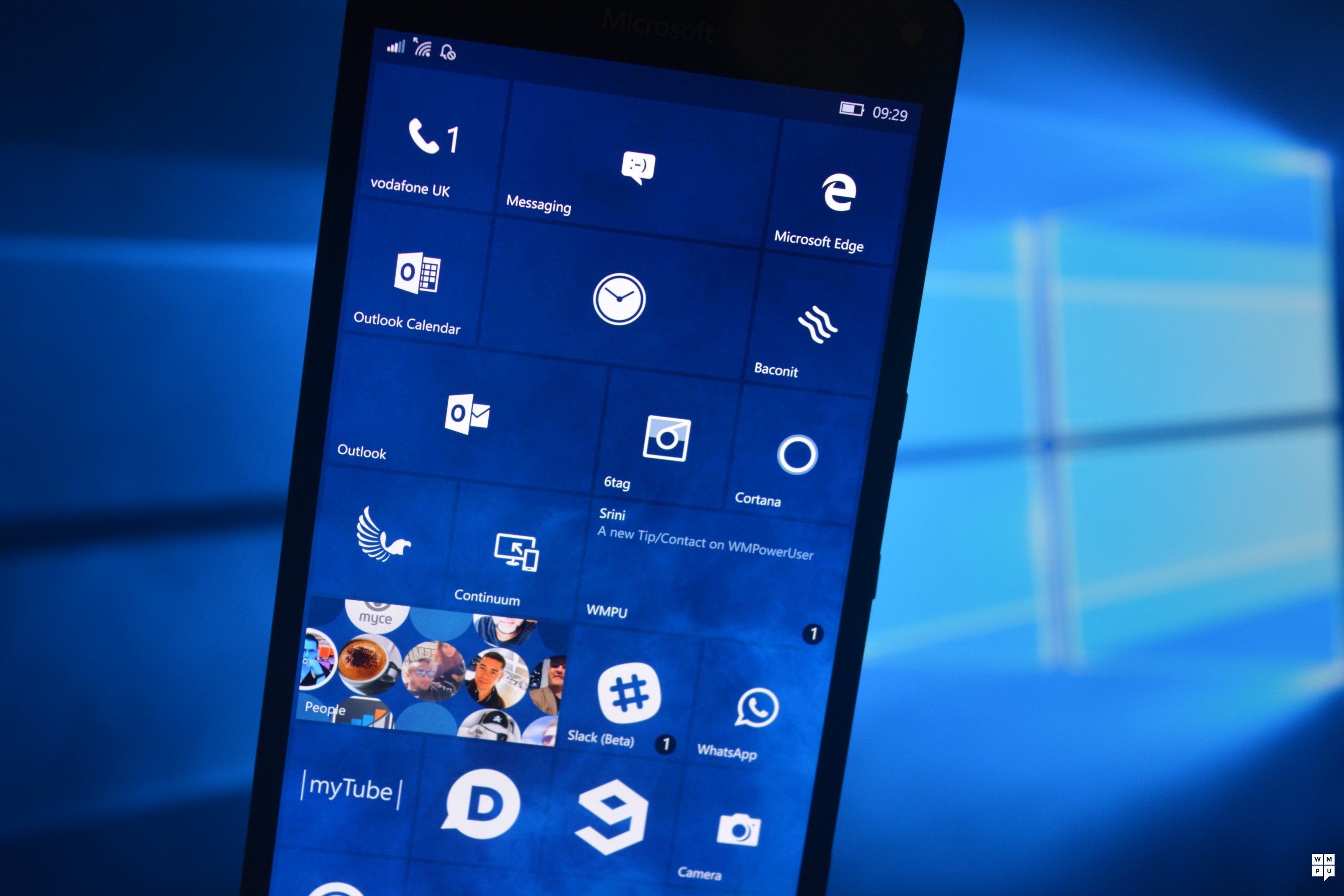
Table of contents
Microsoft’s Windows Phone has never had much luck with big updates. Unlike Android, iOS and BB10 which started out pushing massive feature updates at every opportunity, Windows Phone picked up major updates after a year and a half – all of which had a major caveat in them one way or another. The innovation done in the OS was mostly on the hardware side, and when Microsoft took control of the full stack, that too stopped to coincide with the next Windows Phone release cycle.
Now Microsoft has prepared the next major release of Windows Phone, but it’s not calling it Windows Phone or even Windows Mobile (entirely). Instead, Microsoft refers to its new OS as simply Windows 10 on new devices. While some may point out that Windows 10 mobile is the official branding, that is as much branding as is Windows 10 Home and Windows 10 professional.
That is to say, it is now subsumed into the overall Windows ecosystem and one would notice that Microsoft no longer breaks out Windows Phone into its own category online. Rather, it is Windows (phones) and even older versions of Windows Phone are being retrofitted with the Windows brand name.
However, those are just words. What’s important is knowing what’s new in Windows 10 mobile and why it should be considered over IOS and Android, and why it’s better than Windows Phone 8.1. That’s what this review is here to answer.
A Brief History

It’s hard to discuss Windows Phone without talking about Metro. The interface formerly known as metro first appeared on Windows Phone 7 taking cues from Zune and Windows Media Centre. Windows Phone 7 users (of which I only have a passable knowledge of) launched with a large live tile interface, large fonts and apps based around a UI of pivots and panoramas. Windows Phone 8 continues on this traditional interface, only adding extra live tile templates.
The first minor interface change came in Windows Phone 8.1. The large fonts were reigned back to a more manageable size and Microsoft dialled back on panorama and hub interfaces – hard. Overall, the user interface remained broadly the same, just smaller and more refined. Of note is that the UI paradigm created in Windows Phone 7 remained.
Controls remained at the bottom, users could navigate the entire OS without having to move their thumbs to the top half of the screen and the interface was generally fast and fluid. However, the interface, while smooth and slick, was not powerful enough to account for all use cases, most notably the office apps. Microsoft also pioneered – with Windows Phone 8.1 and Windows 8.1 – a type of app called universal apps.
These apps were made to run on Windows and Windows Phone – and eventually Xbox. But they did not have the results Microsoft was hoping for. The failure of Windows 8.1 meant that Microsoft had to go back to the drawing board and remake Windows from the start. A combination of these factors led to Microsoft rebooting Windows and the Windows Phone interface to be more scalable and feed off each other. As a result, both the Windows and the Windows Phone user interface had to die for Windows 10 to live.
Video Review
MDL2

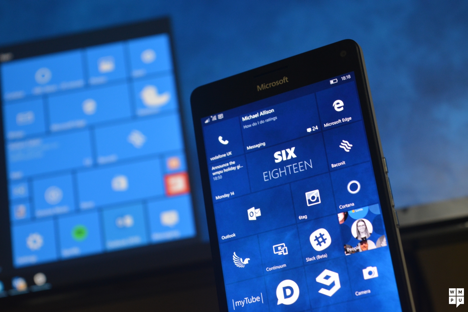
In terms of mobile, the Windows 10 UI is vastly different to Windows Phone 8.1. Gone are horizontal scrolling, panoramas and large fonts. Even the Start Screen has evolved away from its overly minimal look in Windows Phone 7 to one which is tighter and has more customizability. Rather, what we have here is an interface that some have described as being closer to Android and iOS than the traditional Windows Phone OS look. While it is a different look from the metro, the new metro design language has grown on me somewhat. It manages to retain some of its clean aesthetic appeal while being more useful than the previous user-interface. Metro 1.0, while attractive visually and a pleasure to use in some ways was also awful to use in others. Wasted space and poor support for landscape controls for apps were a frequent complaint of the old paradigm.
[shunno-quote align=”right”]MDL2 is pretty[/shunno-quote]
In Windows 10 Mobile, as Microsoft’s goal was to create universal Windows apps that have the exact All these have been fixed in Windows 10, and even if the “purity of design” of the old OS is lost, this new design is better overall. Now apps aren’t built for mobile, following a trend in design, they are built for “screens”. An app is meant to look good on all screen sizes and resolutions, and while this may result in some “misses”, I’ve encountered more hits UWP wise. In terms of scaling, I used Windows 10 Mobile on a variety of devices, from 5.7, all the way to 4.5 and I believe it looks good on all. There are still some issues with the design language, though. Take the hamburger menu for one, while Microsoft as claimed that the UI tool would only be used for little-used settings, it has frequently made use of the button as a key navigation tool. Examples of this can be found in the Office, Music and File explorer apps. The implementation of the hamburger menu also differs according to whoever is implementing it. In Windows 10 OneNote has one hamburger menu, the other Office apps have a different type, the MSN apps follow a different rule and so on. The inconsistency is somewhat understandable if you view the apps as being “team” based rather than produced by one OS maker, however it is still slightly maddening.
Ripping out the core
Microsoft started to rip out core Windows apps like the Calendar, Music and games apps from the OS in Windows Phone 8.1 to make the OS more modular. To this end, they rebuilt several apps from the ground up using WinPRT (a mobile version of the Win RT runtime), these apps were launched to mixed reviews. The music and games app were abominable, calendar was slower and generally, the OS experience fell far behind its experience for Windows Phone 8, and Windows Phone 7 as a result.
Another issue with Windows Phone 7, 8 and 8.1 was the power of non-native third party apps. In those platforms, native apps were simply system components of the OS and were performant based on that alone.
[shunno-quote align=”left”]Universal Windows Apps are fast and powerful[/shunno-quote]
In Windows 10, Microsoft rewrote the OS and removed the built-in system apps as UWP apps. What this meant was that the universal Windows Platform would be used for every app from Microsoft’s own apps to the apps of Jane Doe in the store. There would be no special tools for Microsoft apps, and henceforth Microsoft would have to make the universal platform as robust and powerful as possible in order to continue to provide the experiences they had provided using internal tools. They have by and large been successful at this. Apps written for the UWP are fast, responsive and just pretty nice to use. Microsoft’s own apps are now on the same playing field as other developers, and this time (unlike the half measures in Windows Phone 8.1), they didn’t take too much of a performance hit.
Speaking of experiences, Microsoft had to redevelop all the core experiences, messaging, media, Cortana etc, all written in this new universal language. As a result, these apps are all the same – but different. They are more powerful and more responsive, and many have picked up new tricks on the upgrade to Windows 10.
Communication and messaging
Microsoft’s Windows Phone was once built on communication and “putting people first”. While that aspect has taken a back seat to Microsoft’s current #AcheiveMore and #DoGreatThings campaigns, the social aspects of Windows 10 Mobile still remain almost as developed. The People Hub has been replaced by the Microsoft People app which essentially has all the functionality of the People app and more. It allows you to view your Facebook, Twitter, Skype and other contacts all in one place. You can still view all your social updates there, but there are small UI changes which affect the UX in big ways.
To begin with, the People app no longer shows squares to represent people. Rather, it shows circles as contacts all through the app. This means that where there were squares moving, sliding and generally being live in the app, we now have static circles that don’t do much in terms of motion. It’s less lively than the old one, and that’s a bit of a shame. However, that reflects the reality of how the app was most likely used by and large. People may have just used it as a contacts manager with the social features being almost superfluous, and now the People app is a really really good social manager. Microsoft has also added GroupMe integration into the app so if you used GroupMe rather than Group SMS or email, Microsoft has you covered.
Email may be the most hated of modern communication standards, but it is still pretty important all things considered. Bills, official correspondence and a lot of important messages still get passed through there. It stands to reason that one of the most important aspects of a smartphone is how it handles email. While some users may choose to use third party mail apps, on Windows Phone there is a deficit of good mail apps making it doubly important that Microsoft nail the mail experience out of the box.
The Windows Phone 7 – 8.1 mail experience was fairly good. It had linked inboxes, the ability to pin tiles, supported multi-file upload (limited to images, unfortunately) and was overall a pretty well thought out experience for a mobile experience. However, once Windows Phone launched, times changed. People wanted swipe gestures and snooze functionality and replying to emails with documents and other attachments and Microsoft did not deliver, at least until Windows 10.
[shunno-quote]The new Mail and Calendar apps on Windows 10 are powerful[/shunno-quote]
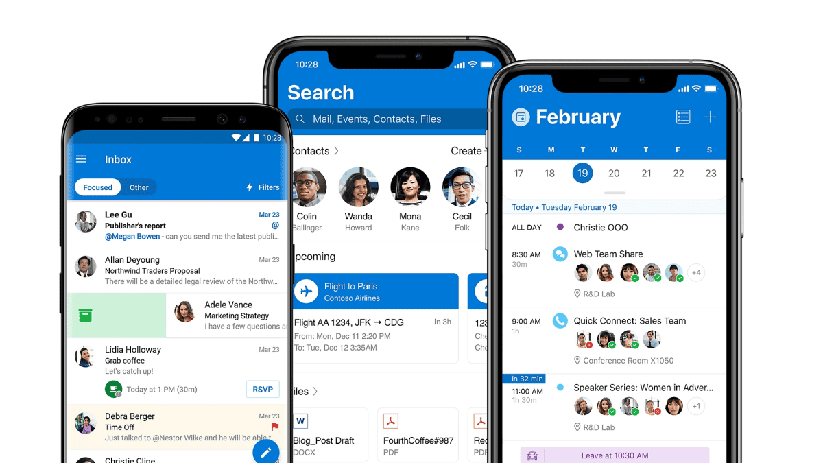
The new Windows 10 Outlook client now handles mail and calendar differently in an attempt to meet modern expectations. It is now a powerful app that no longer gets in the way of your email management.
The app now comes with an intuitive design, letting go of the old pivots of Windows Phone in favour of a more standardised menu bar and drop down the pane. You can now swipe to dismiss flag, archive, delete or move emails with a user configurable simple gesture either to the left or to the right.
In Windows 10 the built-in mail app finally joins the modern mobile word and allows users to attach arbitrary documents using the share contract which opens either File explorer, photos, OneDrive, Dropbox or any other app that registers itself as a target.
In the earlier stages of Windows 10 Mobile and at launch, Microsoft’s Outlook app was missing a feature where you could have all your emails displayed in a single inbox as opposed to hopping from account to account. Due to Microsoft’s new store app model, they were able to update this app with the feature shortly after the official launch of Windows 10 mobile with the Lumia 950, 950 XL and 550. However, I am hesitant to fully compliment the Outlook app on its new features. It often has issues rendering emails properly, perhaps due to its use of the word engine.
I have often times received emails that would look just fine if I chose to view them on Edge, but otherwise would appear to be wonky or off kilter if I used the native email viewer to view them. Another minor omission is the lack of scheduled emails or a focused inbox as in Microsoft’s Outlook apps for iOS and Android. I’m not 100% sure these features are necessary for an email app, but I can acknowledge that it does not look good for Microsoft if one of the flagship apps that Microsoft touted as “the best email client on the planet” is more featured on alternative platforms.
[shunno-quote]The new universal Skype experience is missing some much needed features[/shunno-quote]
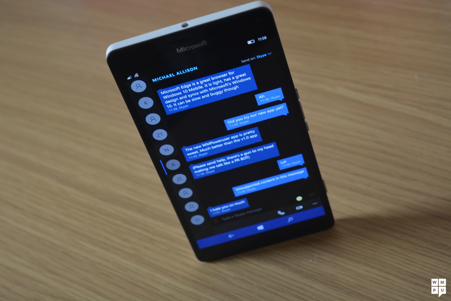
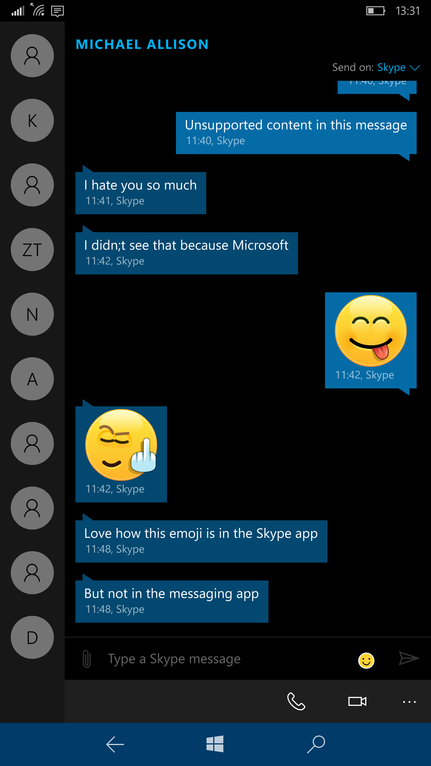
Still on Microsoft’s communication platforms, in Windows 10 Microsoft is attempting to make Skype something of a first party client in the Windows ecosystem. While many people use legacy SMS and telephone systems, these apps are getting used less and less as people transfer to data-based systems. As a result, Microsoft has created new universal apps for the Windows store that do double duty as traditional telephony, SMS and RCS clients and Skype clients. You can now call someone directly from the phone app on Skype and transition to a video call at the tap of a button. It’s also now possible to SMS someone and Skype them from the same app, kind of like iMessage, but without being actually pleasant to use. You see, Microsoft’s Skype team, despite announcing their Windows apps in January, have yet to replicate the full-featured Skype experience on Windows Mobile and Windows 10.
The Skype apps are unable to send images, files, mojis, location, drawings, voice messages, and video messages. It is quite baffling that Windows Phone still has no full-featured Skype app despite being under the same company that owns Skype but the Skype team promise that at some point in the indeterminate future, we will have these apps. I can only hope that someone at Microsoft is running out of patience with their shenanigans.
Groove Music, Film and Photos
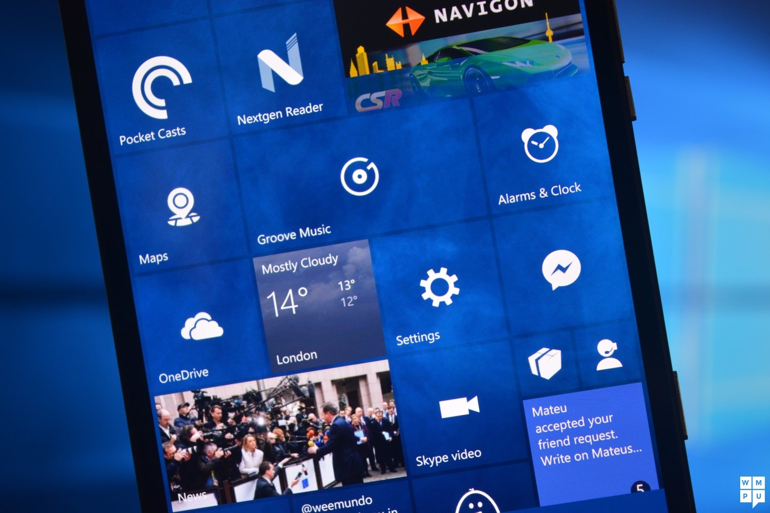
In Windows 10, Microsoft has replaced the Xbox Music and Xbox Video apps with two new apps called Groove Music and Film and TV (Movies and TV in some regions).
The videos app is an app called films and TV does exactly what it says on the tin, its primary purpose is to allow you watch films and tv shows purchased from Microsoft’s storefront and also play your own locally stored videos. Strangely enough, for an app named as such, it does not categorize your films and TV shows into appropriate sections.
Rather, it simply dumps them app into a “My Videos” section. While this is bad for people who have massive movie collections, it must be acknowledged that many people now stream their media from Netflix or Hulu. If you’re using the Microsoft app, you have most likely purchased a movie from the storefront, so would have no need for locally stored/imported media. This does not completely excuse the app from its lack of organization or integration with OneDrive, just an acknowledgment of the thinking that probably shaped the development of the app.
[shunno-quote]Groove Music is fast, fluid and nice to look at[/shunno-quote]
Microsoft Groove Music is the second half of the media equation. It is far better than the Xbox Music app on Windows Phone 8.1 – admittedly it being worse would have been quite a feat. The new app is fast, fluid and nice to look at. I’ve used it on many devices from a small Lumia 735 to the positively gigantic Lumia 1520, and the combination of MDL2 and well-calibrated HD screens on all devices just makes the visual experience of Groove pleasant.
As far as features go, Groove Music is a full featured app that plays most music formats including FLAC files, incorporates gapless playback, and has a radio for auto-generated playlists by the artist. There are so many other small things and additions in Microsoft Groove that make it just generally nicer to use, but the thing to take away from this is that if you choose to use Microsoft’s service as a music consumer, you won’t be handicapped.
[shunno-quote align=”right”]The new Photos app has a lot to offer[/shunno-quote]
Microsoft includes a new Photos app in Windows 10 Mobile. The new Photos app is interesting. It is far more full featured than the Windows Phone 8.1 app. It does auto-enhancing, allows you to print and share photos. The OneDrive integration is done more elegantly than in 8.1. Here photos simply appear in the library from your OneDrive account similar to how placeholder files worked in Windows 8.1 desktop. The full image doesn’t appear (from my looking at storage sense) to be downloaded into the phone until you actually use it.
The app also allows you to create and share photo albums from the albums section as well as navigate your OneDrive library for media (You can even play movies stored on OneDrive using the photos app).
The new Windows camera and maps apps are well designed powerful apps that do exactly what they say on the tin. Maps allows you to download and navigate offline using transit, walking or vehicles with frequent updates to improve features. The camera takes the broad feature set of Lumia Camera and adds in a few tricks like shareable living images, slow motion video for high-end Lumias and auto-HDR.
Microsoft has also shipped a few new apps in Windows 10 that help improve the experience for first-time users and veterans alike. I’m talking about the utility apps like Alarms and clock, File Explorer, and Voice Recorder and help apps like Contact Support and Getting Started.
A file manager and timer app have been requested on Windows Phone UserVoice for a long time now, so Microsoft finally bringing File Explorer to Windows Phone (replacing the Files app) is a good thing for many users. It also brings to mind in the familiar theme of “Do Familiar things” as there’s nothing more familiar to a Windows user than File explorer.
Cortana undergoes a metamorphosis
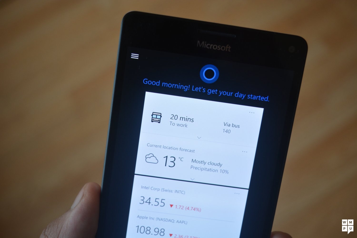
Outside of the built-in app experience of Windows 10, Microsoft also made some changes to Cortana and how she works on Windows 10 and Windows 10 Mobile. In Windows 10, Cortana is no longer in Beta in the EU5, Canada, The USA, China, Japan and a few othe
r countries. What this means is that the Cortana backend service has been tested and localized for each of those regions, as, for Cortana herself, she seems to have gotten a bit weaker.
In Windows Phone 8.1, Microsoft introduced Universal Search for Windows Phone, allowing you to search all built-in apps and files. Microsoft’s removed that in Windows 10 Mobile, possibly due to the addition of a file manager obviating that need somewhat. That’s not all that has been altered as far as search functionality goes, Microsoft debuted Bing Quick Cards in Windows Phone 7.5 as a mobile way to use Bing.
If you’ve ever searched for anything on Bing with Windows Phone up to 8.1, you’ll have noticed that Bing has a custom UI with search results being able to tie into apps. That was all because of Microsoft’s Bing Quick cards which promoted a mobile-first way of looking at Bing search. In Windows 10, searching with Cortana simply opens up a web view of the Bing search results page, which is inferior to the prior implementation, I understand that Microsoft would need to be able to update the web content dynamically, but I wonder if they could have at least created a custom UI for Edge and Windows 10 Mobile to mimic much of the prior functionality.
Internet Explorer gets Edged out

Just like on Windows 10 for desktop PCs and tablets, Microsoft has given Internet Explorer the boot on Windows Phone and replaced it with a nice Windows 10 app, Edge. Microsoft Edge on Windows Phone isn’t quite feature complete yet, lacking a few things such as back/forward buttons, extensions support (coming soon), a fully immersive reading mode and a handful of other tiny features here and there.
[shunno-quote]Edge is powerful enough, but that may not be enough for power users[/shunno-quote]
The app experience itself is OK. It works nicely sometimes, and on a few fairly light websites it seems to choke and go berserk. This has happened on TheNextWeb, The Verge, Neowin and the Guardian in recent memory. Microsoft’s Edge is supposed to replace Internet Explorer and clean the slate on Microsoft browsers and branding, if the Edge team can get it right in the next few months, Edge’s reputation would hopefully not come to resemble that of Internet Explorer.
Right now, you get a powerful web-browser, reading list, a reading views and syncing with Windows 10 PCS. If you aren’t a heavy browser user, then you’ll come to appreciate Edge’s simplicity.
Final Thoughts

Microsoft’s vision for Windows phones has changed in Windows 10. The OS has gone from being all about the mobile experience to being all about the mobile experience of a PC . It’s a slight difference, but it brings back vague memories of the PocketPC phase of Windows mobile. As a result of a shift in strategies and focus of a one Windows for all, Windows 10 Mobile has taken a hit in performance and battery life. Microsoft knows this, and they will be addressing this in builds being pushed out over the next few months, but until, then devices which are weaker may struggle a bit with Windows 10 Mobile as far as performance and battery life go.
[shunno-quote]Windows 10 Mobile is better than 8, but not quite a 10[/shunno-quote]
Windows 10 Mobile overall is a good update, but it is still beset with the issues of the previous OS. The app gap remains every so wide as spectres of Snapchat, YikYak and other apps beckon over to dissatisfied users. This looks set to change soon. Microsoft’s UWP program has been adopted by more and more developers at a faster pace since Windows 10 took off on desktop. Facebook and Twitter have promised to optimise their apps for Windows 10 Mobile soon, and the gap between Microsoft’s first party apps on Windows 10 and other platforms has been closed. There are also new party tricks like Continuum (detailed here) and Windows Hello (detailed in our 950 and 950 XL reviews) to stand out from the crowd on newer devices like the Lumia 950, Neo NuAns, and Acer Jade Primo. Microsoft has made a good start with Windows 10, now all they need to work on is sanding out the rough edges.
Editor’s note: Review originally scored in at 8.1, upon further consideration, that score has been revised downward to be more appropriate.






User forum
0 messages