Edge's new Enterprise New Tab Page actually looks pretty good
2 min. read
Published on
Read our disclosure page to find out how can you help MSPoweruser sustain the editorial team Read more
For most of us the browser New Tab Page is simply an annoyance while we get to the sites we really want to visit, but in the enterprise setting it is often a communication hub and portal used hundreds of times per day to get work done.
Microsoft has been working to make it easier for companies to make this lading page productive, and in November with Edge 87 introduced the following improvements:
The enterprise new tab page (NTP) integrates productivity with customizable, work-relevant feed content.
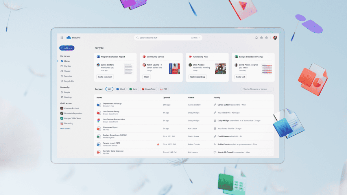
The enterprise NTP blends the Office 365 productivity page we offer to users signed in with their work or school account with personalized, work-relevant company and industry feeds that are organized in a single page. Users will be able to recognize the familiar Office 365 content and Microsoft Search for Business powered by Bing. In addition, they can easily customize “My Feed” by choosing the most relevant content to them from the available content and modules for their organization. IT Administrators can control the News feed settings for their organization, including the selected industry for the Edge new tab page by going to Microsoft 365 admin center.
This feature is still rolling out to users, but a sample uploaded by Alumia shows Microsoft’s new design is pretty attractive:
This compares to the old design, which can be seen below:
The improvements mean admins are less likely to need to code up their own version, which is unlikely to have the deep Office 365 integrations Microsoft offers by default.
It also makes me wonder how I can replace my NTP filled with distracting Bing News with something a bit more sleek and productive.
What do our readers think of these improvements? Let us know below.




User forum
0 messages