Don't fix what's not broken. Windows 11's disk formatting UI is actually 3 decades old
Even the decision to limit FAT to 32GB was made just because.
2 min. read
Published on
Read our disclosure page to find out how can you help MSPoweruser sustain the editorial team Read more
Key notes
- Some UI elements in modern Windows 11 trace back to the basic designs of the 90s.
- A former Microsoft employee shared insights on the creation of the disk formatting dialog.
- Created in 1994, the dialog’s simplicity was intended to be temporary but has persisted for over three decades.
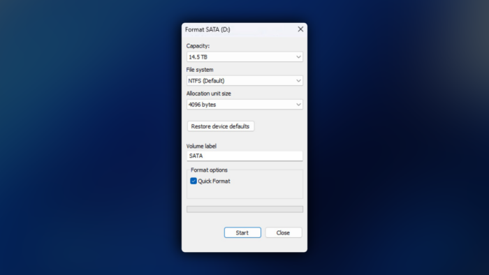
We’ve come a long way from the old, earlier days of Windows in the 90s with limited functionalities, but apparently, some dialogues you see today in the modern, AI-powered Windows 11 still stem from what was already there for decades.
We’re now looking into the disk formatting UI, the dialog that you see when you want to format a disk using File Explorer. Dave Plummer, who worked with Microsoft at that time until 2003, shared this important piece of history.
Plummer, who also worked on Task Manager and the popular Pinball game from Windows XP days, said that he wrote the dialog when folks over at Redmond were busy porting the UI from Windows 95 to Windows NT. He then listed all the formatting options for disks, such as file system type, label, cluster size, compression, and encryption.
Then, he used VC++ 2.0 and the Resource Editor to create a basic layout, arranging the choices in the order they needed to be made. He also limited the format size of a FAT volume to 32GB arbitrarily, which now became a permanent constraint decades later.
This was 1994. The plan was to serve the purpose until a much more “elegant” UI arrived, but 30-something years later, this UI is still around. It’s like that one old adage, “don’t fix what’s not broken.”



User forum
0 messages