Xbox fans: New "Friends & Community Update" is not what we need
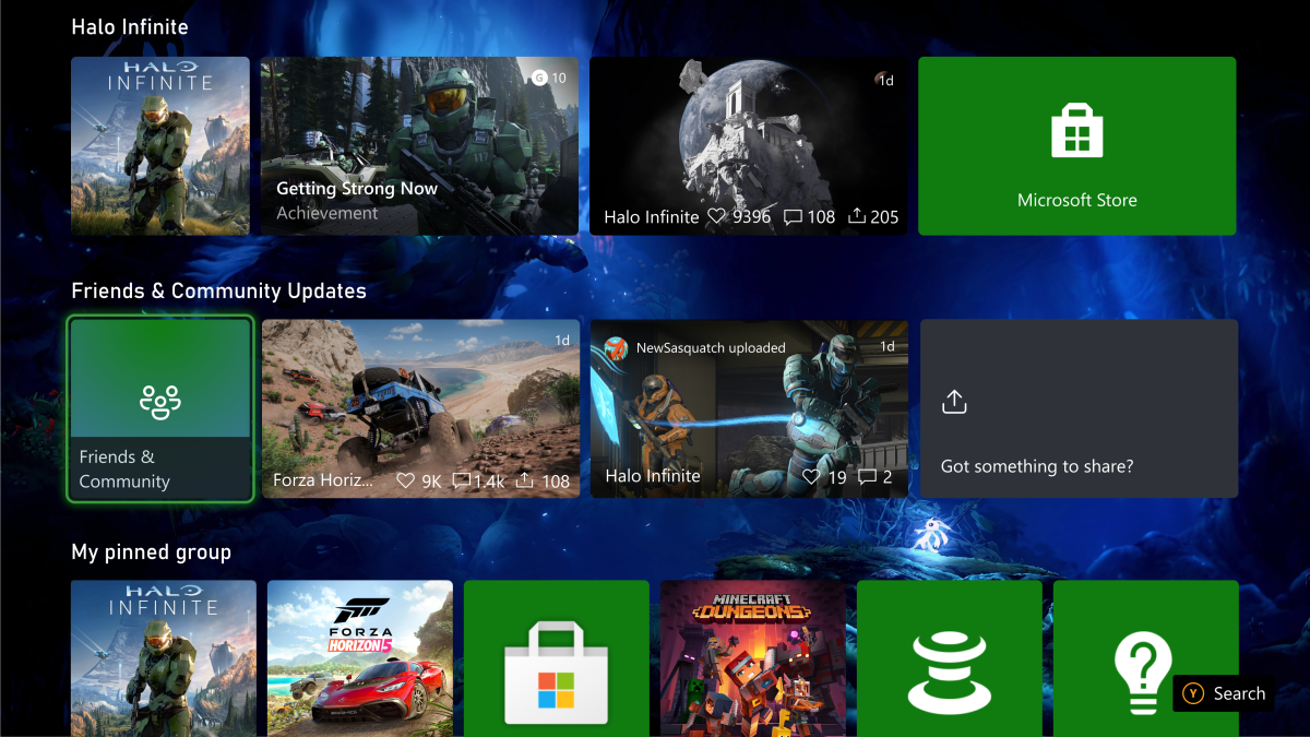
Xbox rolled out a new test in the Alpha Skip-Ahead and Alpha rings, and fans are not happy. It focuses on the new Friends & Community Updates on the Home of the Xbox Dashboard, wherein the users will see a more compact design. The channel also now offers more relevant content regarding the user’s friends and community. However, many expressed disappointment about the test, saying this is not the section that needs improvement.
The Friends & Community Updates channel has always been a part of the Xbox Dashboard, and redesigning it is undeniably a good thing. Compared to the past, the channel is much more compact now, preventing it from consuming too much space in the dashboard. According to Xbox, experiments and decisions like this come from Xbox Insider feedback, which helps the group “determine what features to build and how to design a more personal Home experience.” However, the gaming community says other things in the OS need more urgent actions than what the “tone-deaf” Xbox team is currently focusing on.
In particular, fans are still voicing the need for more customization options and UI enhancements in the system, which has always been one of the topmost requests to Xbox. But, as expected, these things remain a request in the community, despite Xbox’s promise to “create a more personalized home screen experience and address some of the top trends and fan requests.”
Why do you do the opposite of what we ask? ? pic.twitter.com/18dwSWHcqd
— Higor Santos (@ImHigor732) April 3, 2023
“We have been asking for a long time to fix the UI not to give us an update from the community,” comments one user on Twitter.
“No, this is not listening to us,” reads another tweet. “Just another addon and still no way for us to resize or remove all this unnecessary BS. What’s the point in having dynamic backgrounds or even our own if we can’t see the damn thing with all this clutter on the screen. Sorry but I don’t expect this.”
Others underlined how many gamers in the community offer suggestions like UI ideas and more, only to be ignored by the software company constantly.
“Look at all these spectacular UIs people have created and not once have you taken anything into consideration about what your players actually want,” writes one user. “This is why PS is one-upping you constantly.”
How long until the UI will look something like this? Because this is what we all want pic.twitter.com/vu9hYnftoI
— ShadowExile (@LushSlippers) April 3, 2023
“When will you listen to what the community asks?” Another community member commented. “There are several examples in the comments. No one likes that bunch of blocks on the screen.”
The comments are nothing new about this issue. Last year, Xbox also released a new look for its dashboard to Insiders in the Alpha Skip Ahead ring, but the community expressed the same reaction. In particular, many pointed out how the background wallpaper remained useless due to the row of tiles blocking it, making the place appear just like a page for ads. The company, nonetheless, has a logical business reason for including these ads on the dash. However, as we’ve said before, excessively cluttering the place with more rows of suggested content just makes it more repulsive instead of making it a game haven for fans.
Read our disclosure page to find out how can you help MSPoweruser sustain the editorial team Read more


Improve this guide


User forum
0 messages