Fans are disappointed with new Xbox dashboard design featuring rows of ads tiles
Xbox has just released a new look for its dashboard to Insiders in the Alpha Skip Ahead ring, and people are not really happy with the results. The reason? Well, the new look is like an explosion of ads.
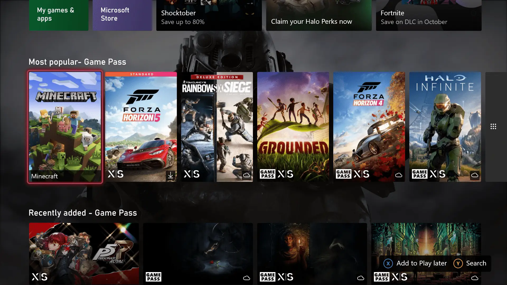
The design shows consistent rows of tiles of suggested content, from the “most popular” to “recently added” titles on Game Pass. What’s even more annoying about this is that the rows can reach the top and bottom parts of the page, covering almost the entirety of your background. This makes the customizability of the dynamic background theme feature almost useless, as it is nearly impossible to see the image with all the tiles present. And speaking of customizability, you can do nothing about these suggestions.
The presence of ads within the Xbox dashboard has always been a problem among gamers using the platform. This makes it one of the top complaints by gamers who are looking for a more plain-looking and more customizable dashboard, but Xbox, obviously, is still not welcome to the possibility of delivering such a simple design. The company, of course, has a logical business reason for including ads on the dash, but excessively cluttering the place with more rows of suggested content just makes it more repulsive instead of making it a game haven for fans.
“If I wanted the extra items, I’d place them there. I don’t need to know what the top free games are. Nor what they are on Game Pass,” one Reddit user said, pointing out how the change adversely affected customization. “While I can understand this move for a new to the console sense. Or for those that just want to play what’s popular. I only had my pins on the previous dashboard. To avoid a bloated dashboard. Less is more. It also looks like the priority is to the added items. Bigger box art versus what I have in my pins. Almost as if to say ‘What you want isn’t what’s important. What we tell you is.’ All the added items are in the store. That’s where I go. Not the dashboard.”
“This new dashboard is terrible,” another Reddit user commented. “We know you want to surface things to users but at the cost of customization it’s not user friendly. Endless scrolling of categories that are not relevant to the user and putting pinned groups underneath the Free to Play category is just not putting the player in the center that you claim to be doing. This UI feels like it’s for TVs for the Game Pass Cloud app and trying to push it onto console which just doesn’t work.”
Others further pointed out how it lacks the Play Later list, irrelevant rows to encounter before getting to Quick Resume, lack of customization, huge ad block sizes, bad general layout, and more. Some even questioned how tone-deaf the release is to the complaints the community has been voicing out for years, making others question the group’s purpose. Others believe it could affect the decision of other gamers regarding staying on the platform in case the same design is released in public. Will Xbox believe and listen to these insightful comments? Well, we can only hope they would.
Read our disclosure page to find out how can you help MSPoweruser sustain the editorial team Read more


Improve this guide


User forum
0 messages