How does Windows 10 improve the stock Windows Phone experience? (Part 1: Messaging and Media)
6 min. read
Published on
Read our disclosure page to find out how can you help MSPoweruser sustain the editorial team Read more
One of the best parts of using multiple devices and operating systems on smartphones is noticing the out of box experience. When it comes to smartphones, most people have the same usage patterns.
They install some social media apps, they download a few apps that fit their need according to their niche and then work from there. They’ll mess about with the stock apps on the device, keep what they use and then hide or delete what is unimportant. Ignoring apps from the store, most people make use of the following apps on their devices : Media, messaging, photos and camera, the clock app, maps, mail and calendar and finally the phone app.
Windows Phone has long since offered apps that handled all these services and Windows 10 doesn’t buck the trend. The core apps that handle all these services have all been updated for Windows 10 mobile, and I’ve been using the OS for a month now. To get back to the topic in the title, the answer is “it varies”. The new user interface in Windows 10 as well as its new UX and philosophy mean that while some things are better, and that some things are just worse.
To begin with, lets start with communication. This is one of the aspects of Windows 10 mobile that is just better and worse at the same time. First of all, I applaud Microsoft’s choice of circle contact photos. Some may find it a bit annoying, but it really makes a big difference in the way the GUI of the texting and dialler panes come across, Rather than just plain white text on a plain black background, you get a contact image so you can put a face to the name.
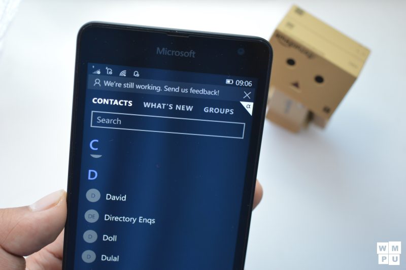
Humans are visual creatures, so this change is good. Similarly, the contacts list of the people hub also looks much better because of this change. Now I cannot say whether it truly looks better or whether it is just novelty speaking, what I can say is that I do prefer the new look of the contacts list over the old one.
Here’s where it gets bad. The new people app is awful compared to the old one. The integration with the social media is just…off at the moment. It could get better in future updates (either due to this very public bit of feedback or because it was already planned), but at the moment I’m not feeling it.
For all the criticism of the hamburger menu I’ve delivered, in this case, I’d rather the menu was implemented so I could just use the app as a contacts app and ignore the bits of functionality that are superfluous. The ability to see contacts social media details is still there and useful, it just seems “lacking” at the moment.
More there because Windows Phone 8 had it and therefore Windows Phone 10 should have it than it is there because Microsoft is implementing social sharing into Windows Phone. Another linked feature falls victim to this mechanical implementation. Groups, once lively and fun are now dull and lifeless. I’m a pretty sentimental guy, I have my family, friends and extended family all labelled into groups for easy access and catching up. The implementation of groups on Windows Phone made that easier, desirable, Windows 10 mobile does not, Its just all a bit dull here as well. (The same can be said about Windows 10 and Windows 8.1)
Aside from the contacts app, Windows Phone 8 loses to Windows 10 in other aspects of communication. Quick reply through the notification banner is quite useful and pleasant. Smart dialling being present in the dialler is one of those “d’oh” moments when you realise that a feature should have been there all along.
Moving on, we move towards the media experience of Windows 10 mobile. Media is one of the largest reasons people use their devices, and with more phablet sized devices, people are going to be using these devices even more to watch videos and music. Windows Phone 8 had a good stock music experience and an abysmal video one, Windows Phone 8.1 was just completely mediocre in either. Windows 10? Its alright.
Not as terribly mediocre as the Windows 8.1 experience, but a step below the Windows Phone 8 experience for now at least music wise. The videos app is an app called films and TV that allows users to watch films, TV shows and see videos they have on their device. Unlike VLC media player it does not attempt to organize your videos into series, rather it just dumps all of them unceremoniously into the my videos section – not unlike the Xbox Video app.
What this app has here is over the former 2 is speed. As Microsoft has broken out the store content of the app into the actual store, the app just has to deal with mostly local content and a relatively small cloud video library. The effect of all this as well as the hamburger menu means that the Film and TV app is actually quite blazing fast compared to its predecessor.
It’s not glamorous, it doesn’t do any fancy tricks, but more importantly, it is not an annoying app to use. It makes it relatively easy to buy new content that if you see a movie you fancy, it can be yours in no time flat. Its a shame that Microsoft apparently has no plans to make this a subscription service like music, it would be far more desirable then.
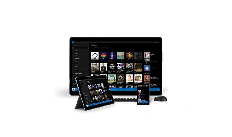
Finally, we come to the music app : Groove (either Grove Music or Microsoft Groove). Lets not mince words, here, the new music app is better than the old music app – admittedly it being worse would have taken quite a feat. The new app is fast, fluid and nice to look out. I’m using Windows 10 on a Lumia 640, and the combination of MDL2 and well calibrated HD screen just makes the visual experience of Groove pleasant.
That’s not to say its all good, since the last update to the app, half of my artists have lost their photos and I haven’t been able to access my playlists. There’s no way to manually reset the app data so I’m left at the mercy of the Groove team. It could be an issue that the app is in preview, but do not forget that the foundation of Groove has been in the making for over a year with the alpha release of Xbox Music.
With Groove, I see potential. I don’t think the team behind the app would want to make a bad app again, the app is already pretty decent. So I think (hope) it’ll be better by next month.
As podcasts and FM radio haven’t been changed in Windows 10, that’s all to cover in our look at the messaging and media experiences of Windows 10 mobile. To summarize, the messaging and phone apps look good, “People” is dead to me and Groove and “Film and TV” have potential.
Have you used Windows 10 mobile? Let us know in the comments what you think of these experiences.


User forum
0 messages