Slack announces a major update with an improved UI and several new features
2 min. read
Published on
Read our disclosure page to find out how can you help MSPoweruser sustain the editorial team Read more
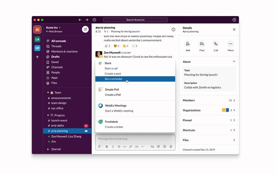
Slack today announced the biggest changes to the interface since the service launched to make the user experience more intuitive and organized. First of all, Slack is introducing a new navigation bar that makes it easier to search and toggle between your recent conversations. Also, on top of the sidebar, mentions, reactions to your messages, files, people and apps are listed for easy access. Paid plan users can also organize their channels, direct messages and apps into customizable sections within their sidebar.
You can find the full list of new features below.
- Easier to use:
- A dedicated compose button allows users to start a message from anywhere in Slack
- A new top navigation will make it easier to switch between channels and search in Slack
- A richer sidebar will provide convenient access to the key conversations and information you need
- Tailored to your work:
- Channels, messages, and apps can be organized into personalized and collapsable sections within the sidebar
- Customize the width of the sidebar
- The launch of new UI color themes
- Efficient access to apps: Slack already integrates with all your essential work tools. A new shortcuts button makes it easier to perform actions, such as starting a call, a workflow, or launching an app. At launch, you’ll be able to use shortcuts to apps such as Google & Outlook Calendar, Google Drive & OneDrive, Giphy, Simple Poll, Looker, Freshdesk, WebEx.
Slack will roll out this new user interface to all users starting today. The roll out will be completed in the next several weeks. The new sidebar channel sections will only be available on paid plans.
Source: Slack





User forum
0 messages