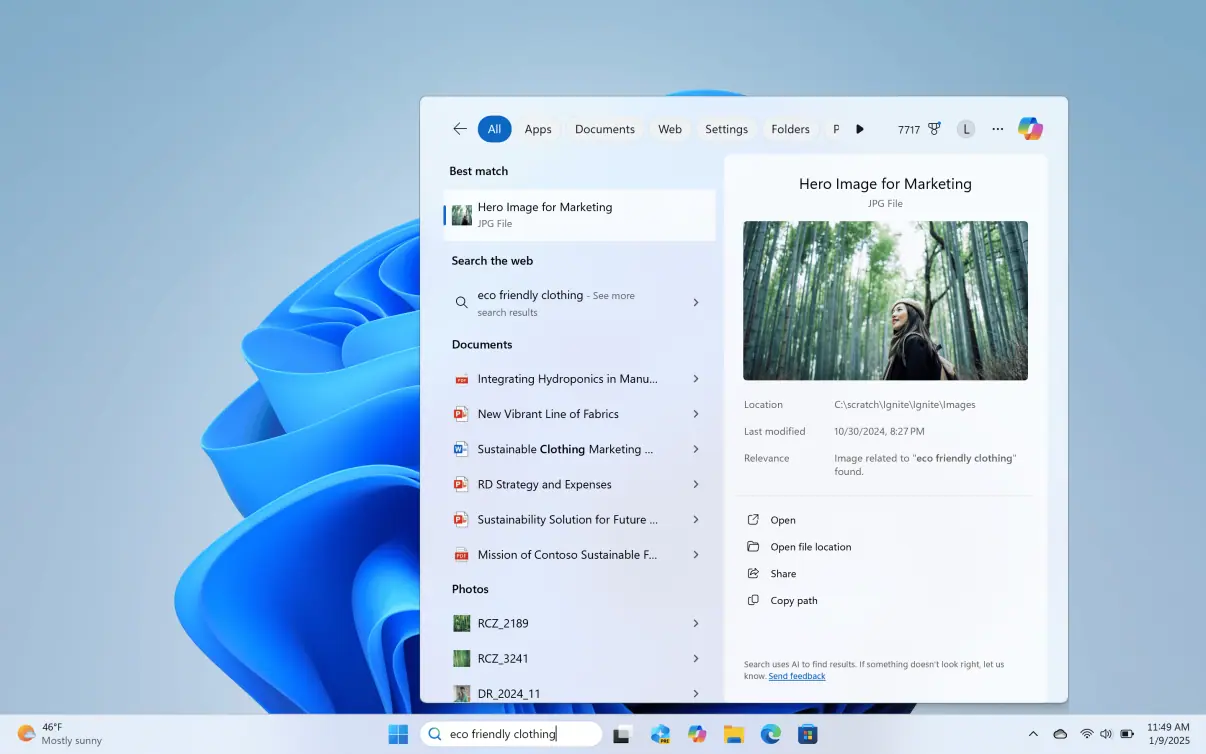
Microsoft talks about redesigning over a 100 product icons based on Fluent Design System
1 min. read
Published on
Read our disclosure page to find out how can you help MSPoweruser sustain the editorial team Read more

Last year, Microsoft revealed a new set of icons for its flagship Office products which included Word, Excel and PowerPoint. Today, Microsoft Design team revealed that it has been working along with various product design teams across the company to redesign over a 100 product icons. All the design teams followed Microsoft’s Fluent Design System to design these icons to make them authentically represent both the product truth and the larger Microsoft brand. Since Microsoft had to maintain the familiarity of these icons for customers, you won’t find radically new design for any of the icons.
“We conducted countless rounds of research for every icon. From mild to wild, we explored a multitude of design directions and listened to customers around the world. We learned what didn’t resonate with people (flat design and muted colors) and what did (depth, gradations, vibrant colors, and motion), all of which drove our decisions,” said Jon Friedman, Head of Microsoft Office design.
Gallery:
Read the whole story about the redesign process from the link below.
Source: Microsoft


User forum
0 messages