Microsoft offers developer guidelines for HoloLens 2's cool hand-attached menu feature
3 min. read
Published on
Read our disclosure page to find out how can you help MSPoweruser sustain the editorial team Read more
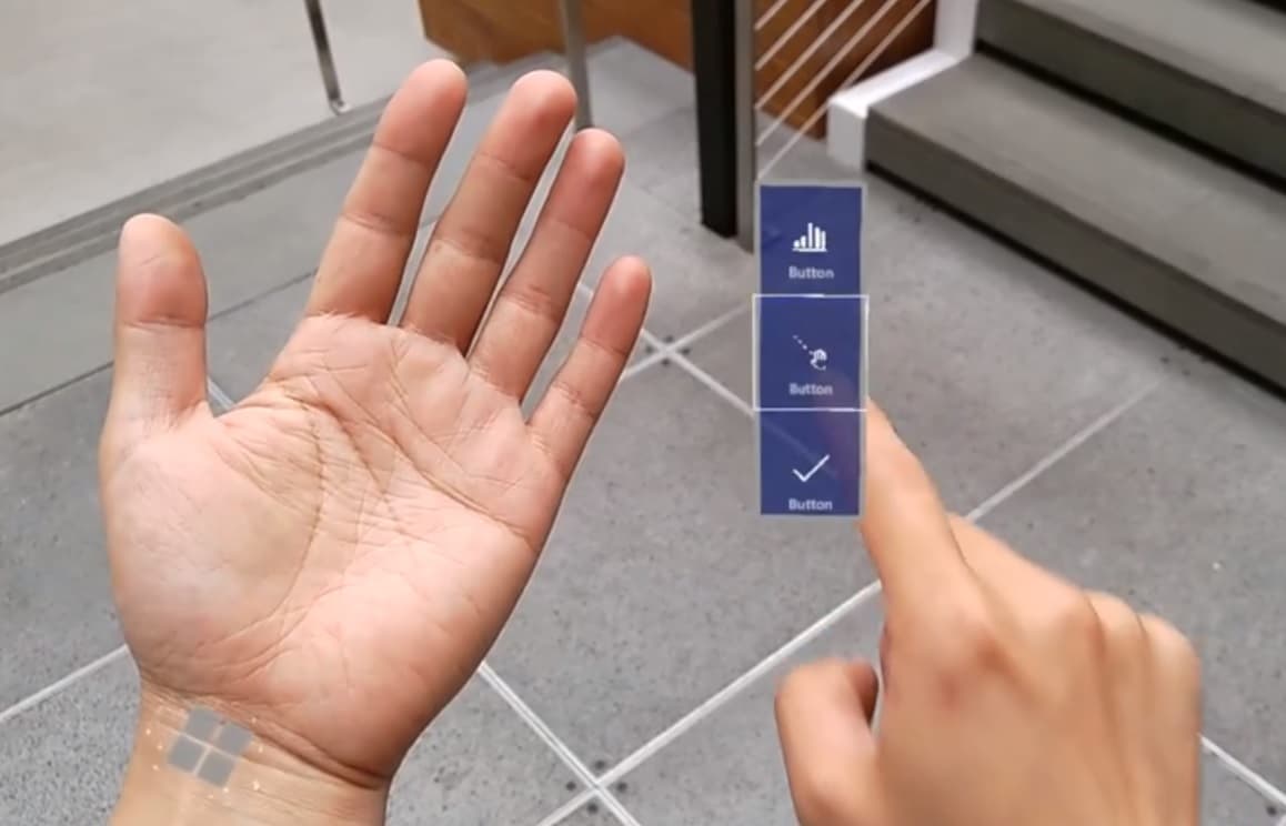
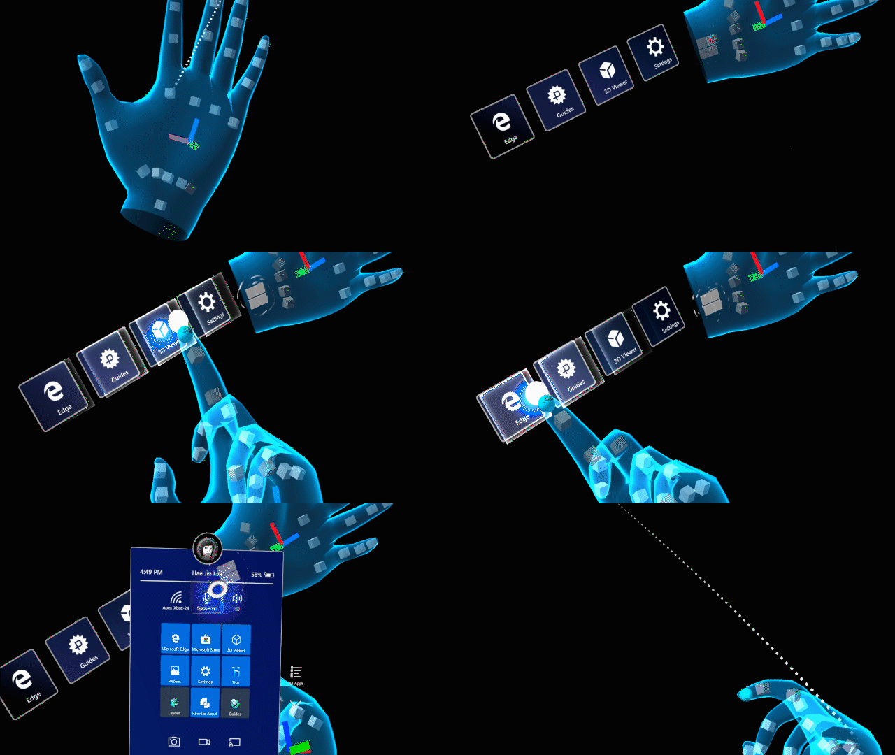
HoloLens 2 has a cool feature called hand-attached menu or hand-menu. It allows you to quickly bring up hand-attached virtual UI that is accessible anytime and can be shown and hidden easily.
The feature is so handy that developers have been somewhat overloading it, so Microsoft has developed some guidelines for best practice in implementing the feature.
These include:
- Keep the number of buttons small
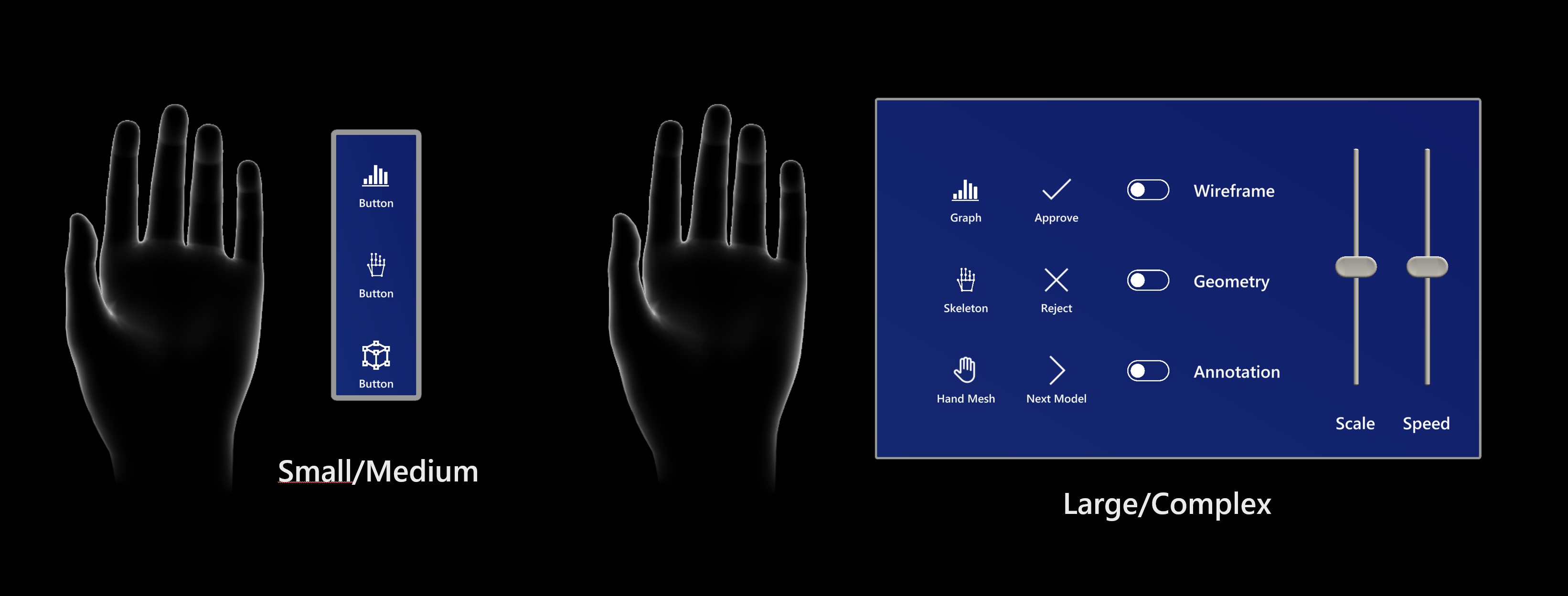
Due to the close distance between a hand-locked menu and the eyes and also the user’s tendency to focus on a relatively small visual area at any time (the attentional cone of vision is roughly 10 degrees), we recommend keeping the number of buttons small. Based on our exploration, one column with three buttons works well by keeping all the content within the field of view (FOV) even when a user moves their hands to the center of the FOV. - Utilize hand menu for quick action
Raising an arm and maintaining the position could easily cause arm fatigue. Use a hand-locked method for the menu requiring a short interaction. If your menu is complex and requires extended interaction times, consider using world-locked or body-locked instead. - Button / Panel angle
Menus should billboard towards the opposite shoulder and middle of the head: This allows a natural hand move to interact with the menu with the opposite hand and avoids any awkward or uncomfortable hand positions when touching buttons. - Consider supporting one-handed or hands-free operation
Do not assume both of the user’s hands are always available. Consider a wide range of contexts when one or both hands are not available, and make sure your design accounts for those situations. To support a one-handed hand menu, you can try transitioning the menu placement from hand-locked to world-locked when the hand flips (goes palm down). For hands-free scenarios, consider using a voice command to invoke the hand menu. - Avoid adding buttons near the wrist (system home button)
If the hand menu buttons are placed too close to the home button, it may accidentally trigger while interacting with the hand menu.
Hand menu with large and complex UI controls
Sometimes developers implement rather large hand menus. Microsoft notes extended interaction with hand menus can cause arm fatigue and recommends developers world-lock the menus in space instead after they are called up, allowing users to drop their arm.
Microsoft recommends a number of techniques to prevent false activation when calling up the hand menu with an palm-up event.
These include requiring a flat palm or that the user be actually looking at their palm when making the gesture.
Microsoft also does not suggest developers get creative with the placement of the hand menu, noting that placing the menu next to the left hand or 13 cm above the hand appears ideal, while other placement runs the risk of false activations, confusion when your hands overlap or causing user fatigue.
The cool back of the arm menu, for example, is tiring to the user and can trigger accidental home button presses.
Read the full guidance with detailed information at Microsoft here.



User forum
0 messages