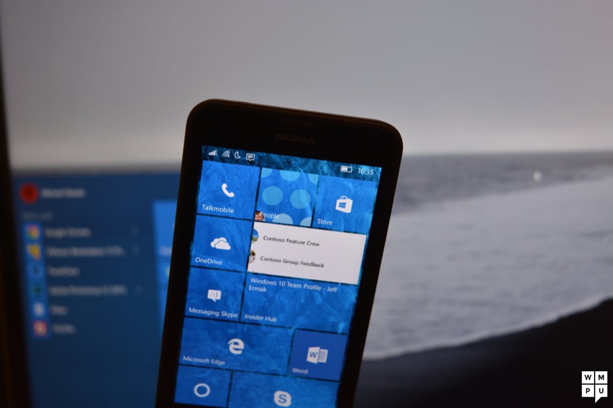
With the first Windows 10 phones being on sale soon, is Windows 10 mobile finally good?
It has been almost exactly two months now since we have covered the design issues in Windows 10 mobile. We did get a lot of positive feedback and support on this article and even though not everyone agreed with us, it seemed like the majority of readers had the same feelings about the operating system as us.
Tomorrow it will be exactly two months since the article has been published and only about one month until the software goes RTM – Microsoft even has a candidate build already – and the first new Windows 10 phones are released. Yesterday a new build has been made public. A great time to check if something has changed since the last article, no?
First of all it is great to see how there have been improvements. Microsoft did not sleep in those two months and made a software that has a lot of great features and is great performance-wise. I personally have never experienced a software that runs this fast and this smoothly. Windows Phone 8 was fluid but not necessarily the fastest system out there, Windows Phone 8.1 felt a lot snappier but had some minor lags now and then. Windows 10 mobile however beats both. It does not only feel faster already but the animations and transitions are really smooth and fluid – and all this without being a RTM build and without optimized firmware. There are some crashes now and then, but it still is a preview build so everyone should expect that. The features that have been there and or have been added over the last two months all work reliably now. Whenever you need to get something done you can expect the features to let you get it done. Sure, there are still some rough edges here and there, but overall there are not only plenty (new) features but they also work as they should. The software just works…
…unfortunately, not in the positive meaning of this saying. Literally speaking they do just work – and that is it. It seems like Microsoft still focused on the quantity only but not on the quality. The software does what it has to do and no more. There is no glare, no beauty, there is a lot of inconsistency and confusing stuff all around the OS. Do not get me wrong, those apps that actually are well made Windows 10 apps with a clear and stringent design work great, have a lot of features and look beautiful. The best example for this are still the MSN apps which show a logical evolution of the Windows 8(.1) design while not lacking beauty or features. The rest, however, feels like it has been made by many people who could not agree on a consistent design.
There are grey header bars sometimes, in some apps these are black, sometimes the notification bar is not there at all, sometimes it disappears only in landscape mode, sometimes it is always there, sometimes in grey, sometimes in black or the accent color of the phone, sometimes you have a great mix of a hamburger menu and swipeable pivots, then you have the hamburger or pivots only, sometimes the settings are hidden in the ellipsis menu, sometimes in the hamburger… You get the point. I have written it all down two months ago already and I am not going to write it all down again because basically nothing has changed. The software feels like a puzzle only that not all pieces fit into each other.
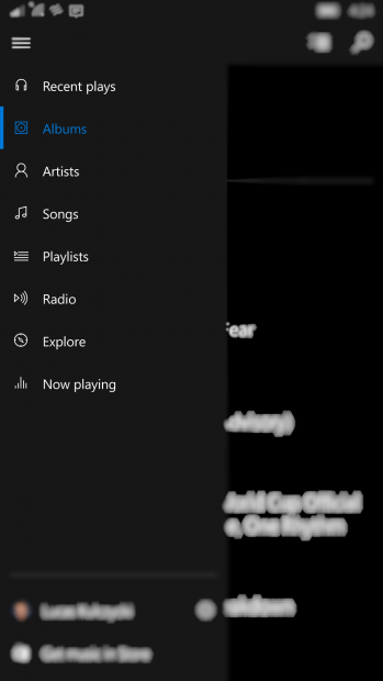

I am a fan of those pivots that were introduced in Windows Phone 7. I agree with people saying that they do not only need a redesign but also do not make sense in every app. However, rather than going the half-hearted way by saying “well, f it and just use the hamburger” if pivots do not make sense they could re-think the apps a little bit. A good example is the current music app which has a hamburger menu and no pivots. It is very beautiful, fast and feature-rich. In the current constellation I do agree that the hamburger makes sense. Having two types of navigation, however, is not the way to go. So why not think of a different way to implement the several pages of the music app? I have a suggestion: Via the hamburger you can switch between the “Explore” section for Music Pass subscribers and the library. The library section can then be divided into “albums”, “artists”, “songs” and “playlists” which can all be accessed by swipes. Not that revolutionary, is it?
But let’s get away from the pivots, it is not only them. The whole OS looks like a map of Germany after the Napoleonic Campaigns: Like a patchwork.
A lot of you will surely be annoyed by me constantly criticizing Windows 10 mobile and I get that. Many people like it but I know that there is also a lot of people who do not. I am part of the latter, obviously. I will understand any sort of criticism towards this article by people who like it, but see this not as some sort of hate. Rather see it as criticism by a dude who wants to stay a part of this community. There is the feedback app and I use it – but I cannot and will not write 20 or something feedback treads only to write them again just because they haven’t been noticed over the weeks. I do not have the time or the nerves for this. I rather address Microsoft in this way and I hope that they will read it.
I have said it again and I will said it as often as it is necessary to say it: I am getting a new phone around Christmas. Looking at the hardware only I am totally obsessed with the Lumia 950 XL, but then there also is the current state of the software. Microsoft can still do a lot, but if they chose not to I am probably getting myself an iPhone. Because this phone just works…
Read our disclosure page to find out how can you help MSPoweruser sustain the editorial team Read more


Improve this guide

User forum
0 messages