Windows 11 widgets board panel is now simpler in the latest improvement rolling out
2 min. read
Published on
Read our disclosure page to find out how can you help MSPoweruser sustain the editorial team Read more
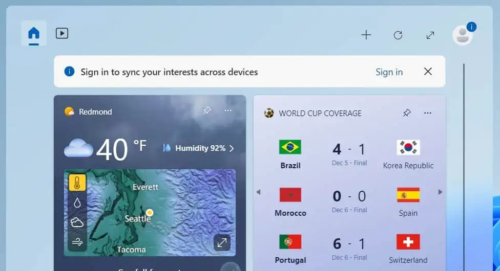
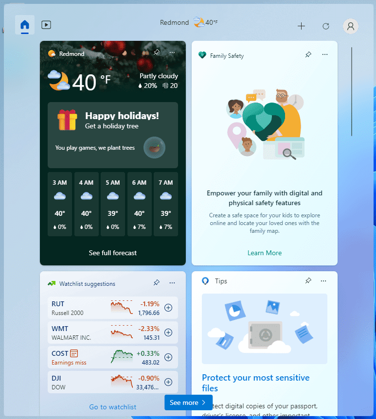
Microsoft slightly changed the looks of the Windows 11 widgets board. The transformation is not that remarkable, but it makes the upper section of the widget board neater and more minimalistic. The changes are now rolling out to all users of Windows 11 22H2 and 21H2.
The change was first spotted by Windows Insider and Twitter user PhantomOcean3. In the discovery PhantomOcean3 shared, it can be noticed that the former panel showing time and a Search bar was changed to a simpler layout. The elements were removed and replaced by small home and video buttons on the left side.
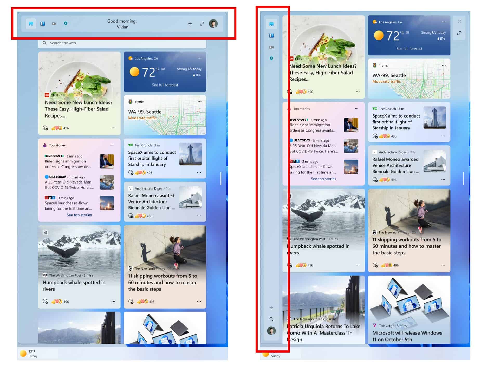
In October, Microsoft released Windows 11 Preview Build 25227 to the Dev Channel, where it tested a new Widgets panel UI in vertical and horizontal positions. In this change visible to public Windows 11 users now, the panel remains horizontal, though it can be noticed that the simplicity and placement of new icons in Build 25227 were adopted. Also, it is worth noting that the exact designs and numbers of the icons used in the said build were not applied in this update. The icons’ new designs look simpler, which is nice as they help make the panel look cleaner and clutter-free. And unlike in Build 25227 with four icons on the left side of the panel, the new layout only has the home and video buttons.
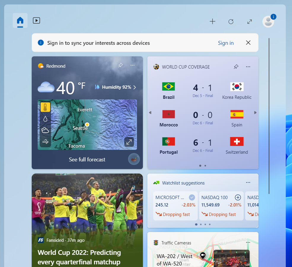
Moreover, the big difference between the new widget panel layout and the one tested in Build 25227 can be noticed from the options available. In Build 25227, there is an option to expand the widgets board. Despite this new change, it is not yet available to Windows 11 users. Nonetheless, there is a huge possibility that it will be released by Microsoft in the future since the maximize button is also included in the recent Windows 11 Insider Preview Build 25262 in Dev Channel.



User forum
0 messages