The Design Around Windows Phone App Bar Icons Explained
![]() 2 min. read
2 min. read
![]() Published on
Published on
Share this article
Improve this guide
Read our disclosure page to find out how can you help MSPoweruser sustain the editorial team Read more
In a Q&A session during the Windows Phone Design Day in Stockholm, Petter Silfver, Interaction designer questioned Microsoft on why Windows Phone app bar icons have circle around it. He even did a blog post claiming Microsoft’s inconsistency in design and made some interesting points on why the circles around the icons should be removed. You can read his post here.
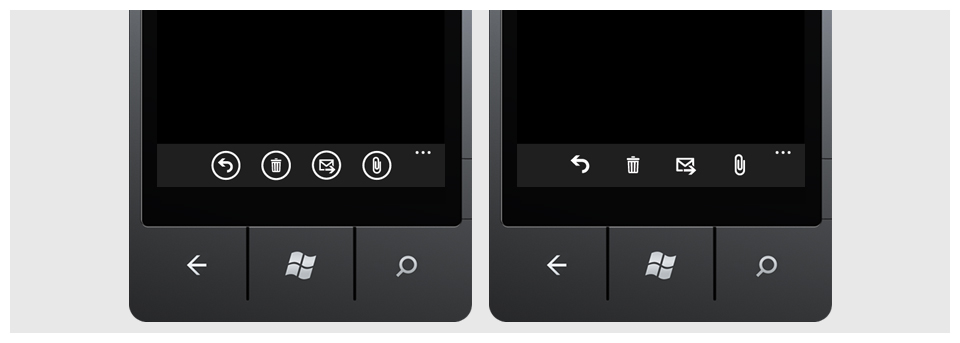
Here is the Microsoft’s response to his claims from Arturo Toledo, UX Designer at Microsoft. Microsoft has two graphic things in their design, icon buttons(circled) and icons.
We use icon buttons for enabling interactivity and icons for communicating a message one-way.
For example, the out-of-the-box phone app uses icon buttons with a phone icon next to the calls in the call history list – these are buttons, not icons. Another example of the use of icon buttons, in the text messages app – when you want to add a new person to send a text message you get a little button with a plus sign icon but again, this is a button – not just an icon.
We use icons as graphics that provide information to the user one-way (they are not interactive, thus not buttons).  For example in the status bar these are truly notification icons and they do not use a circle (they are not buttons). For example in the email app we use little icons (not buttons) to communicate to the user that there’s an attachment in an email or that there’s a high priority email (flag).
You can read more on this here.
Its always exciting to see the level of detail in Windows Phone Design ! !


User forum
0 messages