Notification List Design Concept
2 min. read
Published on
Read our disclosure page to find out how can you help MSPoweruser sustain the editorial team Read more
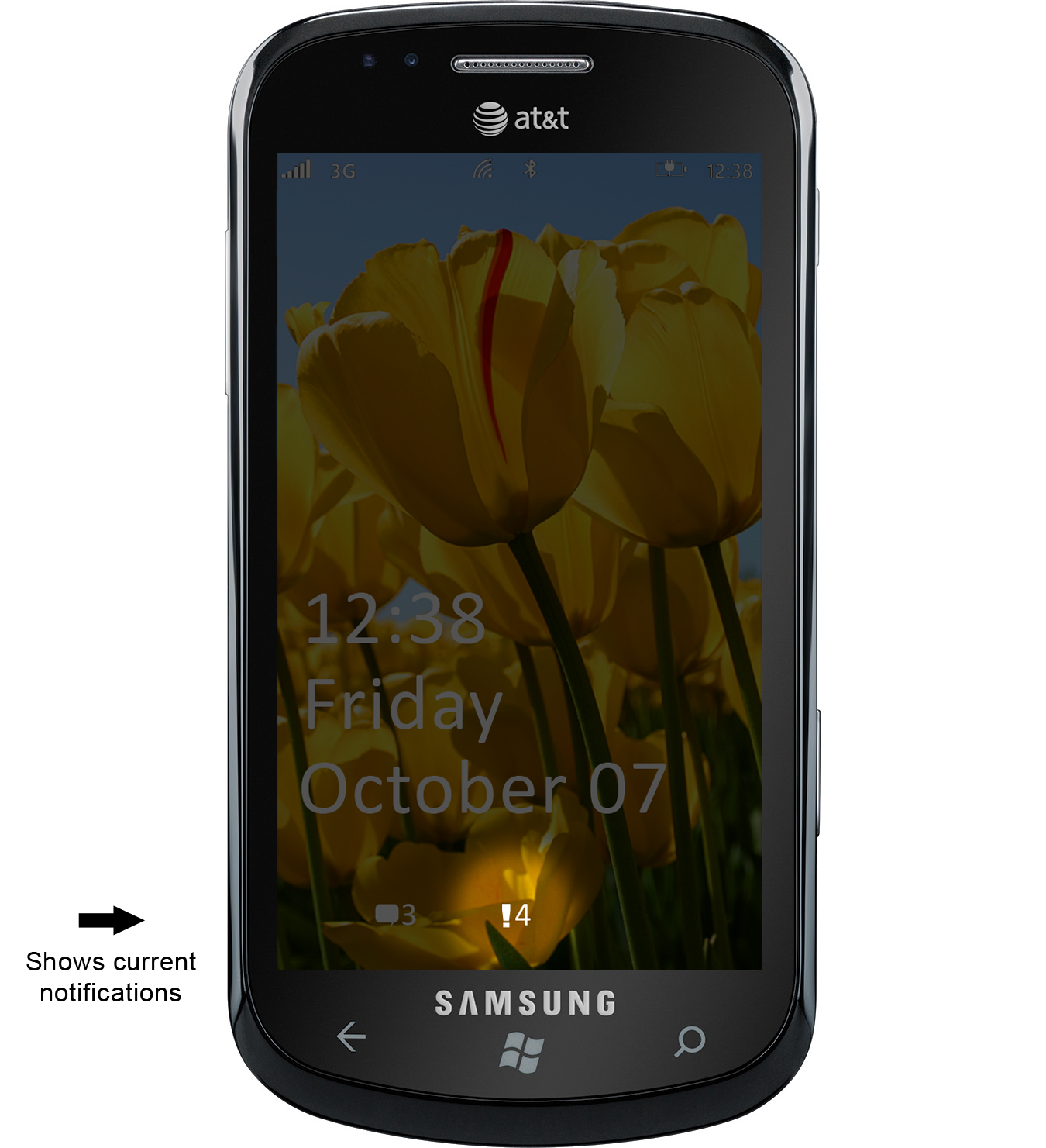
 I think we all can agree that WP7 needs a better system of managing notifications. Currently, if you miss a toast notification, it’s gone forever!
I have created a design concept video showing how I think Microsoft should implement a notification list into Windows Phone 7. This concept fits perfectly with the existing Metro design, and is relatively intuitive. Continue after the break for more details:
An indicator on the lock screen shows the user they have new notifications, just like they do for email and text messages. Therefore, whenever the user missed a notification, they turn on their phone, and instantly see they have a new notification, so they unlock the phone and open the notification list.
Notifications all have their time stamp on them, so the user knows what time (or if older, what date) the notification appeared. Clearing notifications is just like in WP7, simply swipe to clear them. To get out of the list, hit the back button, just like every WP7 interface. To read a notification, simply click it.
If a user is using his phone while a toast notification appears, he can swipe right to clear the notification (the default WP7 interface), or also swipe left, which will save the notification for later viewing in the notification list. If the user doesn’t do anything with the notification, it will also be saved once it disappears from the screen.
Finally, the status bar also appears at the top of the notification list, in case the user wants to see his signal strength info! That also lets the user see the current time and compare that time to when the notifications were received.
Let me know what you think in the comment section below! And try to watch the video instead of simply viewing the pictures, since it looks better in action like everything else on WP7!




User forum
0 messages