Microsoft encourages developers to put up more video trailers
2 min. read
Updated on
Read our disclosure page to find out how can you help MSPoweruser sustain the editorial team Read more
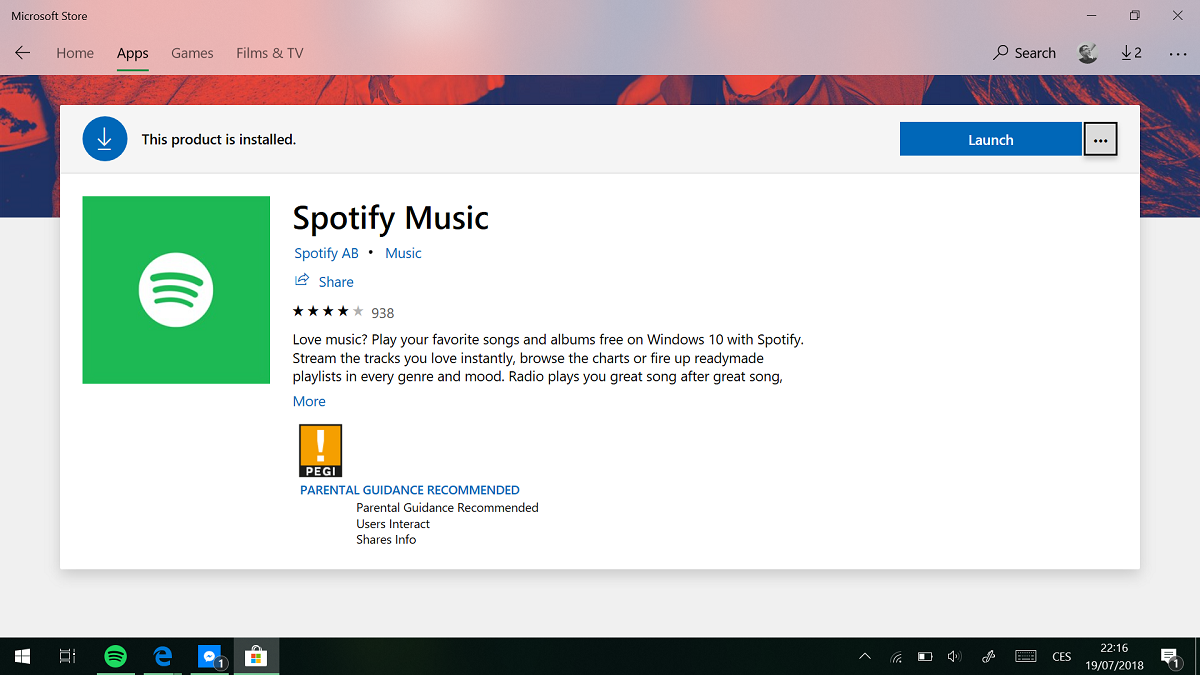
Microsoft has just released a new set of tips for developers on its Windows Blog, advising them on how to improve their app’s presentation in the Microsoft Store.
The firm notes that the presence of video trailers improves downloads for developers by up to 11%. Not much, but for users of paid apps, that can be a small boost in consistent income as more users get used to an app store on the Windows desktop.
The firm issued the following tips regarding video trailers:
- Focus on high quality and short length (60 seconds or less).
- Use different thumbnails for each trailer.
- Keep key messaging short and centered in each frame.
- When using trailers, you must also provide a 1920 x 1080 pixel image (16:9) in the Promotional images section in order for your trailers to appear at the top of your Store listing. This image will appear after your trailers have finished playing
While we wouldn’t normally write about this, it’s notable due to the fact that Microsoft last week updated the store to improve the prominence of video trailers and highlight the visual appeal of app listings. With that as the background contest of this post, developers who are interested in making their presence felt and their app listings more appealing would be well served to pay attention to Microsoft’s tips. Netflix and Affinity Photo among others already make use of this feature.
The firm also notes basic things like creating a good app description, an eye-catching logo and regular updates with changelogs. One would hope developers don’t need to be told.
Source: Microsoft

User forum
0 messages