Microsoft gives us another look at the new Windows 10 Start Menu
2 min. read
Updated on
Read our disclosure page to find out how can you help MSPoweruser sustain the editorial team Read more
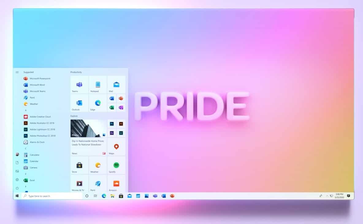
Microsoft has been teasing us with an updated Start Menu for some months now, with rumours that the emphasis will move away from Live Tiles to basic icons.
Microsoft has in part both confirmed and debunked the rumour, for example on the Windows Insider Webcast saying the Live Tiles will remain available to developers and users, but confirming that Microsoft itself is moving away from them, and releasing a set of icons for Windows 10 apps which do not include Live Tiles at all, a big change from previously.
The design team also showed off a design concept where the move back to icons is used to improve the look of the Windows 10 Start Menu, and today the Office 365 team posted a set to Windows 10 wallpapers which appear to show the same new-style Start Menu in action.
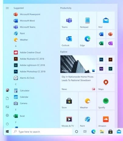
The screenshot shows that the “tile” area is now used to integrate better with your choice of Dark or Light mode, with Microsoft noting that your Start Menu would no longer be dominated by blocks of colour you can not change. Microsoft says this is the experience users will receive when they switch Live Tiles off.
We can also see on the App list the items are also no longer surrounded by blocks of colour.
The intention is to bring Windows 10 closer to Windows 10X and to make a UI that works as well with the Dark as Light mode.
What do our readers think of the look? Let us know below.
Via WindowsLatest.






User forum
0 messages