Instagram tests new tablet interface: Side navigation bar
![]() 1 min. read
1 min. read
![]() Published on
Published on
Share this article

Improve this guide
Read our disclosure page to find out how can you help MSPoweruser sustain the editorial team Read more
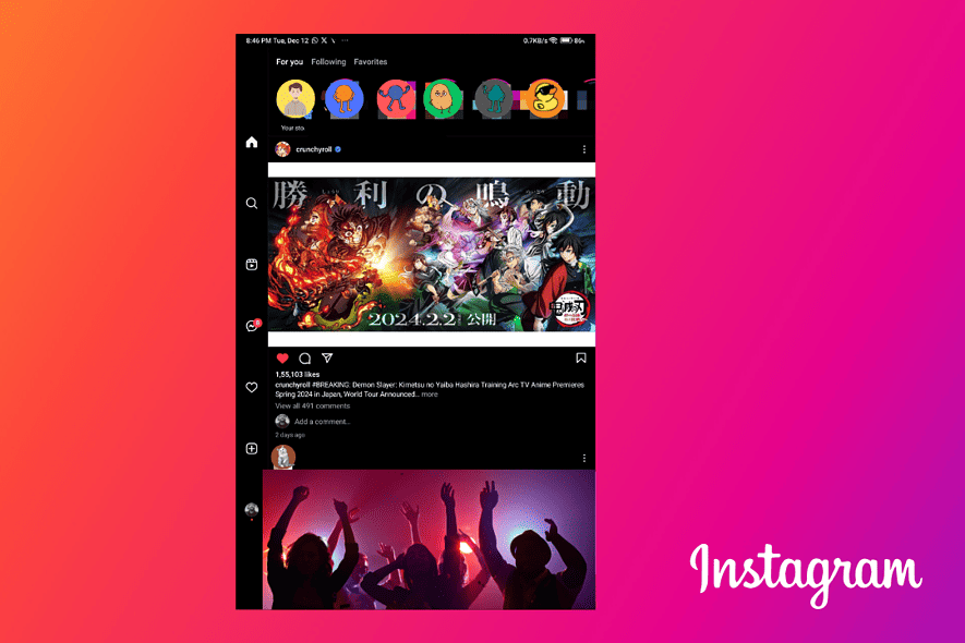
Instagram is currently experimenting with a revamped interface for tablet users, focusing on optimizing the layout for larger screens. This alpha test introduces notable changes to navigation and messaging functionalities.
The familiar bottom navigation bar, housing icons for Home, Search, New Post, Reels, and Profile, is replaced with a vertical bar on the left side of the screen. This could free up space and be more intuitive for tablet users.
Instagram is merging the separate message and notification icons in the top right corner into the same vertical navigation bar on the left of the screen. This streamlined approach could improve accessibility and reduce clutter, with all icons in one pane.
This new layout is currently in an alpha testing phase (version 312.0.0.0.71) and is unavailable to the public. If you’re eager to test it on your mobile device, changing your “Smallest width” to ~600 might trigger the tablet interface.
While its full impact and official release date remain uncertain, this testing phase is a promising step towards a more optimized tablet experience.


User forum
4 messages