How to enable Google's new Material Design 2 and touchable interfaces for Chrome
2 min. read
Updated on
Read our disclosure page to find out how can you help MSPoweruser sustain the editorial team Read more
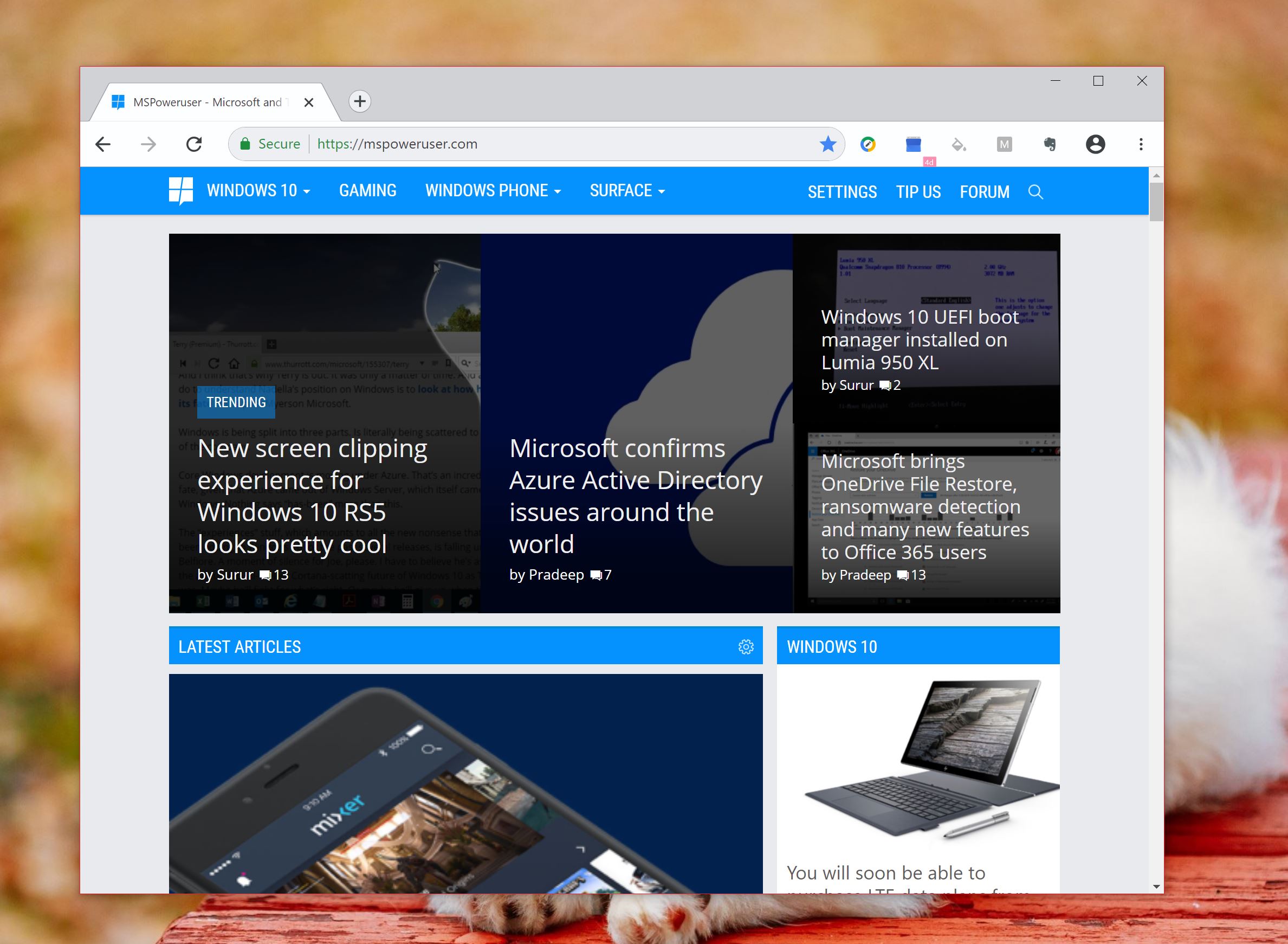
Google is working on making Chrome more touch-friendly this year, and we’ve just gotten a glimpse of how it will likely look when it rolls out later this year.
The firm will be rounding Chrome out in line with its new Android UI, and making elements like the new tab button and tab area more finger friendly.
Here’s how to activate it if you’re on the Chrome beta or canary channels
- Enter chrome://flags/#top-chrome-md into your URL bar.
- Under the dropdown, select “touchable” and relaunch.
- You’ll now get a user interface similar to that above.
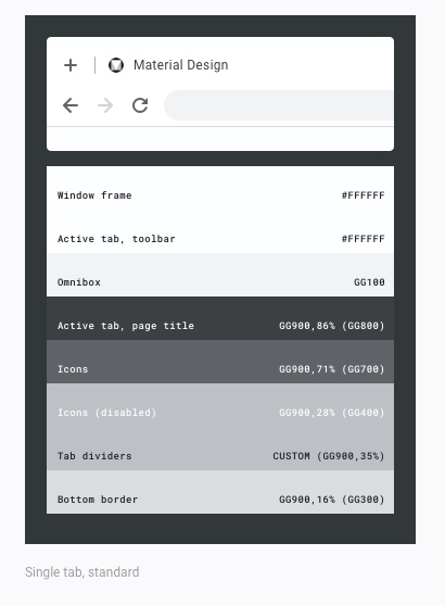
Google is also refreshing the Chrome UI for regular users who use clamshells and desktop PCs. Chrome is ditching its interface for one which is simultaneously more rounded and more squared off when it comes to its tabbed view, resembling FireFox and Internet Explorer.
Here’s how to activate it if you’re on the Chrome Canary channel
- Enter chrome://flags/#top-chrome-md into your URL bar.
- Under the dropdown, select “refresh” and relaunch.
- You’ll now get a user interface similar to that above.
While Chrome’s new user interface will mostly benefit Chrome OS and users of said platform, Windows users who use devices like the Surface or Surface Pro will now have one more very good browser option they can use in tablet mode.





User forum
0 messages