Google Docs is getting much better menus
2 min. read
Published on
Read our disclosure page to find out how can you help MSPoweruser sustain the editorial team Read more

Google has showcased new, much improved, menus that are coming to Google Docs in the coming weeks to make things more findable.
Revealed in a new Workspace Updates blog post the new menus that are coming to Google Docs promise to “make it easier to locate the most commonly-used features,” in Docs. This feature will no doubt be a godsend to power users who were similarly excited about the online text editor getting expanded Markdown support last month.
To make Google Docs easier to use and features easier to find, Google made menus smaller for “better navigation,” reorganized menus for more “intuitive feature location,” and made icons within the menu larger for “faster recognition,” which all sound like good things to us.
While reorganized and different looking menus may take some getting used to, leaving you actually less productive for a little while, Google hopes that “their new menu location will be more intuitive and make it easier and faster to navigate the product,” so in the long run productivity should be increased.
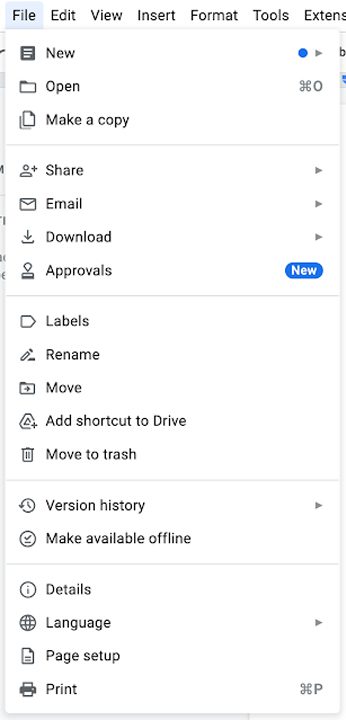
According to Google, the new menus in Google Docs will roll out to users over the next few weeks, with everyone being expected to have the update by the end of May at the latest.




User forum
0 messages