Chrome version 100 has launched with a new logo to celebrate
2 min. read
Published on
Read our disclosure page to find out how can you help MSPoweruser sustain the editorial team Read more
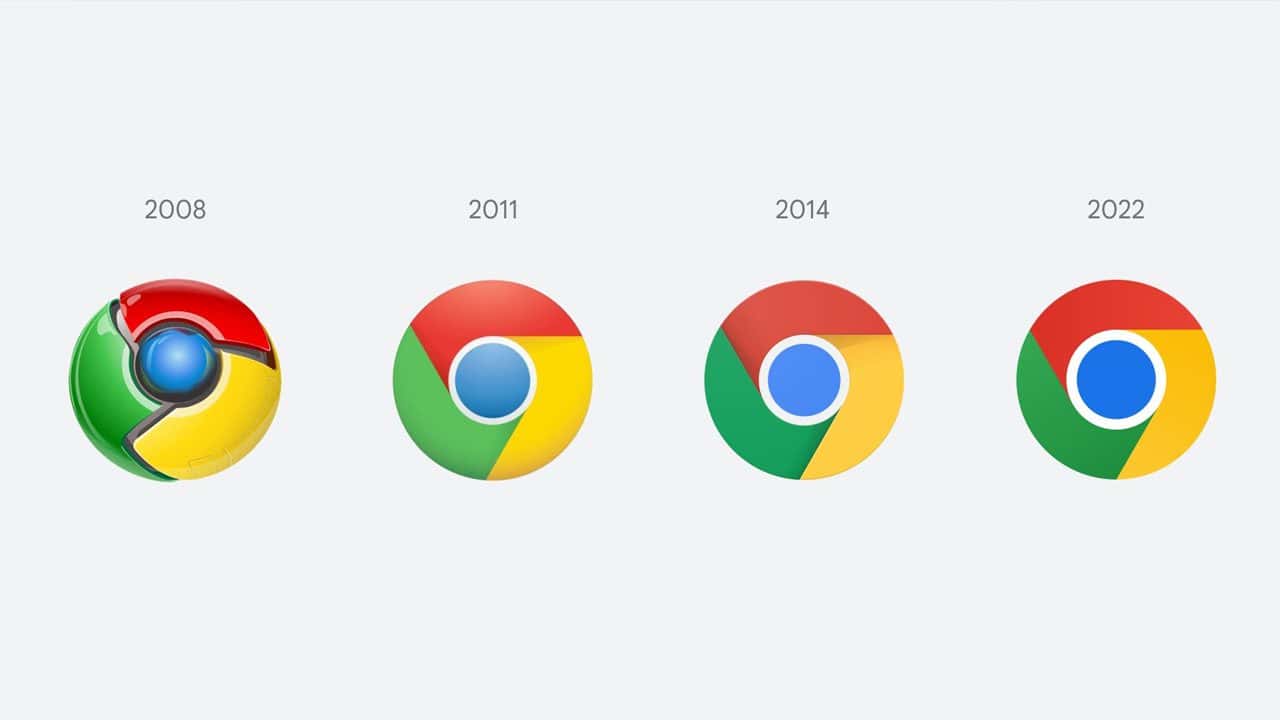
After launching all the way back in September of 2008, Google’s Chrome browser has finally hit version 100, and there’s a new barely different logo to celebrate this milestone.
Despite the fanfare of a new marginally changed logo, version 100 of Chrome isn’t a feature-packed affair that we can all get excited about, as instead the 100th iteration of the world’s favourite web browser is merely just a handful of bug and security fixes.
Disappointingly, the biggest notable change in version 100 of Chrome is actually the removal of a feature, as “lite mode” is being taken away from Android users. While this feature once made web pages load faster and use up to 60% less data, according to Google, the feature is no longer needed as the cost of mobile data is decreasing and webpages have been optimized to load faster without the need of a dedicated “lite mode”.
Thankfully with Chrome’s version 100, there is at least some cause for celebration as, after eight long years, we finally have a new slightly different logo to gawp at which boasts a cleaner design.
Highlighting the changes to the design on Twitter, Google Chrome engineer Elvin Hu stated that they have “simplified the main brand icon by removing the shadows, refining the proportions and brightening the colors, to align with Google’s more modern brand expression.”
Some of you might have noticed a new icon in Chrome’s Canary update today. Yes! we’re refreshing Chrome’s brand icons for the first time in 8 years. The new icons will start to appear across your devices soon. pic.twitter.com/aaaRRzFLI1
— Elvin ? (@elvin_not_11) February 4, 2022



User forum
0 messages