Google Assistant gets a new design on phones
2 min. read
Published on
Read our disclosure page to find out how can you help MSPoweruser sustain the editorial team Read more
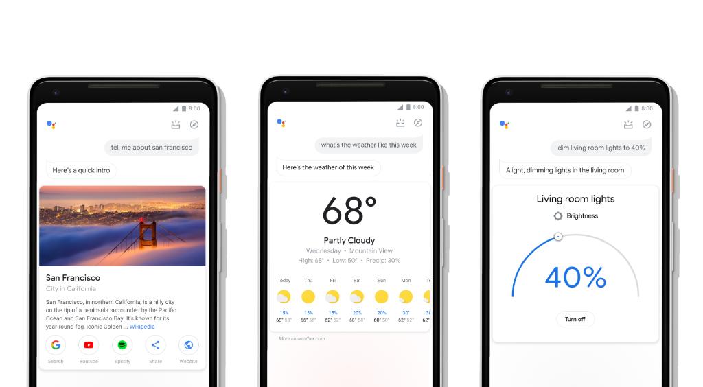
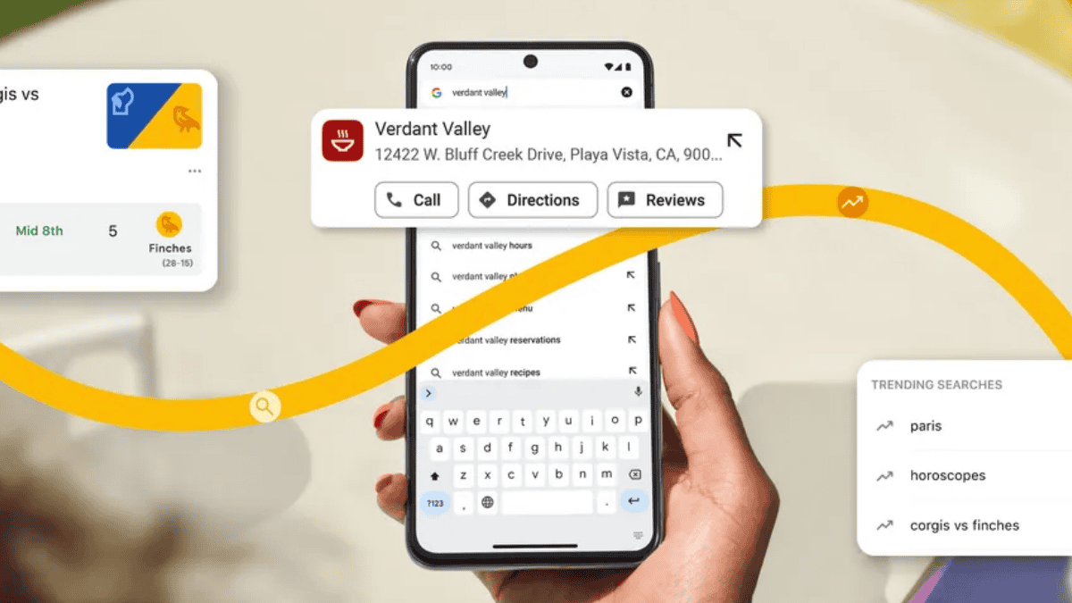
Google today announced an updated design for Google Assistant on mobile devices. This new visual refresh will make it easier to get things done when you are using your hands, your voice, or a combination of the two. When you ask something to Google Assistant, you now get cleaner looking visual answers that includes actionable buttons and more.
What’s new with Google Assistant:
- Bigger visuals that are easy to glance at quickly.
- New controls and sliders to manage your smart home devices. Use the dials to adjust your lights to the right brightness, or the sliders to control the volume of your smart speaker.
- An interactive messaging interface so you can use your fingers to add a comma, change a word or make any other quick edits as you compose messages.
- On Android phones, it’s now easier to access an overview of your day. Open up the Assistant and swipe up on your screen to get curated information based on the time of day and your recent interactions with the Assistant.
- Developers and brands now have tools to take full advantage of the phone screen. Starbucks now has thumbnails to select from recommended items on their menus, Food Network has larger images of their recipes, and FitStar uses GIFs to give you a preview of your workout.
You can download the Google Assistant app on iOS here. On your Android device, open the Assistant with a long press of the home button.
Source: Google


User forum
0 messages