Windows 10's UI is Windows Phone's Windows 8
7 min. read
Published on
Read our disclosure page to find out how can you help MSPoweruser sustain the editorial team Read more

The Windows 10 for phones and small tablets (or Windows 10 for Phones and Small Tablets)UI has been extremely polarizing. On the one hand, it introduced a brand new design language into the OS. On the other, that new design language brought something that Windows Phone users regard as alien to the platform- the hamburger menu.
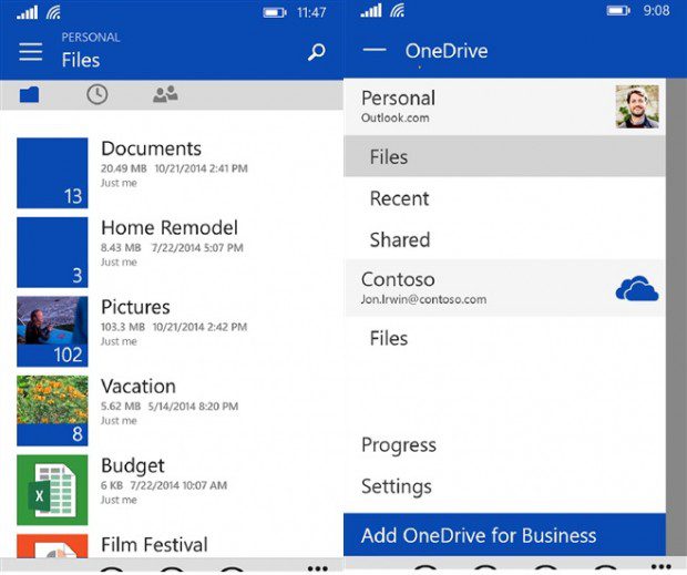
The Hamburger menu, for those who do not know, is a set of three lines which indicates a menu. It can be placed anywhere, but in Microsoft Windows apps is usually placed on the top leftmost corner. Microsoft first introduced this to Windows Phone with Cortana, in what many people hoped would be a one-off. The menu was also placed within the reach of the thumb, in the right corner. The next time the hatred sandwich made its return was in the OneDrive app along with a newer design language. This time, rather, than being met with passive resistance, the redesign received a vicious backlash that forced Microsoft to go back to the drawing board. They came up with a better design that mainly pacified users, though it retained the burger menu (I don’t use it btw). In Windows 10 for Phones, Microsoft has shown us that they wish to continue down this path with nearly every app having a hamburger menu as opposed to pivots. But, using the example of the OneDrive app, Microsoft has yet to show us why the menu is necessary.
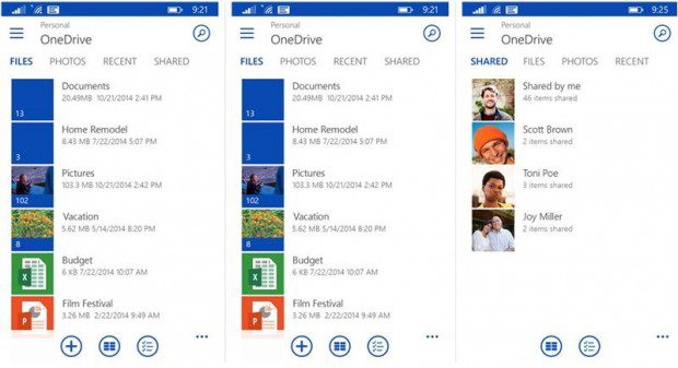
They have shown that they can, not that they should. In OneDrive, the hamburger menu hides the account section, the progress screen and settings screen. That’s three things, all swept behind the hamburger menu. The problem here is that there is already a section that can be used that can be used for the progress screen and settings screen. Microsoft may not notice it and it might be a bit out of sight, but if you take a look at the … menu you’ll see it has space for at least two more options. The accounts option is a bit trickier, but there’s no need to reinvent the wheel there. Replace the meat feast Icon with a profile picture as so many apps do and use that as a toggle for the account feature. It’s quite simple if you put a little thought into it.
The main reason Microsoft seems to want the hamburger menu is for consistency with their desktop applications. For those who would argue that MS would want it to be like IOS and Android, that’s stupid for another reason. Here’s someone else putting it an entertaining manner:
So the logic here is that if Microsoft offered an Android-like experience without any of Android’s advantages, people would switch?
A: Do you like Android?
B: Yes!
A: Do you like how it looks?
B: Sure
A: How would you like to buy a phone that looks like Android but doesn’t have any of its advantages?
B: Like what?
A: Apps, official apps, Google services, customizablity, skins, themes, custom keyboards, set default browser, app piracy, 60fps video, custom lockscreens, custom passwords, accessories, choice of hardware from 20+ companies, multitasking,
B: What? Why would I do that?
A: You said you liked the way it looked!
B: ….
A: Now I have a 2-year old Lumia 920 for you… or a spanking brand new phone… yeah, let’s go with the new one.. How do you feel about Snapdragon 200? Would you like it in dual-core or quad-core?”
The people who argue this are taking the easy way out. They are looking at iOS and Android and saying that Windows Phone UI (which no-one, including the people who argue against it now) is the problem. They are overlooking hardware, app availability, functionality and the history of Windows Phone (read our lengthy write-up here). They are overlooking the fact that iOS and Android already have different UIs. And most of all, they are overlooking the fact that creating s poor man’s iOS and Android will not attract users who already have the actual iOS AND Android. For some Windows Phone users, they may feel that the uniqueness of Windows Phone is gone and well, why stick with a pale imitation when you can get the real thing.
Back to the hamburger menu and desktop consistency, I think Microsoft’s desktop app UI gets it right in a way. It doesn’t hide anything, its simply an extra panel for a program that you can open or close to gain more UI space. In Windows 10, the hamburger complements the app-bar, or replaces it, or serves as a navigational element. There is no consistency in the phone UI as well, its like Microsoft saw the menu, heard everything bad about it and decided to use all these bad things. Here’s apple on the hamburger menu.
“Remember, the three key things about an intuitive navigation system is that they tell you where you are, and they show you where else you can go. Hamburger menus are terrible at both of those things, because the menu is not on the screen. It’s not visible. Only the button to display the menu is.
And in practice, talking to developers, they found this out themselves. That people who use their app don’t switch to different sections very frequently when they use this menu. And the reason for that is because the people who use their app don’t know where else they can go. Right? They don’t know because they can’t see the options, or maybe they saw it at one point in time, but they have since forgotten.
And if you use this control, you have to recognize that the people who use your app may not realize the full potential of your app.
Hamburger menus are also just tedious, right? If you want to switch sections from the Accounts tab to the Transfers tab, all you need to do is tap the button and you’re there instantly, and if you want to go back, you tap the account button, and you’re back where you started from.”~
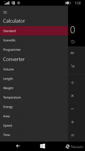
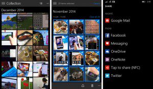
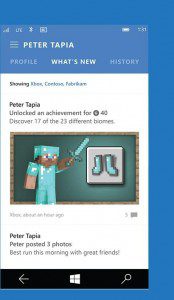
Again, let’s go over what Microsoft uses the hamburger menu now for currently. In OneDrive it is used to hide a few options that could go somewhere else. In Photos it is used to replace the pivot. In people it replaces the pivot. In Calculator it serves as a drawer for all the modes. In other words, the menu is used for whatever they feel like right now.
Yes, consistency between different form factors is great, when it leads to better UX. That’s why Windows 8 didn’t work. It tried to shoehorn a tablet UI on a desktop. Reversing this for Windows 10 is not great. The experience on Phones and Small-Tablets and even regular tablets like the Surface Pro 3 is not great. It is wrongheaded and short-sighted. To put it in simple terms, a good user interface is like a good vehicle. It works well for its environment. Microsoft already has this vehicle, Windows Phone and big Windows. They have added to the latter where it makes sense, but the former suffers in return UX wise.
Windows 10 is supposed to be the Windows we all build for ourselves, the one where our feedback counts. If Microsoft took feedback over OneDrive and other UI changes and decided this was the way to go, I’m not sure whether preview users have any power over the direction of Windows. The destination will be clear at /build/. Whether we led the direction, or MS simply steered us towards the direction they were heading to all along will become clear as well.
What do you think of the Windows 10 UI? Let us know in the comments
P.s – Here’s a nice metro redesign of the photos hub http://imgur.com/a/0CVqg

