Opinion: Windows 10's live tiles are vestigial, they need to evolve or die
Windows Live Tiles are one of the more uniquely identifiable features of Windows 10 and Windows Mobile, perhaps it’s time for Microsoft to get rid of them. To briefly recap on the history of tiles, Microsoft first introduced that user interface paradigm with Windows Phone 7 around the initial debut of Windows Phone. The user interface was praised as different from iOS, Android, BlackBerry, and Symbian at the time and it represented n authentically digital take on home screens. Live tiles and the Start Screen were a notification centre and home screen rolled into one, and pundits and users alike loved it.
Let’s not mince words about this, on phones and tablets, Live Tiles made sense back in 2010 when we were still figuring out which way we wanted our modern mobile OSes to work. We weren’t sure whether icons, widgets or some other user interface was what was needed, and manufacturers reached out with different exciting user interfaces and modes of interaction. Android had Honey Comb’s tablet UI, BlackBerry and Nokia came out with swipe-heavy interfaces, and Microsoft innovated away with live tiles.
The debate has long since been settled, the “boring”, “tired” and “static” grid of icons actually turns out to be what almost everyone wants. Even Android manufacturers like Huawei, LG and Samsung who went crazy with widgets here, there and everywhere at the start are beginning to experiment with removing the app drawer and pushing everything onto the screen. While widgets still abound, they differ from app shortcuts and are used sparingly, and in differing ways by users. Android users often pin a clock and weather widget on their home screen, with a task screen widget for some and perhaps even emails, while iOS widgets are either to the left of the home screen, lock screen or notification centre.
For PCs, there was no such debate. We have the Windows taskbar and desktop, Mac OS’s dock and the ChromeOS shelf. All these metaphors tell us that when we want to launch an app, we simply want to click on the icon that launches it and we don’t give it more thought than that.
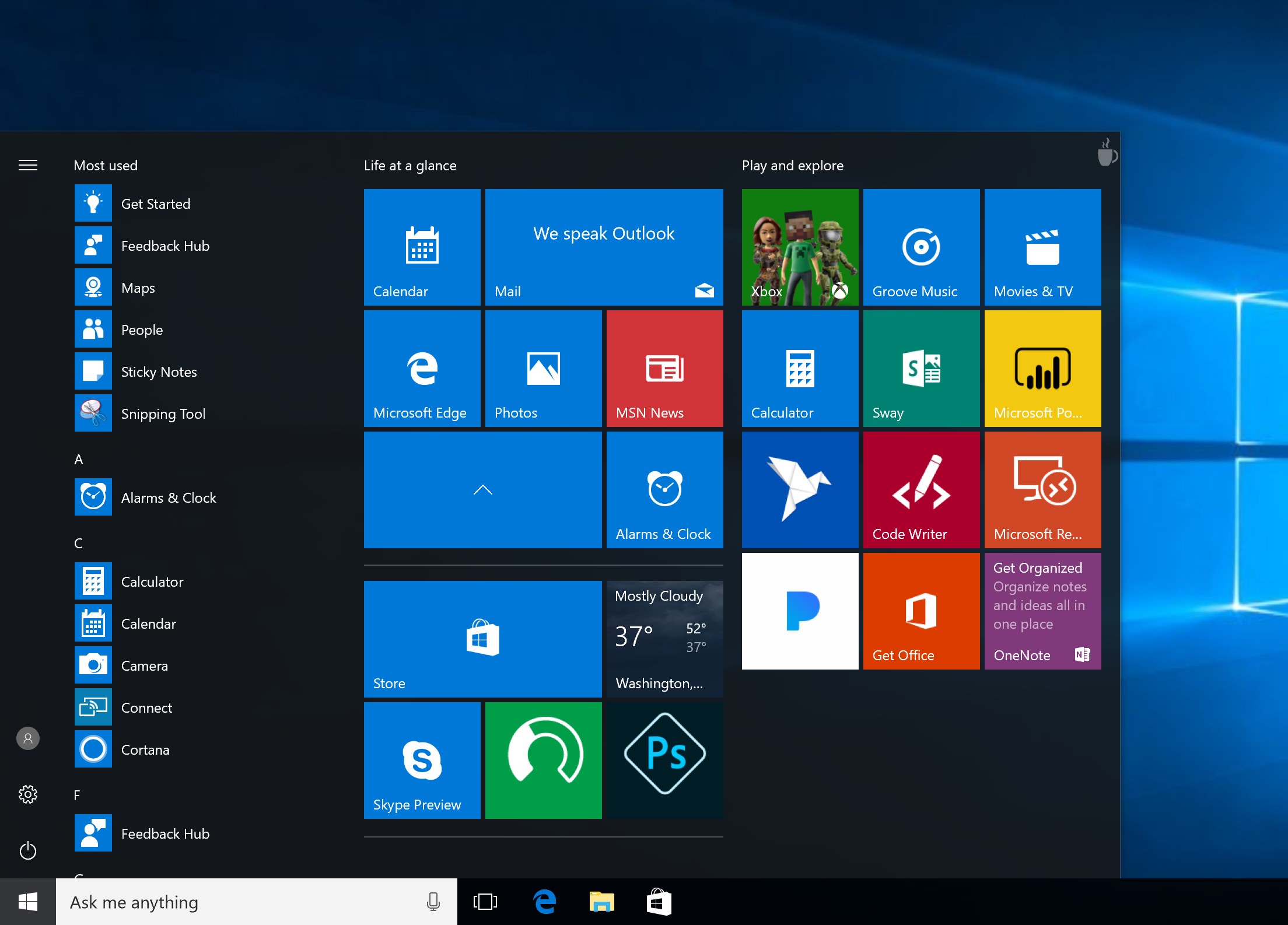
Which brings me back to live tiles, as someone who’s used Windows 10 on both phones and tablets, it turns out that live tiles are actually their own worst enemy. The main draw of live tiles is that they display continually updating information on the home screen of your device. The Microsoft Photos app, for instance, will show you rotating pictures from various albums, the messaging app will show you your last text message, Facebook will display random photos etcetera.
This constant change is antithetical to the main reason we use app launchers though — to launch apps quickly and without fuss. Live tiles slow down the app launching process. For myself –and I imagine others too –when a phone or tablet or laptop is picked up, 90% of the time there is some task in mind. We want to message someone, or look at some pictures, tweet, or write the next big novel in Word or Docs or what have you.
Live tiles slow down that process on mobile because they are constantly changing, flipping and updating. We can’t pin down where the apps we want to get to are because the screen is fluid, tiles can be scrolled down and change their position, icons can change into photos, etc. I for one, have stared at my screen looking for an app or two before realising that the icon or tile has metamorphosized into something else entirely. Sure we can kill the liveness of the tiles, but then what’s the point?
In addition, they are also high maintenance on touch devices. Sure, live tiles can make for beautiful home screens, but that requires more work than you would have to put in on other OSes. On iOS and Android, you can simply drag and drop a row of icons, throw in a wallpaper and leave it as that and everything looks fine. On Windows, you’ll have to experiment with the right tile sizes and arrangement to get something that looks just right, and even then you’ll still deal with the cognitive issues faced when using the Start Screen as an app launcher.
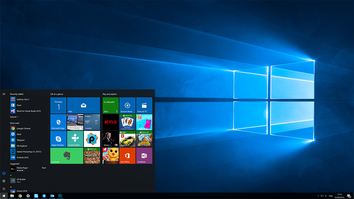
For traditional PCs, on the other hand, they are vestigial and tolerated at best, and intrusive and reviled at worst. When I talked to people about Windows 8 and Windows 8.1, most users I know talked about “hating the squares”. The most popular app in Windows 8 era was an app which reverted the Start Screen to the Windows 7 Start Menu, and Windows 10’s biggest hit feature was bringing the Start Menu back.
Yes, you can use live tiles on Windows 10 PCs and they are out of the way and not as rage-inducing as they were in Windows 8 now, but that doesn’t make them useful. If you keep in mind the main purpose of live tiles when introduced was to serve as a notification centre and app launcher combined, it becomes clear that they no longer do that well. In Windows 10 Live Tiles aren’t the best at notifying you – the Windows Action Center has that covered and is more useful. They also aren’t very good at launching apps either, for reasons mentioned above. In addition to that, both the taskbar and the desktop make better app launchers for the average user. With that in mind, what purpose do live tiles serve then?
An article elsewhere this weekend pointed out that Windows 10’s My People feature shows Microsoft recognising the folly of Start Menu tiles. Consider, My People essentially is Microsoft transplanting the deep pinning ability of The Windows 10 People app to from the Start Screen to the Windows taskbar. It is essentially recognising that deep pinning isn’t an effective way to get things done on PC, and is taking a more PC centric approach to the matter. That’s progress.
So perhaps, its time to move on. Live tiles have been fun while they lasted, but every product that has had it as a unique selling point has failed to attract users. They’re high maintenance for the users that love them, and most users actively hate them. This isn’t the first, second or third time live tiles have been critiqued by a tech writer, and it certainly won’t be the last. It’s time for Microsoft to quit while they’re behind and leave this contentious metaphor in the past.
Read our disclosure page to find out how can you help MSPoweruser sustain the editorial team Read more


Improve this guide


User forum
0 messages