How does Windows 10 improve the stock experience of Windows Phone? (Part 3: Store, Cortana and final thoughts)
9 min. read
Updated on
Read our disclosure page to find out how can you help MSPoweruser sustain the editorial team Read more
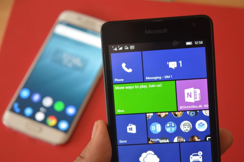
We’ve been taking a look at the Windows 10 mobile preview over the last few days and have gone over how some of the new features and apps have improved the Windows Phone OS. We’re now going to round this up with talking about Cortana, the new Windows store, the out of box experience and miscellaneous other aspects of the new OS.
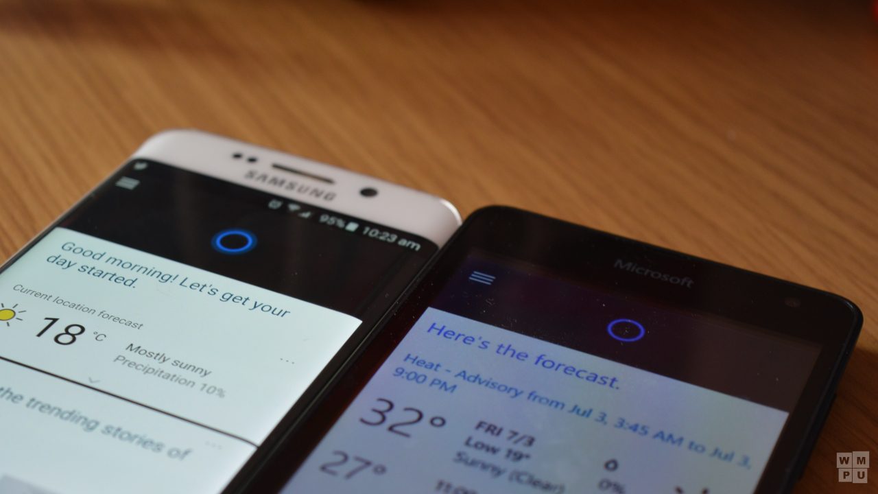
First, let’s start with Cortana. Cortana is one of the headlining features of Windows Phone 8.1. It was quite an integrated and useful feature for managing your daily life. In Windows 10 mobile, we have what I will call Cortana-In-Name-Only or Discount-Cortana. I’m aware that Windows 10 is currently in preview, but both Windows 10 and Windows 10 mobile provide an inferior experience to the Windows Phone 8.1 experience.
Let’s start with the home page. Windows Phone currently offers a way for users to customize their theme with either light, or dark theme. Windows 10 carries this functionality forward and Cortana – which used to respect this setting in Windows Phone 8.1, only respects this on a superficial level in Windows 10. Using Cortana in the dark theme gives you dark corners bordering content in blinding white light. This little inconsistency is an annoying UX inconsistency for many users if the feedback app is to be believed.
The bigger issue here is Cortana’s UX for everything else. Currently Cortana on Windows Phone 8.1(and Windows 8.1) is a built in app. It displays the Bing UI in a specialised UX for mobile allowing users to browse Bing content in a specialised environment with deep links to apps, sharing options and pinning facilities. Windows 10? It’s quite literally just Bing on Windows 10 and 10 Mobile. I would understand if this was limited to the mobile platform, but the desktop version is also “discount Cortana”.
Like I said about the People app and social integration, it feels tacked on, not built in. Microsoft is working on polish so I hope they pay attention to feedback like this.
Another thing about Cortana that irritates me is the absence of typed commands. Previously you were able to type commands as well as speak them, now the OS merely searches for 90% of all commands that would previously have been interpreted by the Cortana app.
I do hear the Cortana/Bing app change is done so Microsoft is able to push out features faster. It is quite embarrassing that Microsoft gets Bing features launched on the web, Android and iOS and not on Windows Phone, so they intend to remedy this by making the Windows Phone app provide a more similar experience to the web.
Unfortunately, the Bing app experience on Windows Phone at the moment is basically a web wrapper app. Its not a nice experience. For something that is so linked to Cortana, I’d hope Microsoft would work to provide at least an experience on par with Cortana Beta before release.
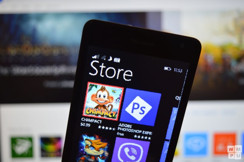
Next is the new Windows store. I’ve written about it in a more focused article about the content of the store earlier this week, now I’m looking at the app on a pure functional level.
First of all, it’s a bit slow if you were to look at it in a vacuum. Compared to the old Windows store, it is very very slow, and quite prone to errors. Once more, I’d excuse these errors if they were exclusive to the Windows Mobile version, but once again, the new Windows store on the desktop has these same issues. It is also comparatively featureless, we can’t see apps which get updated, we can’t see release notes, we can’t see when apps get updated and all that. Microsoft says they’ll fix this down the line but some features like remote app install and downloading of XAPs will no longer be possible again.
The philosophy behind the new store is an good one though. A one stop shop for apps, games, music and movies is similar to what the OS had 2 generations ago and is just as convenient as it was then.
In addition, Microsoft has fixed the store search, making it provide results that are more relevant to the search terms and even now sending up results for direct app matches.
Its hard to talk about Windows 10 mobile without talking about the new User Interface. When it first debuted, I was strongly against some aspects of the new UI, most especially the hamburger menu. My position on the hamburger menu hasn’t changed all too much. Its still an inelegant solution that replaces what I thought was an efficient system. However, as the hamburger menu is now a mobile UI standard, it can’t be helped. Microsoft’s universal app solution also necessitates an easily scalable UI for tablets, phones and large screen computers. This will provide a compromised solution for all parties involved if implemented incorrectly. Fortunately Microsoft and Audible (Only two SVs that have both Win10 and WM10 UAs) have developed unique UIs for mobile scenarios, so I’m hopeful that other vendors will follow their lead.
As for MDL2 in general, I have a love hate relationship with it. I like the UX/UI in places like the dialler, messaging etc, but I can’t help but feel that the new design has a long way to go before it matches the beautiful panoramic apps UI of Windows Phone 8.
The apps are quite stark and minimalistic, there’s still a Windows Phone flair about them, they do not resemble Android/iOS apps in anyway. The main difference between Windows 10 and 8 is that the former is more toned down. Whether that is a good thing or not depends on your perspective.
Miscellaneous, Microsoft has shipped a few new apps in Windows 10 that help improve the experience for first time users and veterans alike. I’m talking about the utility apps like Alarms and clock, file explorer and Edge and help apps like Contact Support and Getting Started.
A file manager and timer app have been requests on Windows Phone uservoice for a long time now, so Microsoft finally bringing File Explorer to Windows Phone (replacing files) is a good thing for many users. It also links in with the theme of “Do Familiar things” as there’s nothing more familiar to a Windows user than File explorer.
The new alarms and clock app is better than the old alarms app on WP8 in every single way. It has more features (what some would consider basic) like World clock, timer and stopwatch. After using the app it is hard to imagine that Windows Phone didn’t have these features built in for over 5 years.
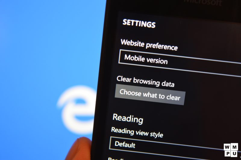
Speaking of built in features, the built in Internet explorer is now dead on Windows Phone and in a coma on Windows. Instead we have the shiny new browser, Microsoft Edge (which sometimes identifies as Internet Explorer 12 Mobile). Edge on Windows Phone isn’t quite feature complete yet, lacking a few things such as back/forward buttons, extensions support (coming soon), a fully immersive reading mode and a handful of other tiny features here and there.
That being said, the app is still functional, and what it does, it does well. It renders pages well (even the “evil” Google ones) and loads everything fast. It has a new hub feature for saving page URLS so you can catch up to long article later when you have time. It now has a downloads page so you can actually view what you are downloading on Edge.
Most importantly, the new Edge brand eliminates the “bad” IE brand, making it more palatable to your average user.
Finally, we come to the Getting started and Contact Support apps. Windows 10 is somewhat a departure from its predecessor (as well as its competitors), so some users may be confused on how to use the new OS upon updating. Microsoft’s new Getting Started app easily mitigates this for new users by explaining the basics of the OS in an easy to navigate, “idiot proof” app. If the app isn’t idiot proof enough and you still need help however, Microsoft now has a baked in Contact Support app that allows you to contact support on various issues quickly. This is a great idea and makes the new OS more user-friendly and nearly up to par with Apple’s iOS.
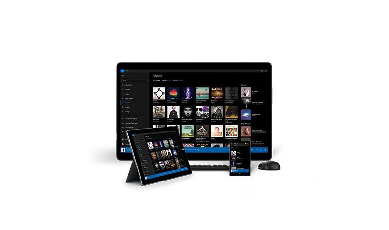
Final thoughts: I like Windows 10 mobile. I like it a lot. I admit, I did rip on it loose seams quite a bit and ignored some of the more positive aspects of it in this series, but that’s because the good parts are fine. Windows 10 has at most (going by previous pace of release) 3 builds till RTM. That’s 6 weeks to fix Cortana, the Windows store, bring Groove Music and Edge up to par and basically wow everyone when it debuts on the Talkman and Cityman Duo.
Even more importantly, it is going to be (like the Lumia 1520 and 1320) launched in direct competition with new Apple and Samsung products. If the OS cannot stand on its own compared to the mature iOS and Android on release without a “but”, then there would have been little point to this feedback exercise.
Overall, right now I think that Windows 10 Mobile has the potential to offer a solid experience, from here on out, its all in Microsoft’s hands to make sure that potential materialises.
Should you jump on the Insider Preview now?
Yes and no. The Insider preview has served me well on my 640, all my apps save one work and I’ve been able to peek into the future of Windows Phone without instantly longing for the past. This build is very stable and being worthy of being used as a daily driver, however if you’re still asking this question now, I’d recommend against it. Not because the build is buggy, but because Microsoft is going to release a new build on a new branch sometime in the next week, if you’ve waited this long, then a few more days wouldn’t hurt.


User forum
0 messages