Why Windows 10's asymmetrical cursor is better
2 min. read
Updated on
Read our disclosure page to find out how can you help MSPoweruser sustain the editorial team Read more
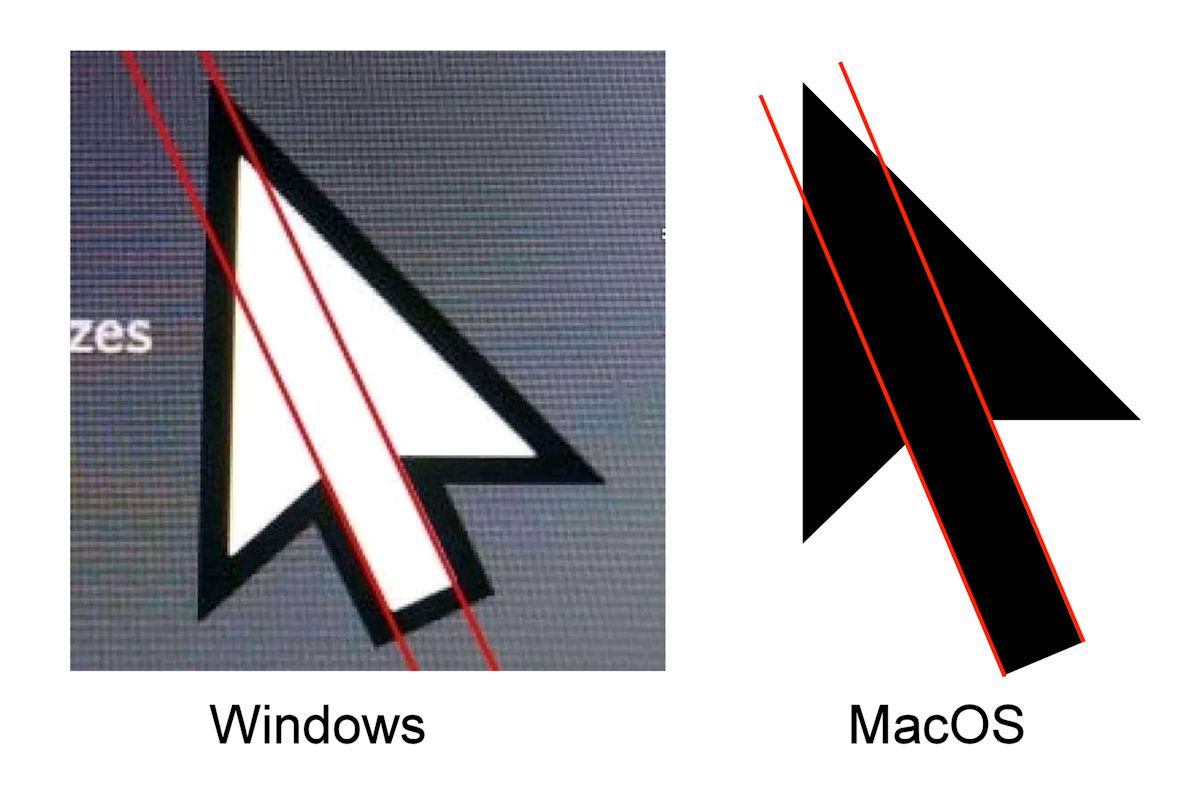
The last few days there has been an image doing the rounds decrying the asymmetrical appearance of the Windows 10 cursor, contrasting this with the arrow-straight appearance of the MacOS cursor.
Those complaining that the flaw can not be unseen may very well lack an appreciation of the motivation behind the obviously intentional design.
Thankfully Markus Dittrich on Reddit is here to educate us and explains that this is an example of optical balancing.
He notes that designers have to account for how the human eye works, and that symmetrical designs often do not look symmetrical at all.
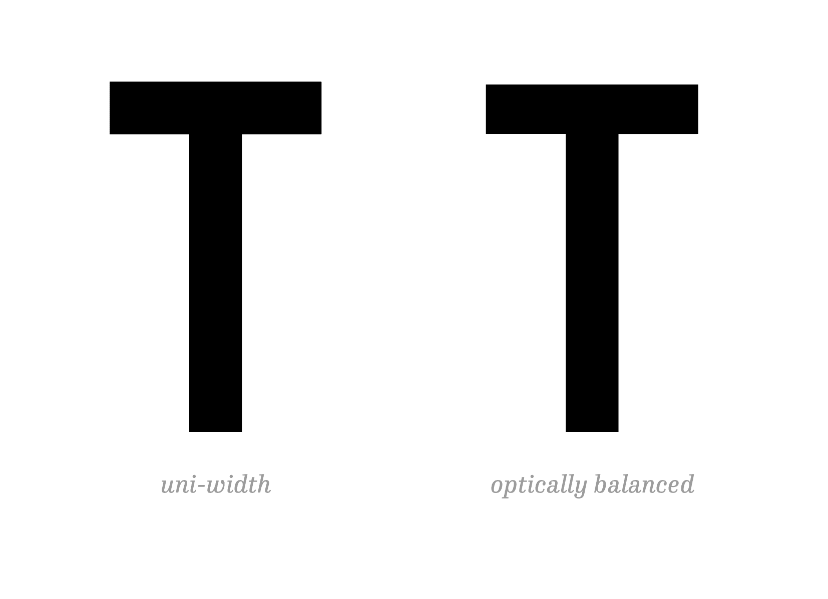
As an example, things on the horizontal axis often appear to be wider than they actually are. In the letter T above, for example, if both the horizontal and vertical lines have the same width, the horizontal line will appear “fatter” than the vertical line. An optically balanced design will, therefore, make the horizontal bar thinner to look symmetrical.
Another example is the optical center:


If you were to place an object right in the geometrical center of another object, it would actually look as if it were placed a bit too low. For it to look centered you’ll actually have to move it up a bit.
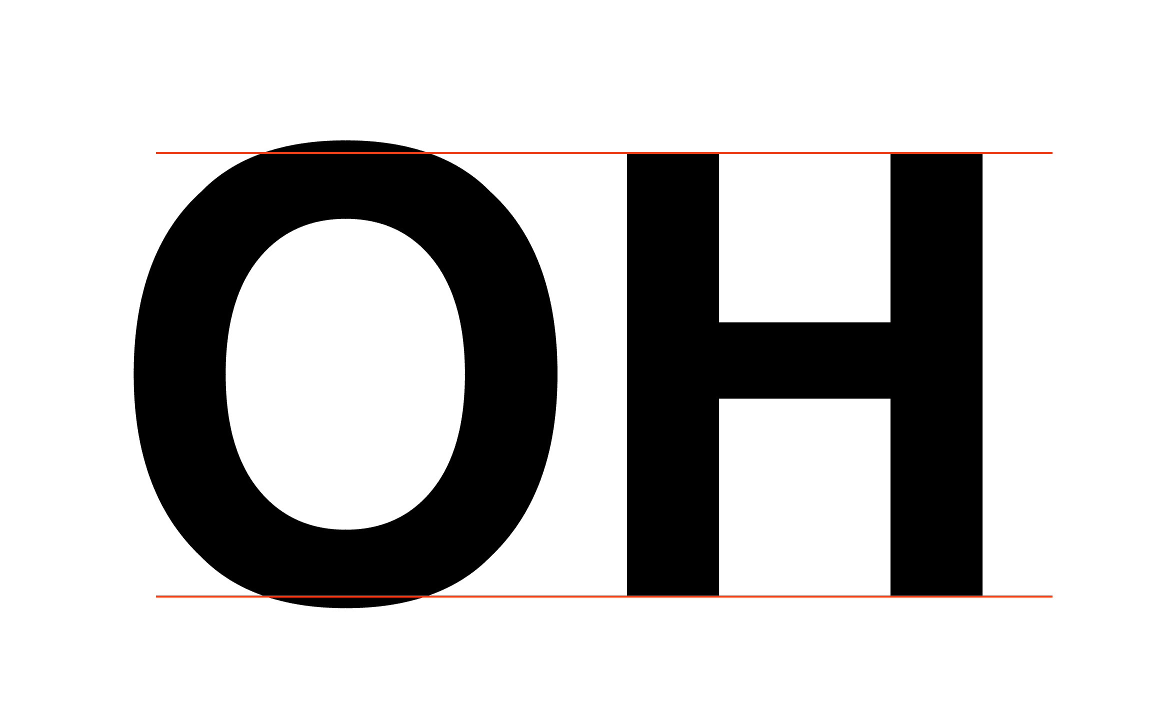
Another example is if you put a circle next to a square, the circle actually needs to be a bit bigger than the square in order for it to look like it is the same size.
Suffice to say that Microsoft designers know what they are doing. One would normally have said the same thing about Apple, but history suggests those days are long gone.




User forum
0 messages