WhatsApp Interface on Android is getting a new design, coming later in 2023
2 min. read
Updated on
Read our disclosure page to find out how can you help MSPoweruser sustain the editorial team Read more
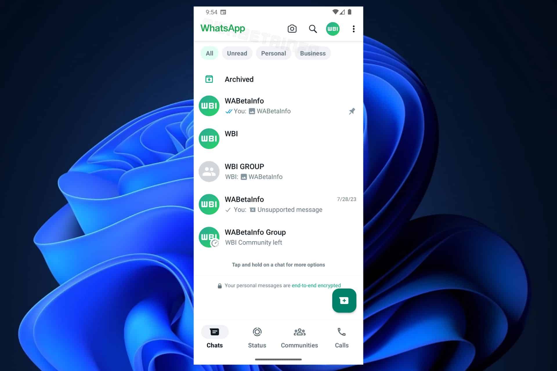
The WhatsApp interface on Android will debut a new design, most probably at the end of 2023. According to the latest blog entry in the WhatsApp Beta Channel, the new design is set to come on the Android version of WhatsApp, for now.
As you can see in the image above, WhatsApp will redesign its top app bar in white while making the logo text green. The status panel at the bottom is now white, too, and there are a lot of new tweaks here and there, including the label cells: all, unread, personal, and business.
The label cells will theoretically allow you to filter your conversations, so you can find them more easily. The design for them is slick, but it can be tricky, so WhatsApp would need to darken the color a bit, for us to be able to distinguish between them. As you can see, the green from the All cell is not so different than the gray on the unselected cells.
However, this is just a preview, and until it comes to the Beta Channel, the new WhatsApp interface on Android will suffer changes. The design is set to be released before the end of this year.
How do you like it?





User forum
0 messages