Users unhappy as Google rolls out new color scheme for Google Maps
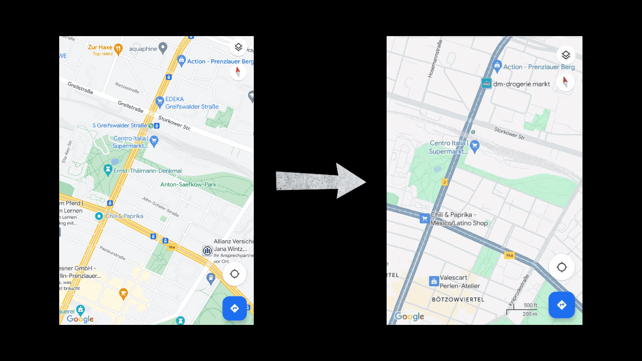
Google is rolling out a new color scheme for Google Maps, designed to make it easier for users to understand their surroundings while navigating. The new color palette consists of teal blue, mint green, and gray. It seems like we are using a completely different application.
The new color scheme is being rolled out slowly and is unavailable to all users. Twelve countries, including France, Germany, the UK, and the US, will receive the new color scheme first.
But as seen on the internet, users have expressed concerns that the new colors are too bright and that the old palette is more accurate. Many are hoping that the change is not permanent. Google says the new colors are meant to “reflect the real world even more accurately.”
What in the Rand McNally is with these dreary colors?!?! If I’m in a test, I’m saying now that this shouldn’t go out to everyone, @googlemaps! https://t.co/IQb3lETURF pic.twitter.com/06WRFahoqS
— Nathan Schimpf • also @mrschimpf everywhere else (@mrschimpf) November 14, 2023
Google has to continuously update Maps to improve everything from its functionality to UI as the company faces stiff competition from Apple Maps, which has its own app.
Google may have attempted to make its maps more accessible for colorblind and visually impaired individuals, but there is no official statement has been made by Google regarding this matter. However, if this feature is meant for them, there should have been an option to turn it on and off so that it does not affect others.
The new color scheme is just one of many recent updates to Google Maps. The company has recently announced that they plan to introduce AI in the app and other updates, which will soon inform you about transit station entrances, exits, and other details.
Read our disclosure page to find out how can you help MSPoweruser sustain the editorial team Read more


Improve this guide


User forum
0 messages