Users absolutely loving Google Messages’ redesigned profile UI
This month, Google Messages has been on a roll, adding new features such as noise cancellation for voice messages. With beta versions of Google Messages – messages.android_20231117_01_RCO0.phone.openbeta_dynamic, Google Message is working on changing the UI of the bottom chat bar and the profile page, as revealed by SPAndroid.
In the bottom chat bar where you type your text, the + button and gallery icon on the left change their positions and are now placed inside the input field layout. The smiley icon is taking the place of the + icon. Also, the voice message icon is being placed alone on the right.
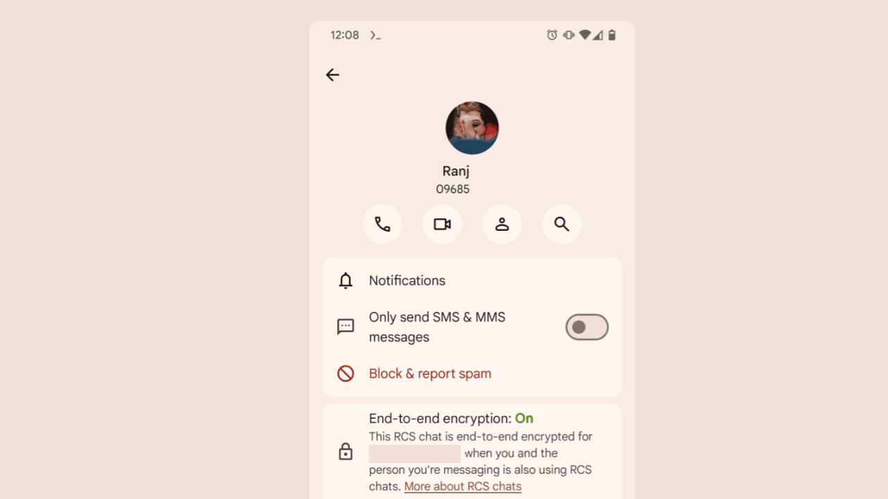
The Profile UI has changed completely from plain, boring texts and icons to new ones with material you theme and elements.
Users’ reactions to the changes have been overwhelmingly positive. Many take to social media to express their excitement about the new UI. “This is gorgeous,” one user commented on the Reddit post sharing this update. “I can’t wait to try it out!” Another user said, “The new design is so good. It makes me want to use Messages even more.”
Comment
byu/welp_im_damned from discussion
inAndroid
Comment
byu/welp_im_damned from discussion
inAndroid
These UI changes are currently hidden behind flags and may soon appear for beta testers.
Read our disclosure page to find out how can you help MSPoweruser sustain the editorial team Read more


Improve this guide

User forum
0 messages