The Xbox Live TV fall update misses the mark: Pt. 1
7 min. read
Published on
Read our disclosure page to find out how can you help MSPoweruser sustain the editorial team Read more
Disclaimer: This is an opinion piece, the thoughts of one person that may differ from yours.
The much anticipated Xbox Live fall update is upon us and most of the early reviews conclude that the experience will be a game changer. I tried to read and watch as many videos reviews as possible and last night, I installed the update to experience first hand if the hype matched the reality. I really wanted to like it but in the end, I felt let down. I am puzzled by the rave reviews from even some of Microsoft’s most ardent critics. Its ironic how the one instance that I think they should have been bashed a little for, they got accolades instead.
I’ll start with a little background. For all the technical abilities and knowledge I have acquired over the years, I never was blessed with fast thumbs or the abstract thinking required to play hardcore games. In other words, I have never been or ever will be a gamer per se. I instead prefer to watch and cheer on my friends while they blow up people on COD or score a touchdown on Madden. I once had a 7 year old promise to take it easy on me on Tekken so that we could keep on playing when he saw the frustration painted on my face after losing to him a few too many times!
The point I’m trying make is that I evaluated the new features from the perspective of a non gamer and the one multimedia device to conquer the living room which the fall update was supposed to usher in.
The Dashboard and Live TV
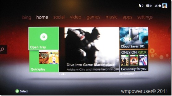
For those of you who own and have used an Xbox in the past, you might welcome this change and hail it as Microsoft’s advance towards unification of the user interface via the Metro design principles which in itself is a great endeavor. The problem is that the Metro stuff only forms a thin veneer that masks the ugly interface and usability problems present when you get deeper into the system. Move beyond the top menu and you realize that almost everything is siloed into distinct apps that feel disconnected from each other. For a company that has been trying and doing a good job to move away from apps to integrated experiences with Windows Phone 7, this is not only disappointing but also 100 steps backwards. A quick example of which I’ll delve into deeper later. Scroll over to the Music tab and the nested mess come to the forefront. Try to play a song locally available on your network. You are presented with a screen with My Music Apps, Zune Music Marketplace and the rest of the screen, (majority of it) consists of ads from the Zune service. What should door should you pick? Open door one (My Music Apps) and now you get the options for Music player, Zune Music and an option to purchase or find more apps from the App market place! Who designed this stuff? It even gets worse so keep on reading.
Now back to the first screen.Take a moment to think about the audience that the new dashboard is supposed to attract. People looking replace their cable boxes with the Xbox. Compare what shows up on your screen the moment you turn on your cable/satellite box to the dashboard.The latter fails right off the bat! Most casual users I contend would want to see the last channel they watched playing on their screen. The beauty of the current TV technology warts and all, is the immediate availability and seamless switching between channels without having to dig into “apps” But can’t you just search for the program you want? Well unfortunately, typical Microsoft fashion, they launched without most of the content they promised so the pickings are quite slim.
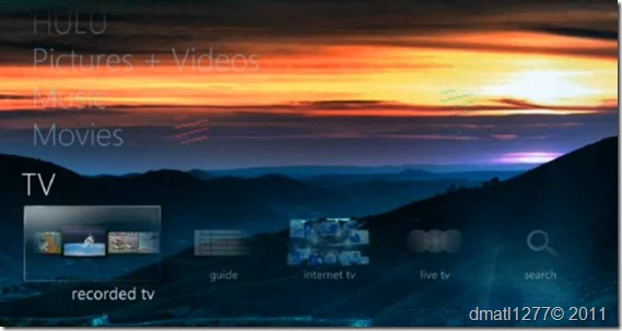
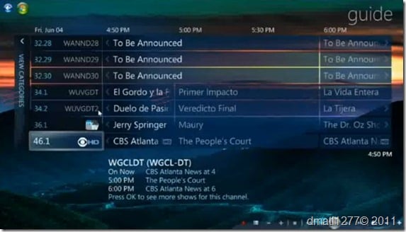
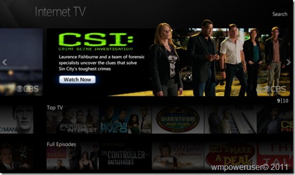
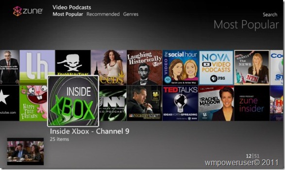
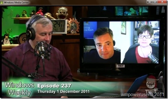
A question now arises. How is it that small companies like Roku, Boxee and even Western Digital, a hard drive company, can have so much content on their boxes but not the tech behemoth from Redmond? At the very least, video podcasts from my favorite tech shows like Paul Thurrott’s Windows Weekly, Tekzilla or Twit Live. It may come as a surprise to you but Microsoft has a lot of that content already accessible via their rarely used but excellent application, Windows Media center’s Internet TV. Not only that, you can add a TV turner in the form of a USB adapter, PC card or a network turner like SiliconDust’s HD Homerun connected to an external antenna for free over the air content. Why Microsoft did not include any of this technology on the Xbox still puzzles me! Below are some images.
Windows Media Center TV tab
Windows Media Center Live Over the Air TV guide
Windows Media Center Internet TV guide
Windows Media Center Internet TV main
WMC top rated movies from Netflix
WMC Zune Video podcasts
WMC Windows Weekly Video podcast
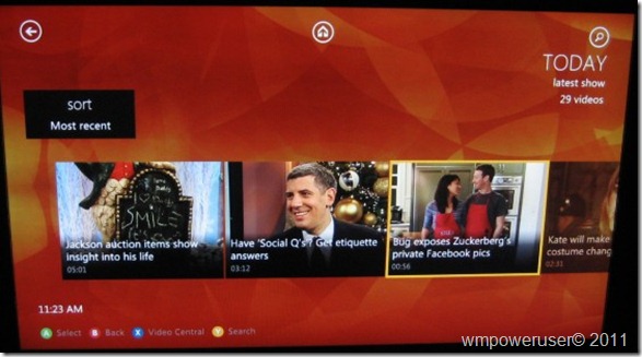
We can then establish that there is content currently available that somehow Microsoft chose not include. Lets now move on to the apps that are included with the system.Take the Today Show for example.
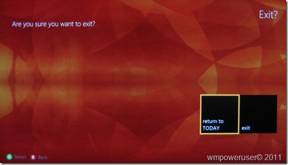
First you will be prompted to download the app. Then you have to go find it in the “apps” tab. I don’t believe you can watch a live show yet, but I stand to be corrected. Click on a video and it starts playing. Now press on the back button. The clip stops and goes back to the previous screen. Unfortunately, your place on the clip is not saved so when you go back to it, you have to start all over again. Press the back button again and you will be met by the following screen.
You will soon come to despise this screen because it appears in various forms on all apps during the process of attempting to go back to the main dashboard. Using voice control doesn’t save you from the prompts either. It is a poor navigational element that just doesn’t work for multimedia and gets annoying pretty quickly. Oddly enough, Windows phone 7.5 just implemented a fast app switching and resume mechanism that would have worked perfectly in this scenario. One gets the feeling that all these apps are poorly bolted onto the main dashboard in that even the native Zune app and Video Kinect give you similar prompts!
Additionally, I prefer Windows Media Center’s method of utilizing the full screen to present multimedia content in an X and Y axis on the TV tab than does the Xbox 360. I think it’s a mistake to force the Metro interface using only the middle part of the screen for navigating video content like on the new dashboard. It results in an excruciatingly long horizontal scrolling list when hundreds of items are present.
Testing out voice control using Kinect, the device did an excellent job picking up my voice. However, after playing around with it for a little while, I contend that a remote would be faster or at least more comfortable for some uses. I got tired of barking every command to navigate the screen. I can see using it for playback control more than anything else. Where I also found voice control effective was for general content search. What would make it even better would be additional categories for results based on my favorites and one curated from my friends’ likes on Facebook, Zune, Spotify and so forth.
The voice option does help in narrowing down content, but having a channel guide, especially a user customizable one, would be complementary and go a long way in aiding the users to find stuff to watch, play or listen to more easily.






User forum
0 messages