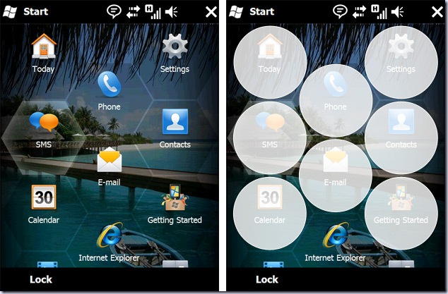
The Windows Mobile 6.5 honeycomb explained
1 min. read
Published on
Read our disclosure page to find out how can you help MSPoweruser sustain the editorial team Read more

Long Zheng, from the istartedsomething blog and regular leaker of Windows news, has taken it upon himself to explain why the new Windows Mobile start menu is made of hexagonal cells.
The hexagonal design has been met by derision by many, but Long explains that this design is in fact the best way to maximize the surface area available to touch each icon while at the same time maximizing the number of icons on the screen. While 9 icons could have been in screen instead of 8 if a grid was used, our fingers are not square-shaped, and accidental mis-pressed would be more common.
We of course have mentioned the same thing in our podcasts, and agree with Long’s closing line:
So the next time you see something new and shiny from Microsoft, before you dismiss it for a poor clone of an existing product or idea, just remember there might be a possibility, the slightest possibility, that some thought and reasoning is behind the decision.
Read the full blog post at istartedsomething.com, which includes a more detailed explanation and more graphics.


User forum
0 messages