The Guardian's Second Screen web app has more than a bit of Modern UI about it
![]() 1 min. read
1 min. read
![]() Published on
Published on
Share this article
Improve this guide
Read our disclosure page to find out how can you help MSPoweruser sustain the editorial team Read more

Whether other designers are inspired by the UI design that used to be called Metro, or whether Microsoft just caught the spirit of the moment, it is certainly undeniable that the Metro ethos of content speaking for itself, with as little unnecessary adornment as possible, all support by a fast and fluid engine, is popping up all over the place.
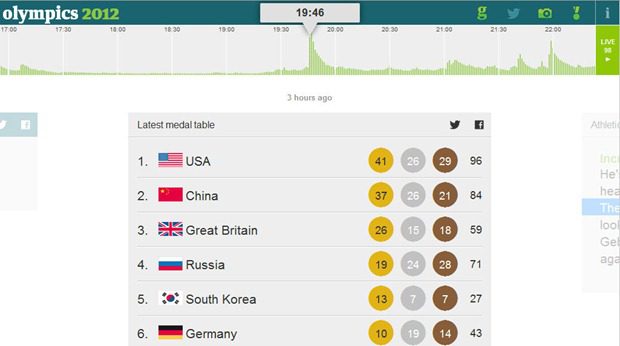
The latest noticed by a reader is the Guardian’s Second screen web app, a web destination for Android tablet, iPad and desktop which brings all manner of Olympics-related news together in one, rolling stream – easily navigable via a beautiful, sliding interface.
The web app receives updates from live blog posts, tweets, pictures, and results, all in a panorama-like horizontal-sliding user interface, while allowing users to select dates and times with a smooth slider.
With all the hullabaloo about the name of the user interface, there is little doubt the paradigms underlying the UI will become more influential as time goes on, especially when it starts showing up on hundreds of millions of desktops in the next year or two.
See the Guardian’s Second Screen here.
Thanks Oliver for the tip.
User forum
0 messages