Spotify for Windows 10 goes borderless in UI update
Spotify for Windows 10 has been updated int he Windows Store, with an update to the user interface.
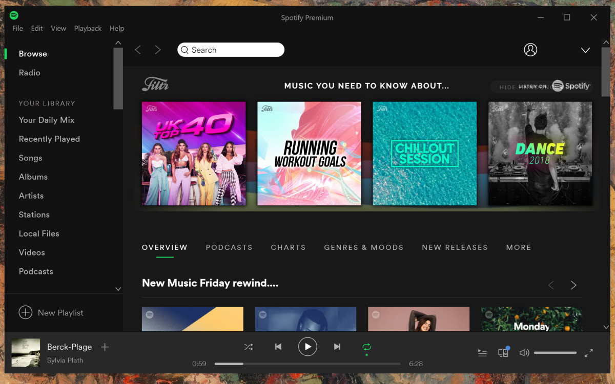
The firm has now made the app more touch-friendly, and removed the top bar, shifting all controls like search and the profile button into the space where the top button used to be.
For tablet mode, the app now fills the entire screen, appearing a little more touch friendly than its previous incarnation — though not so much so as to make a dedicated tablet app redundant.
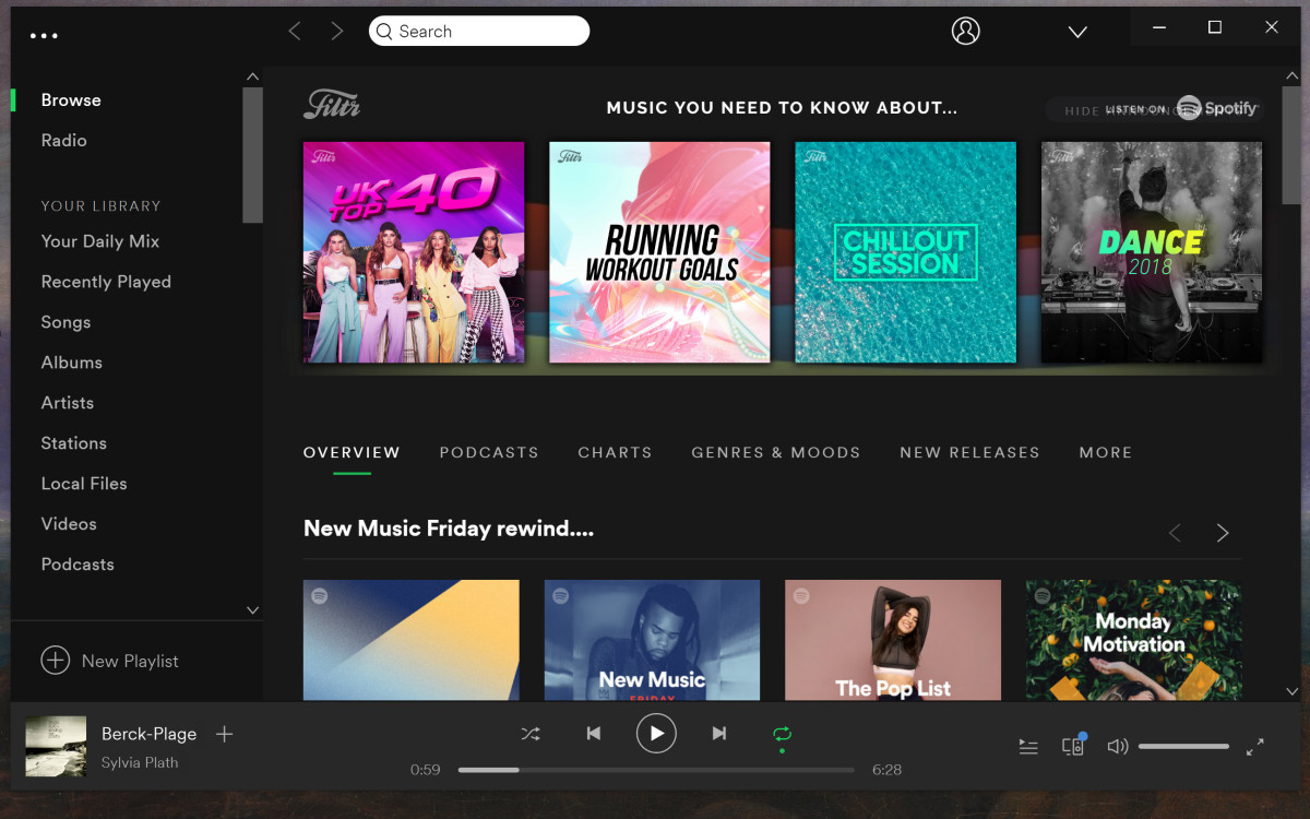
For reference, here’s what Spotify looked like before, the title image is what the app looks like now.
Its worth noting that, unlike Groove and other UWP apps, Spotify is actually better at being borderless since it lacks the 1px border that UWP Windows Store apps often have.
You can download Spotify for Windows 10 from the Store link here.
[appbox windowsstore 9ncbcszsjrsb]
Thanks for the tip, Yaswin
Read our disclosure page to find out how can you help MSPoweruser sustain the editorial team Read more


Improve this guide

User forum
0 messages