The sad, abandoned state of Tablet Mode on Windows 10
5 min. read
Published on
Read our disclosure page to find out how can you help MSPoweruser sustain the editorial team Read more

Microsoft’s Windows 10 is an operating system that powers devices ranging from phones to consoles to tablets to laptops. While it has been argued before that an operating system that tries to do too much will inevitably be mediocre at most things, Microsoft touts Windows 10 as an example. Indeed, the best selling device that the firm puts out hardware wise is the Surface Pro hybrid device which is by all accounts a tablet-focused device.
When all is said and done, however, there’s no denying that Microsoft has left the Windows 10 tablet mode in a dire state, and there’s no sign of that changing in the near future.
Tablet mode in Windows 10 was introduced with Continuum, the term Microsoft coined for their software which enables multi-modal devices. The Surface Pro, for example, would be a multi-modal device, being able to swap between a tablet form-factor and the more conventional laptop-like design.
Continuum would provide the best experience for with the user depending on which mode they were currently running. Windows 10 users using desktops would, for instance, get the traditional desktop interface with windowed apps, file explorer and more. For tablet mode users, a full-screen Start Screen, full-screen apps, and larger buttons would transform that desktop experience into a tablet experience.
“Tablet mode gives customers the flexibility to use their device in a way that is most comfortable for them. For example, a customer might want to use their 8” tablet in “tablet mode” exclusively until they dock it to an external monitor, mouse, and keyboard.” Microsoft tells OEMs.
Tablet Mode has not lived up to its promise over the years, and still remains a significant downgrade over the Windows 8 and 8.1 tablet experience.
The Start Screen is the home-screen of the Windows 10 tablet mode and is the first point of contact for every tablet user when they launch their device. With Windows 10, Microsoft’s lack of attention is a harbinger of what you can expect from the rest of tablet mode.
Take folders for instance. On any other platform, the implementation of folders would naturally mean that you could name those folders — as folders are inherently a form of categorization. It would have been absurd to imagine a software maker shipping an app folder feature for its operating system, but deny users the ability to name them.
Yet, that is what Microsoft has done with Windows 10’s Start Screen. It is a perplexing omission, considering that Microsoft managed to implement the feature on its very first release with the Windows Phone 8.1 Update. Perhaps one could offer them the benefit of the doubt, but the operating system is in the process of receiving another major update, and Microsoft has done nothing to improve the start experience save a transition to acrylic.
A more egregious and disconcerting example occurs when one unpins all the apps from the Start Screen/Menu. Naturally, one would assume that with the Start Screen empty, the natural screen to bring up when Start is invoked is the App list. Not so with Windows 10’s brilliant design.
Pressing the Start button in tablet mode with a blank start screen will take you to a blank screen every time. As with folders, Microsoft has figured out how this should work with Windows Phone. As with folders, the firm has not cared enough to implement it into “big” Windows.
With Windows 8.1, Microsoft transitioned the navigation system of Windows from a button based one, to a very swipe heavy UX. Users would swipe from the left to multitask, and swipe from the right to access the “Charms” menu.
With Windows 10, while you can still swipe into taskview, and the action centre, Microsoft still prioritises buttons over swipe gestures, another indication of its renewed desktop focus.
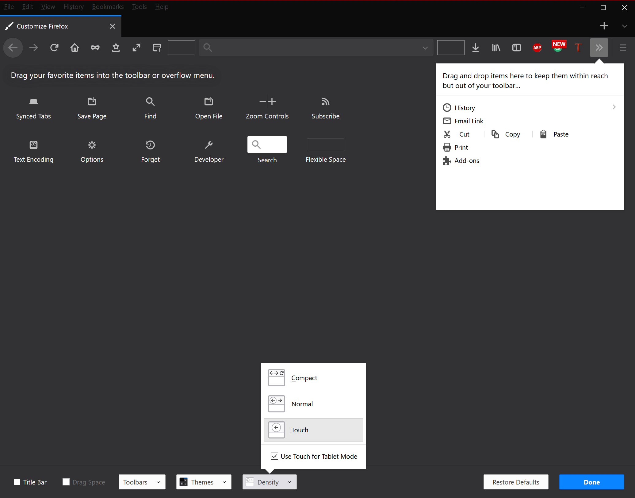
Built in apps like Edge which had a previously touch-focused counterpart, have been revamped so much so as to nearly almost disregard touch users. Using Edge on the Spring 2018 Update preview, I could not help but notice that Firefox’s Touch Mode was now slightly more touch-optimized than Edge itself.
Edge is but a symptom, as the Microsoft Store has grown, it has transitioned from a place where users could find touch-focused apps to where the best and brightest apps are warmed-over and repackaged classic Windows apps like Office, Spotify, and Photoshop. With fewer and fewer tablet apps and features, one wonders what Microsoft wants.
For Microsoft, Windows 10 has been optimised to straddle a balance between mobile devices and PCs. While a well-meaning goal, the pendulum swung far too backwards from Windows 8.1.
Microsoft has not been able to find the balance between too much tablet, and too much desktop, and has swung from one extreme to the other. The firm would be advised to ditch tablet mode altogether, but with the lack of Windows 10 tablet-focused apps, and the growing death of the tablet market altogether, it would be more reasonable to conclude that Microsoft simply finds no reason to improve on tablet mode.
Yet, despite that, Microsoft continues selling expensive tablets, and OEMs are encouraged to make variations on those expensive tablets. If rumours are to be believed, Microsoft is making a foldable tablet cum smartphone for release later this year, if the tablet mode experience is to be left in this state, it need not bother.


User forum
0 messages