A quick look at Windows 10 technical preview on the Lumia 830

Yesterday Microsoft released the first build of Windows 10 for phones for Windows insiders. It is a very early build and there is so much not included yet, but one can very well see where Windows (Phone) is going.
While the Windows technical preview unfortunately runs on very few devices only, we asked Microsoft whether it would be alright if I install it on the Lumia 830 trial device we have here. As you probably already have guessed they allowed us installing the latest version of Windows on the phone, and in the last hours we were very busy trying things out.
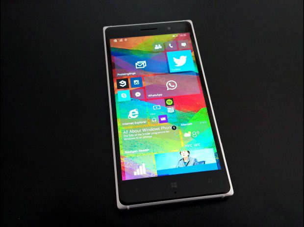
The for me biggest change is the UI. The new startscreen looks amazing (with the right wallpaper, of course) and the design which Windows Phone is getting looks nice, too. I still do not like the hamburger menus and I think Microsoft should use them only when absolutely necessary (like in the calendar), as well as put the hamburger button to the bottom rather than to the top, but in general I like where the design is going.
Pivots are no longer text only but square buttons with icons and text. To me this looks much better, but Microsoft should keep the swipe UI, so the user does not need to press the icons and can swipe through the pivots as always. Also in most apps, except the picture gallery, MS kept the grey option menu with circled icons. I think this is the best design for this UI element and it seems like Microsoft is sticking with it.
In this early build the UI is very inconsistent. Not all apps have been updated (which means they still have the Windows Phone 8.1 design) and even when they got a refresh there are some differences, but as always: Things will change. The good news, however, is that the back button behavior improved and boot screens have been abandoned. Now every app (even 3rd party 8.1 apps!) will close when the back button is pressed rather than just minimize and open without a boot screen.
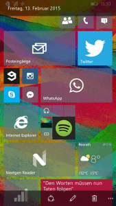
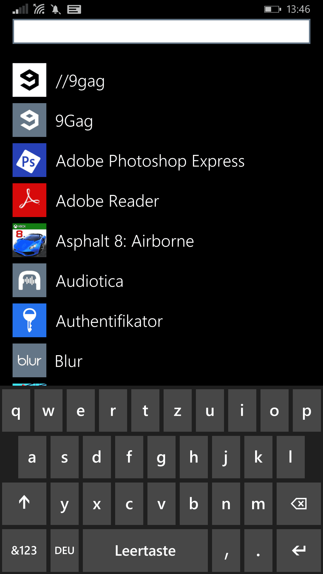
I like how Microsoft added a bit of transparency to the app list with the start screen background being darkened and behind the app list. I hope this kind of transparency will be implanted into other apps as well as it looks modern yet minimalistic.Another new UI change is the keyboard. It has different shades of grey (not 50, though) than before, different fonts, new animations and in general looks not only more modern and better to me, but also more minimalistic. Microsoft is really sticking with its modern design language and improving it, which is very welcomed.
 |
 |
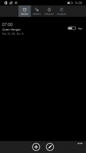
The 8.1 keyboard for comparison
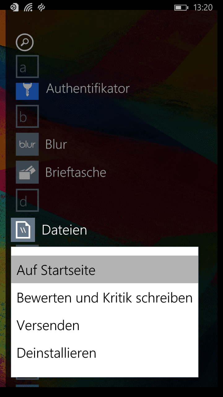
Another big change is the new settings app. It does not only look better but also cleaner, however only on the first look. Inside the several categories the list can still be quite long, and also illogical. For example the keyboard (the onscreen keyboard, no Bluetooth device) is found under devices and Lumia-exclusive settings like display are found inside the Extras folder rather than under display, where they would make much more sense.
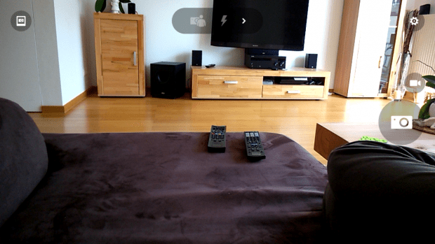
The stock camera app has also been updated. It is now exactly the same as Lumia camera only with three differences: The pictures icon in the upper left corner now links to the new gallery app, it does not support living images and it does not support rich capture. The latter will probably change when the final version of Windows 10 is being rolled out to phones along a new firmware update, so do not hope for this to come back in the next few preview releases.
The new notifications in Windows 10 are certainly a very welcomed update. However, so far not really much apps have access to that. They now have to be swiped up to be hid and in the notification center even single notifications in groups can be swiped away. The action center can now display 12 quick access icons.
In terms of performance this build is both good and bad. Scrolling and animations are quite slow and laggy, but even heavy universal apps like the picture gallery open quite quickly. There is room for improvements left of course, but we are not looking at a finished product.
So, would I recommend installing this build? Not on your main device, the user experience is just too messy, laggy and slow just yet. On your secondary device however trying out the new features of Windows 10 can be fun, and since Microsoft really needs your feedback, the more people use Windows 10 technical preview for phones the better.
Read our disclosure page to find out how can you help MSPoweruser sustain the editorial team Read more


Improve this guide

User forum
0 messages