Poll results: Circles vs Squares
2 min. read
Updated on
Read our disclosure page to find out how can you help MSPoweruser sustain the editorial team Read more
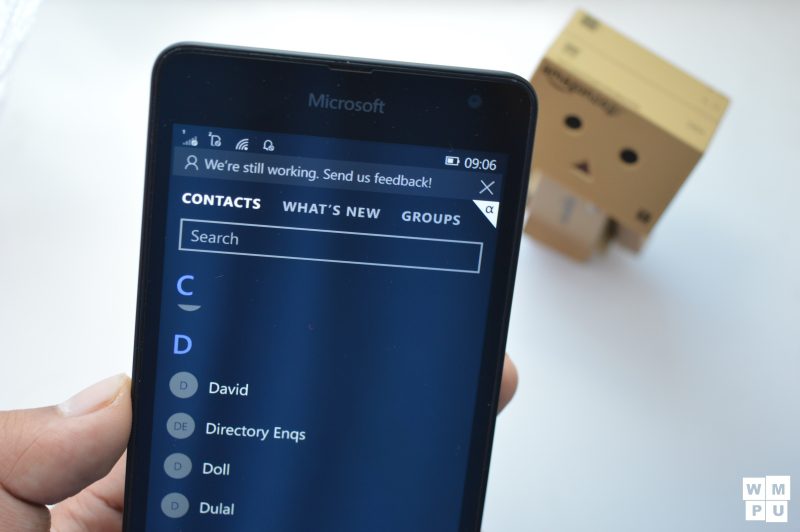
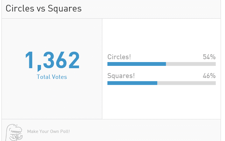
Last week we held a discussion on the preference of our readers on the topic of circles vs squares in Windows 10 mobile.
To provide a background, the Windows Mobile OS had introduced the concept of circles to represent people in the Windows Phone OS in all apps, most apparently People, Messaging, Music and Mail. Several users across different sites reacted with extreme backlash, hating the circles for a variety of reasons. To quantify this, we held a poll on the site last weekend to quantify how many preferred circles over squares, and the results are surprising.
From reading the comments, one would imagine that only a few people would prefer circles over squares and yet the votes don’t bear that out with Circles leading at 54% and squares getting 46% of the votes. While it is close, the results are clear, the majority of readers prefer the new circles to the squares of Windows Phone 8.1.
Circles are a new part of modern 2.0 design, along with the hamburger menu (non-swipeable), and they won’t be going away any time soon. As we can see from the poll and several others like this, enough people like it that Microsoft is justified in moving forward with this new UI paradigm.
Change is hard, and unlike the hamburger menu the circles don’t actually negatively impact the experience, personally I don’t see any reason not to go with circles.
Why do you prefer circles over squares? Let us know in the comments below



User forum
0 messages