OnePlus details what went into the making of new OxygenOS 11 design
2 min. read
Published on
Read our disclosure page to find out how can you help MSPoweruser sustain the editorial team Read more
OnePlus recently released the OxygenOS 11 Developer Preview 3 update, giving us a glimpse of some of the design changes that are coming to its upcoming OS update. Now, in its community post, OnePlus explains what went into the making of the new OxygenOS 11 design.
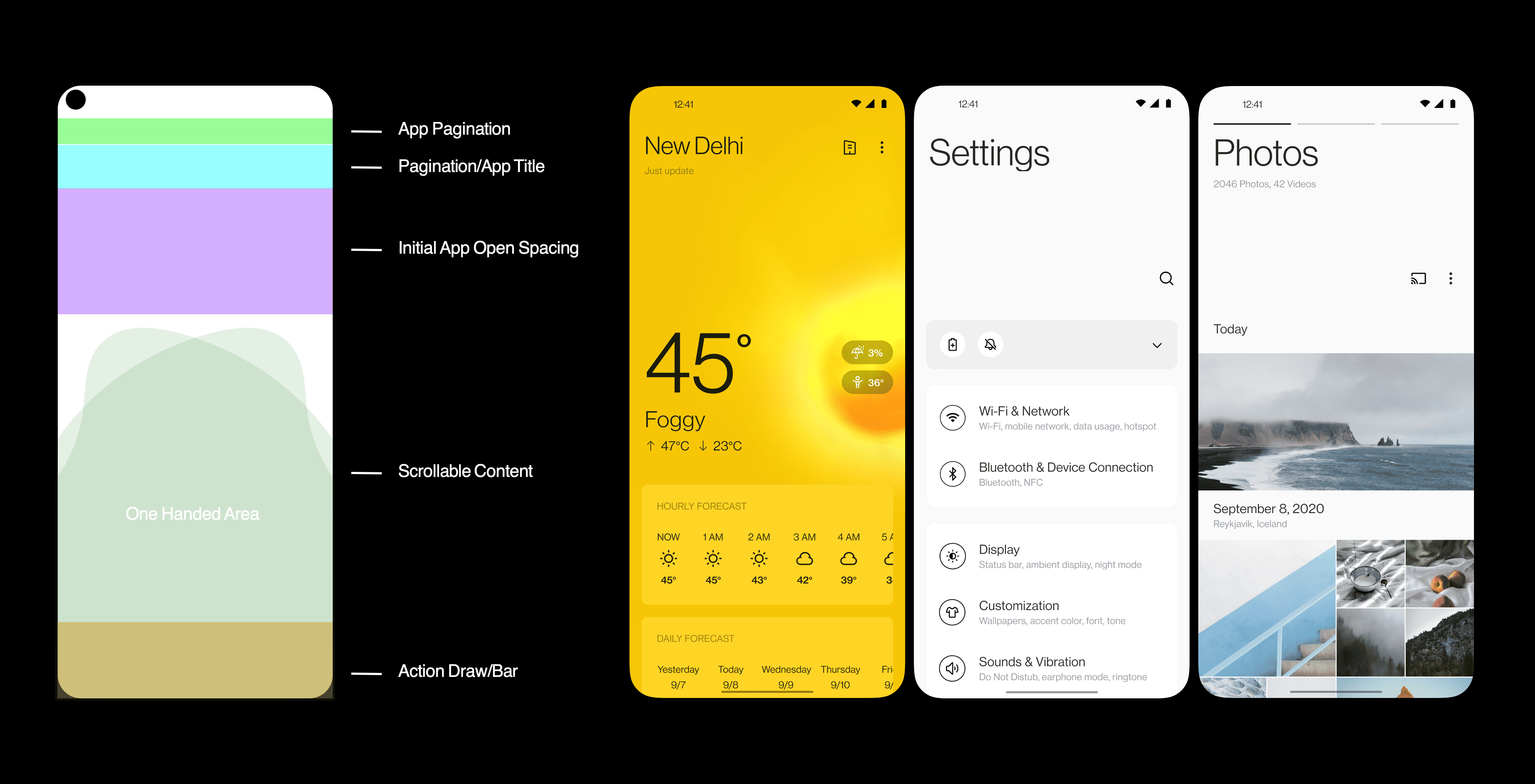
Highlighting that the Stock Android is a good starting point, the company says that the overall Android experience can further be improved and one of the ways to do that is by listening to the user feedback. The company post then further explains how OnePlus is making the most of the unused white space while keeping the interface easy to use. The company claims to have conducted A/B testing with the users — 65% of users prefer slightly smaller headlines, and 80% of users preferred titles with subtitles. The result: a new headline-body hierarchy that streamlines information delivery in OxygenOS 11.
The company also made changes to the Contacts interface based on the user suggestions. It changed the line tab navigation to bottom navigation so that users can more intuitively switch to other menus in Contacts with just a glimpse at the icons.
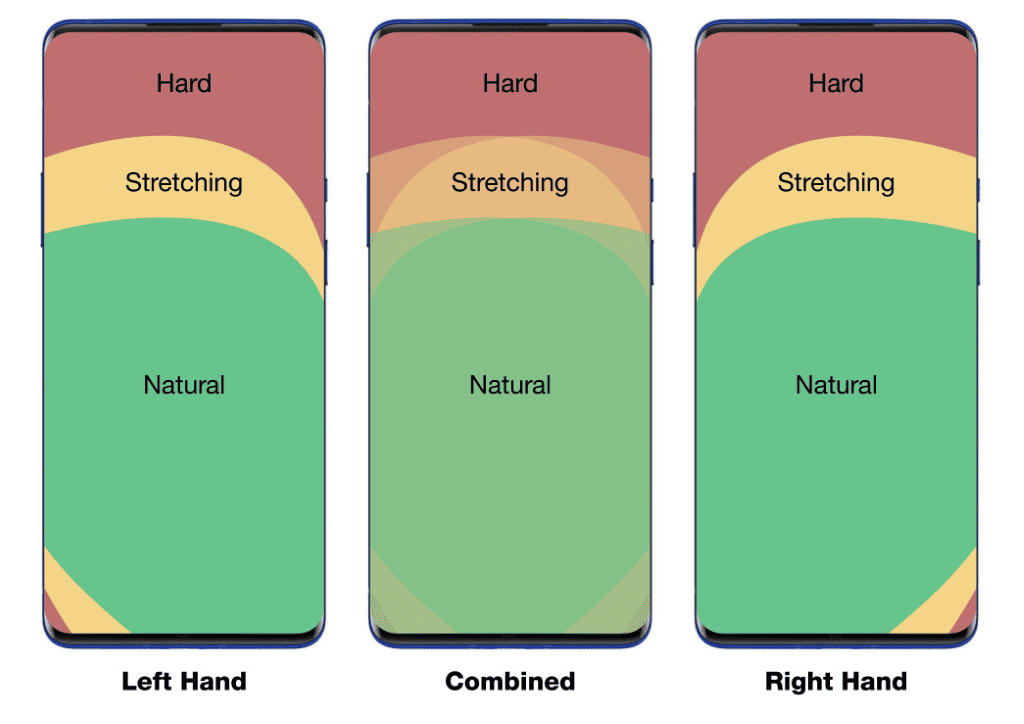
The company then goes on to talk about how it used anthropometric data to design a UI that is more comfortable for one-handed use. As a result of this, you’ll get touch controls closer to your thumbs for easier access as soon as you open a menu in OxygenOS 11.
OnePlus has already developed a thriving community and the company is taking full advantage of it. A months ago, the company had invited OnePlus community members to share their ideas about ways to improve the OxygenOS. After listenning to the user feedback, the Shenzhen-based company announced a list of the most requested features by its community memebers and promised to add the requested featrures in OxygenOS 11.





User forum
0 messages