OneDrive gets a "simpler" sharing experience on the Web
2 min. read
Published on
Read our disclosure page to find out how can you help MSPoweruser sustain the editorial team Read more
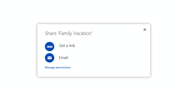
Microsoft is releasing a “simpler” sharing experience for OneDrive.com today. The company has been apparently testing the new sharing experience with more than 25 thousand real-world users, and it reportedly resulted in more users sharing more stuff more often than the previous sharing experience. So, what’s new in the new sharing experience?
Microsoft says the company now shows the two most popular options for sharing which are easy to see and interact with. The company stated that the new experience is “in a word, simple.”
Previously, when you clicked “Share,” we presented you with the option to either “Invite people” or “Get a link.” The majority of people just wanted to get a link, but that wasn’t the default choice. When you selected “Get a link,” we also offered a number of ways to customize that link and restrict access. This resulted in a lot of confusion and broken links, and most of these options were used less than 0.01% of the time. We wanted to do better.
The new experience is, in a word, simple. We show the two most popular options for sharing right up front with big blue buttons that are easy to see and easy to hit. We use terms that are understandable to a wider range of users. We optimized for the common cases and present the rarely used options in less distracting ways. Basically, it’s not as messy.
It is interesting to see how Microsoft is making sure its services offer a good user interface which allows the company to provide a better user experience. Of course, the latest update for the sharing experience isn’t a major change, but it’s definitely a better experience the previous sharing experience and should allow users to share things pretty quickly.
What do you think of the new OneDrive.com sharing experience? Discuss in the comment section below.





User forum
6 messages