New Action Center concept shows off a desktop focused interface
![]() 2 min. read
2 min. read
![]() Updated on
Updated on
Share this article
Improve this guide
Read our disclosure page to find out how can you help MSPoweruser sustain the editorial team Read more
With Windows 10, Microsoft introduced the concept of the Action Center to the desktop, an all in one hub which acted as a place to access your notifications and various quick actions.
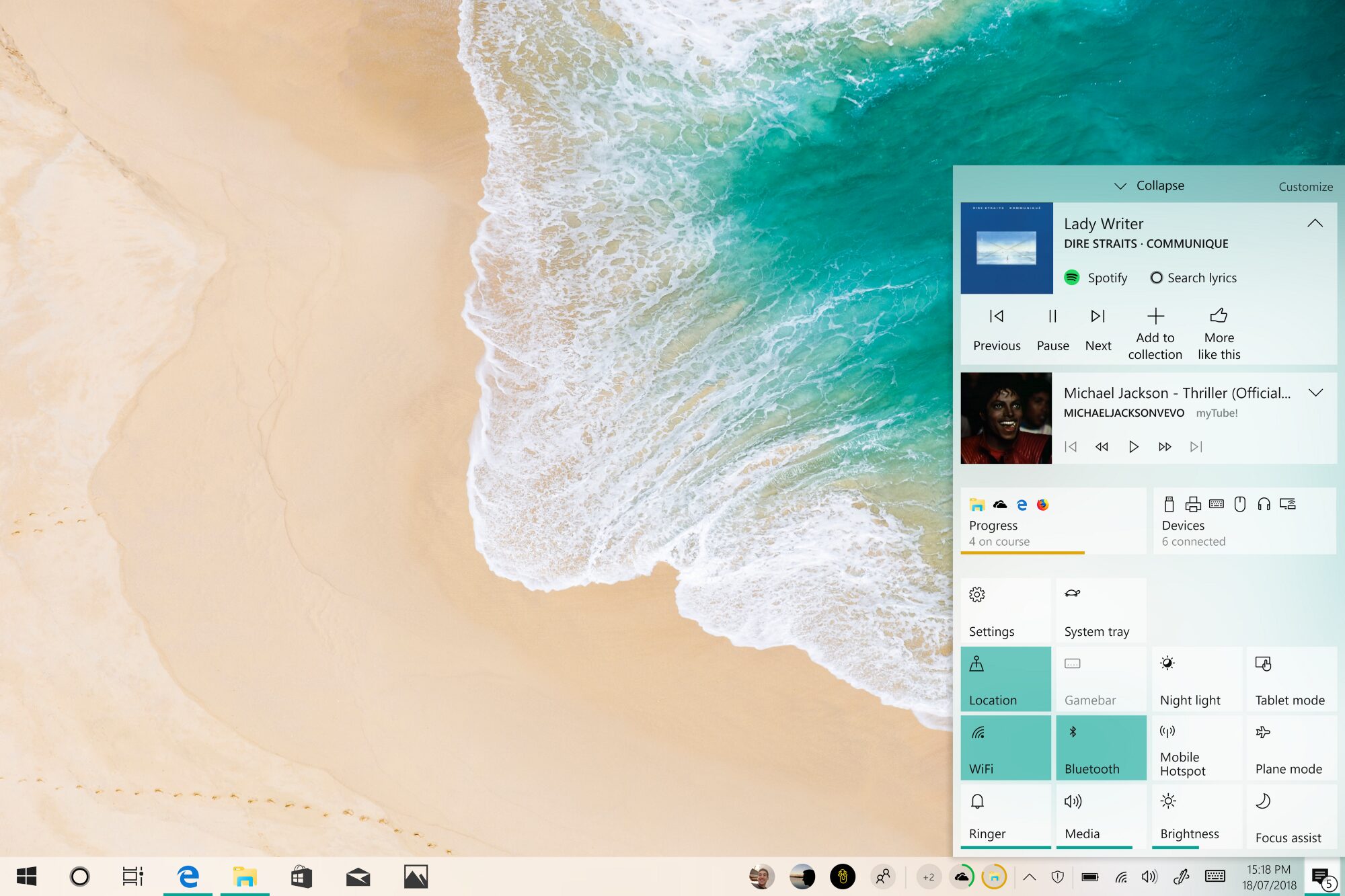
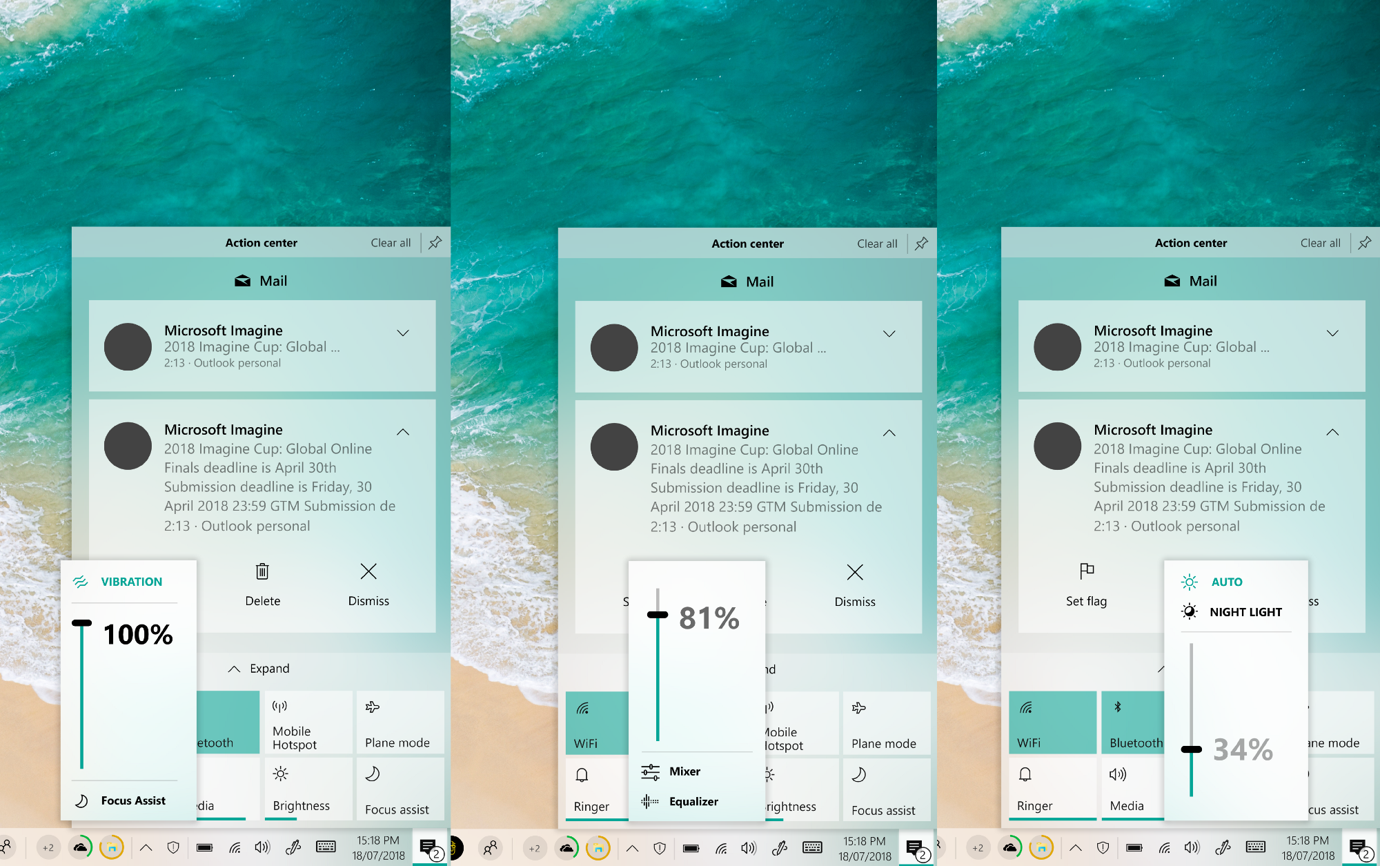
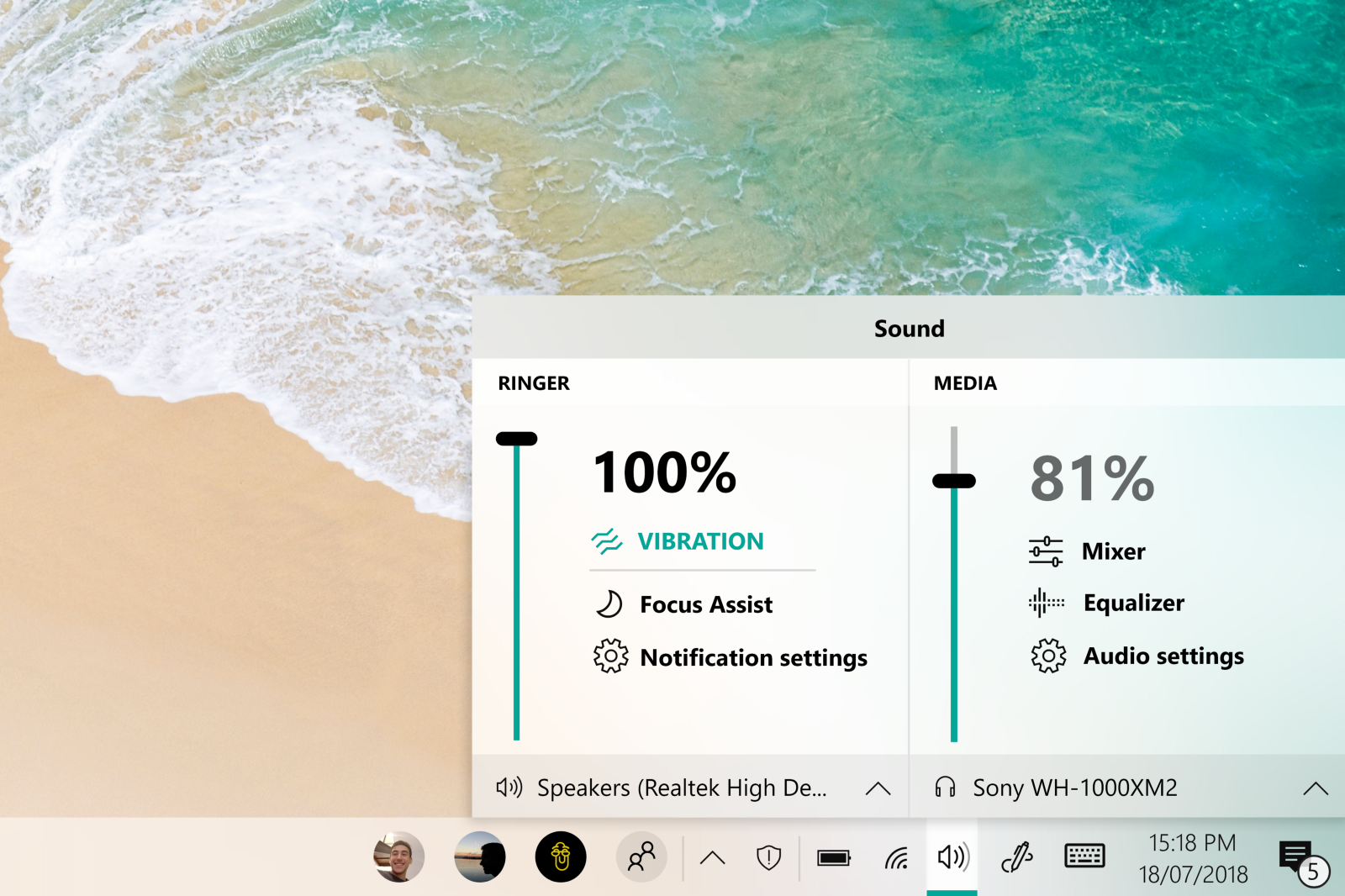
The firm has evolved the Action Center over time, building upon the foundation it originally laid with Windows 10 and modifying it for the desktop Like all things, there’s still room for improvement and this concept show off one of the nicest Action Center designs we’ve seen so far.
“From my own experience in my office and with my family I’ve noticed that they are reluctant to use any feature using the UI of Windows 8 for being too “weird” compared to the classic desktop one. ” Designer Samuel Ojeda explained on Medium, “This is why I’ve made a hybrid between the full-screen panel designed for the good old Windows 8 and the panel design used in the calendar flyout in Windows 10.”
The new Action Center interface looks crazy good. It draws some (perhaps unintentional) influence from Google;’s ChromeOS and applies Fluent Design thoughtfully to elements like flyouts.
The Quick Actions Panel looks slightly cluttered on the one hand. However, seeing as this is for desktop users, perhaps a pushback on the low information density UI Microsoft has been pushing since Windows 10 is due.
You can have a look a the full concept on Medium, and let us know what you think in the comments below.
Source: Medium


User forum
0 messages