Netflix redesigns its TV app with a new sidebar for faster navigation
2 min. read
Updated on
Read our disclosure page to find out how can you help MSPoweruser sustain the editorial team Read more

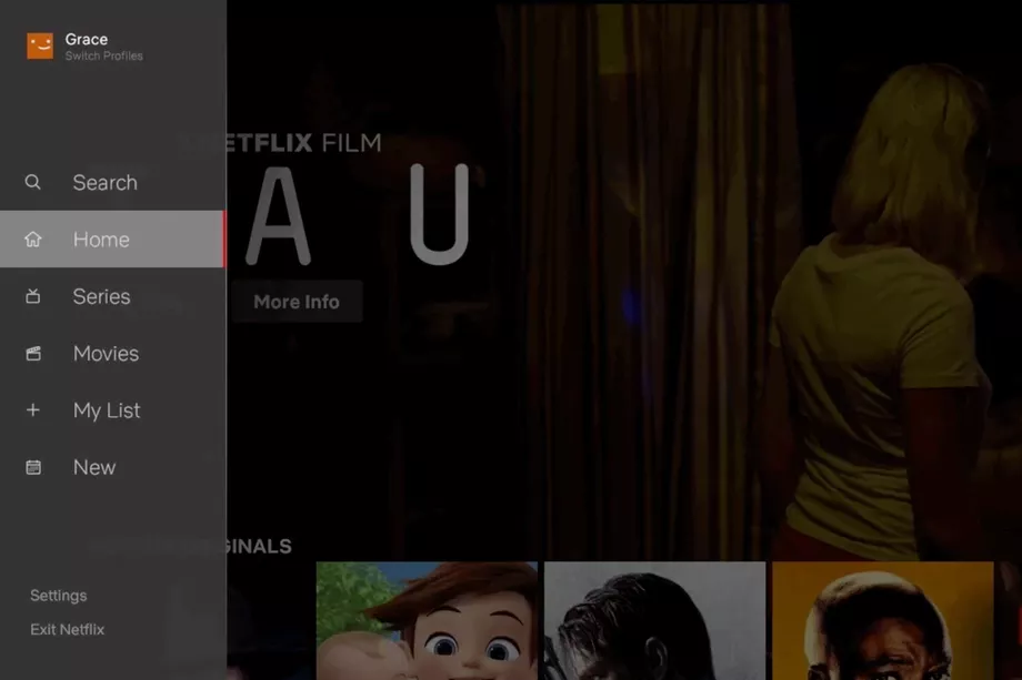
Netflix is making a tweak to its user interface to make it easier to navigate on a TV where you’ll likely have a TV remote or a controller.
Netflix’s Stephen Garcia, Director of Product Innovation explains:
The new TV interface was designed to make the Netflix experience simpler and more intuitive in a few different ways. First, it is now easier to search and view new content added to the service. It is also far simpler to start browsing with either a series or movie; our research has shown us that while a member generally isn’t sure what exact title they want to watch, they have a pretty good sense of whether they are in the mood for a quick series episode or a longer movie experience. We’ve also made it easier to access titles you’ve saved for later viewing in My List. In our testing of this new interface, we saw that this simpler design helped members find something great to watch.
This is just one of many of the firm’s changes done to make the TV experience better for their users. The firm said there was “extensive” and “rigorous” testing done to validate the new interface, and it plans to make “many improvements” over the coming months to its service.
This update will roll out automatically to all Smart TVs and consoles.
Via The Verge


User forum
0 messages