Microsoft's designers show us a Windows 10 Start Menu with rounded corners
1 min. read
Updated on
Read our disclosure page to find out how can you help MSPoweruser sustain the editorial team Read more
We have heard recently that Microsoft abandoned plans to square off the tabs and menus in the new Edge, saying:
… the latest Fluent designs are characterized by rounded corners across objects and controls…
Of course, most of Windows 10 has exactly the opposite design – sharp, square corners.
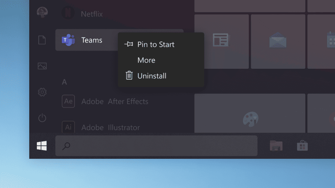
It seems, however, this look may be on the way out, going by a mock-up of the Windows 10 Start Menu posted by Microsoft’s Tips site.
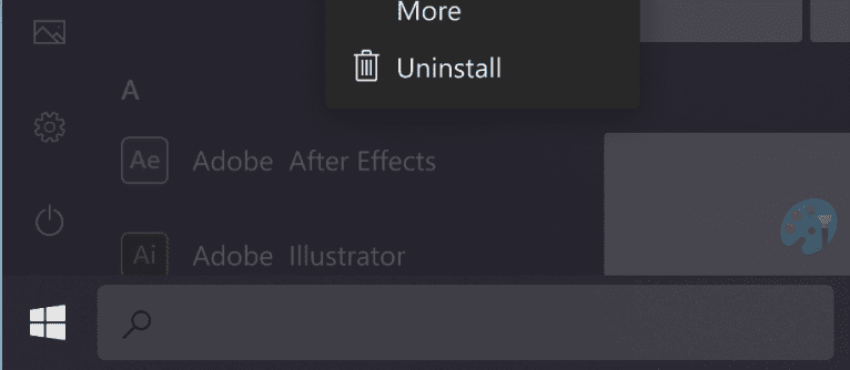
As can be seen above, the Search box is distinctly rounded, as is the context menu and tiles.
It is unclear if we are looking at a screenshot or a mock-up made from scratch, but given Microsoft’s recent comments on Edge’s Fluent Design, it seems likely the days of Windows 10 being square are pretty numbered.
via WindowsLatest





User forum
0 messages