Microsoft says Edge is already pretty Fluent Design, no transparency effects needed
If you were hoping for dramatic improvements to the design of Microsoft’s Edge browser, based on their Fluent Design initiative, you would be happy to know that Microsoft feels that they are more or less there already.
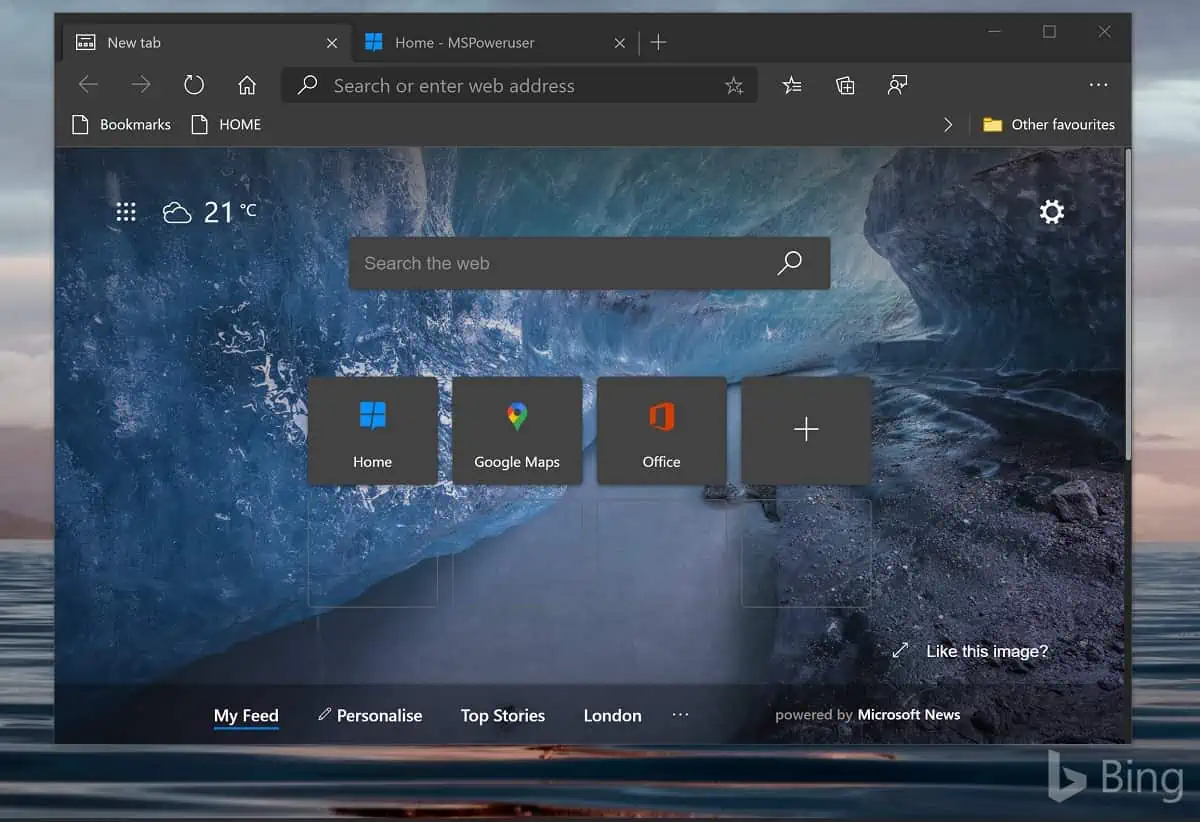
In a post on TechCommunity, Microsoft says “you’ll note that the new version of Edge is aligned with the current direction Fluent is going,” and notes that earlier concepts of Fluent Design that emphasized elements like transparency as below are now outdated.
Microsoft specifically said they were now no longer planning to make Edge tabs more square or provide a transparent theme, nothing these are no longer consistent with Fluent Design.
Their full post reads as below:
Thank you so much for all your feedback on the overall design of the new version of Edge, as it is invaluable to our getting the experience right. A common thread through this feedback has been a lot of discussion about the definition of “Fluent” design, and how it should apply to Microsoft products, so we wanted to share an update to provide some clarity. As opposed to a specific or static set of design rules, Fluent is intended to be an ever-evolving design system across Microsoft products. As the world around us continues to evolve, including devices, interaction models, user habits and expectations, the Microsoft design system must also evolve to meet the changing needs of our users. This means Fluent will not necessarily always represent everything that it did several years ago when the look and feel of the legacy version of Edge was first developed. You can learn more about the current direction of Fluent by visiting the Fluent Design System Page, which provides a summary of the design system as a whole, as well as how it applies to different platforms, applications and controls across Microsoft.
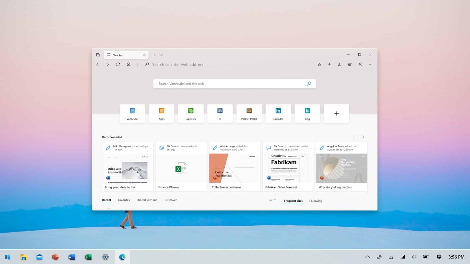
If you browse through the Fluent guidance at the link above, you’ll note that the new version of Edge is aligned with the current direction Fluent is going, and we will continue to evolve along with the design system and Microsoft as a whole. While Edge may be one of the first to put some of these new Fluent elements into practice, you will continue to see other products across the company update to reflect this direction as well. For example, you’ll notice that the latest Fluent designs are characterized by rounded corners across objects and controls, and the new version of Edge is consistent with that guidance. Another example is that there isn’t a pivotal focus on transparency in the latest Fluent designs, and surfaces of the new version of Edge reflects this.
This is not to say we will never consider incorporating such aspects into our designs going forward, or perhaps offering options to customize the look and feel, but there are no plans to incorporate these elements into the default experience for all users at this time. However, there are other design investments on our roadmap to continue aligning with the broader Fluent direction, such as updating icons and illustrations across the product. Please continue to send your feedback on the overall Edge look and feel, including preferences and pain points, as we are always open to learning more and updating our direction based on the needs of our users.
– The Microsoft Edge Team
Some may agree with Microsoft that Edge is exactly as beautiful as it needs to be while others may feel Microsoft, as usual, is leaving a job half-done because it became too hard.
What do our readers think? Let us know below.
via Techdows
Read our disclosure page to find out how can you help MSPoweruser sustain the editorial team Read more


Improve this guide

User forum
0 messages