Microsoft Store gets a new app icon
2 min. read
Updated on
Read our disclosure page to find out how can you help MSPoweruser sustain the editorial team Read more
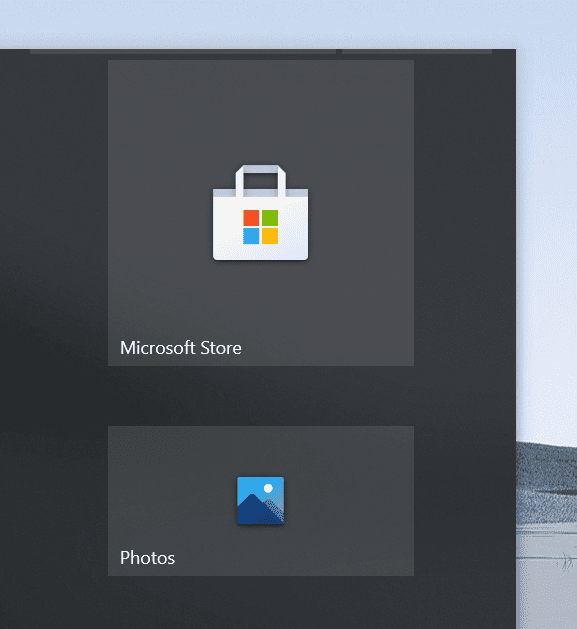
Microsoft promised to bring Fluent Design-based app icons for all its apps across all major major platforms, including Windows 10, Android, and iOS. True to its word, Microsoft started rolling out modern Fluent Design-based icons for some of its popular stock apps such as Photos, Voice Recorder, Feedback Hub, and Office a couple of months ago. However, Microsoft is yet to upgrade the old app icon of all its apps to the new, modern fluent design-based icons.
Today, Microsoft introduces its modern app icon to Microsoft Store. Of course, the new app icon for Microsoft Store is based on the fluent design system and looks nicer than the old one. However, the new icon is not available for everyone at this moment as Microsoft is rolling out the new app icon for Windows Insiders in Release Preview Channel(earlier known as Release Preview ring). In other words, if you’re a Windows Insider on the Dev Channel or Beta Channel, you won’t see the change at this moment. Needless to say, users running a stable version of Windows 10 won’t see the change either.
What do our readers think about the new fluent design-based app icon for Microsoft Store? Let us know in the comments below.
via ALumia






User forum
0 messages