Microsoft Edge dark mode: Is an even darker UI of the browser coming?
2 min. read
Published on
Read our disclosure page to find out how can you help MSPoweruser sustain the editorial team Read more
Are you a fan of Microsoft Edge dark mode? If so, we’ve got some good news for you.
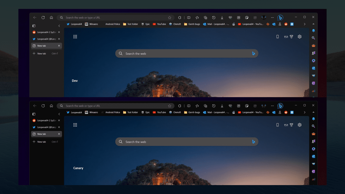
Microsoft is reportedly working to bring an even darker UI for the native browser. As spotted by Windows enthusiast @Leopeva64, the Redmond-based tech giant is currently testing a striking new feature in Edge Canary, the experimental channel of the browser. The company is experimenting with a full black background for various elements, including the tab strip, toolbar, favorites bar, vertical tabs, and sidebar.
In Edge Canary Microsoft is testing a full black background for the tab strip, toolbar, favorites bar, vertical tabs and sidebar, here’s a comparison between the Dev and Canary versions (the first two screenshots have the Mica effect enabled): pic.twitter.com/X6E2QouK3n
— Leopeva64 (@Leopeva64) June 21, 2023
As you can see, if you have the Mica effect enabled for Edge, it won’t affect the all-black UI that much as it will not blend with the background color. So, if you desire a visually pleasing experience that is gentle on your eyes, this combination is the ideal choice.
Speaking of the dark mode, you have the option to enable the dark reader in Edge as well. While this feature is currently categorized as an experimental flag within the browser, we’ve also prepared a simple step-by-step guide on how to activate it.
What are your thoughts on Microsoft Edge getting a much darker UI? Let us know in the comments!




User forum
0 messages