LinkedIn's desktop redesign rolling out now
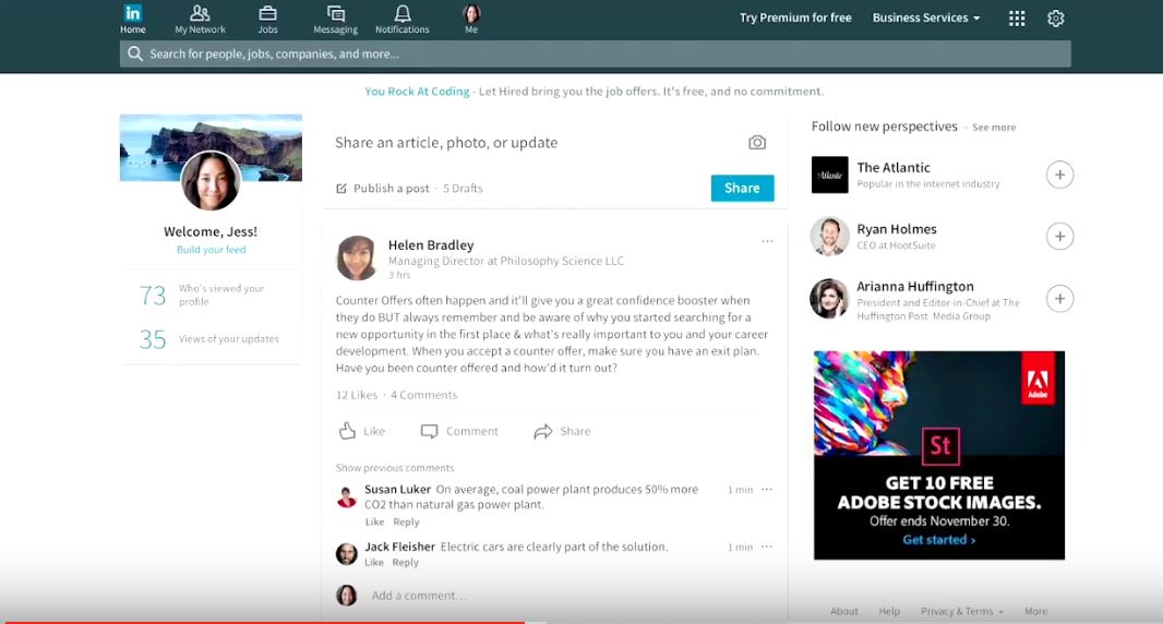
Last year, LinkedIn announced that they are redesigning their desktop web experience. Today, they are launching the redesigned experience and it will be rolling out to all LinkedIn users globally over the coming weeks. They have built it from the ground up to provide a LinkedIn experience that is more intuitive, faster and creates more value for users.
Here are a few enhancements included in this release:
- Streamlined navigation: There are now seven core areas on the bar navigation — Home (Your Feed), Messaging, Jobs, Notifications, Me, My Network, and Search. With one simple click on the “more” icon on the navigation bar you can also launch into other experiences that matter to you, like LinkedIn Learning.
- Smarter messaging that helps you connect and unlock new opportunities: With our new real-time messaging interface, you can message a connection wherever you are on LinkedIn. We’ll also start serving up insights across the site to help you break the ice in any conversation and connect you to your next opportunity. For example, if you see a new job posting you’re interested in, we’ll suggest someone within your network who works at the company.
- Richer Feed to keep you informed: With a combination of algorithms and human editors working together, we’ve fine tuned your Feed to surface the most relevant content from people and publishers you care most about. We’ll also be adding new ways for you to dive deep into specific topics relevant to you and follow trending stories.
- More intuitive search: You now have one universal search box to easily find people, jobs, companies, groups and schools. You can refine your search by using filter options on the right hand side, with the ability to search posts coming soon. Also, we’re investing further to better understand signals on what they searching for? Or who you are searching for so we can bring you the best results for any search query.
- Greater insight into who’s viewing your content: You can now see who’s reading and engaging with the content you share, including the company, job title and location of the people who are interested in your updates.
- Better suggestions to make your profile stand out: We’ve improved profile suggestions so you can more easily see what you need to do to look your best professionally, for example, suggested skills based on what recruiters are searching for.
They have also simplified the navigation on desktop into seven core areas — Home (Your Feed), Messaging, Jobs, Notifications, Me, My Network, and Search. With one simple click on the “more” icon on the navigation bar you can also launch into other experiences, like LinkedIn Learning.
Read our disclosure page to find out how can you help MSPoweruser sustain the editorial team Read more


Improve this guide
User forum
0 messages